hey! my name's craig and i'm a designer./3d designer./art director.
PÉREbranding - packaging - 3d - digital - art direction
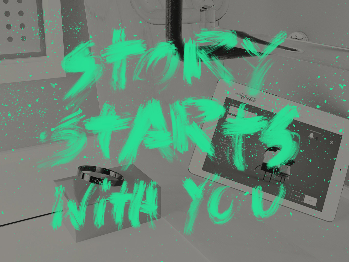
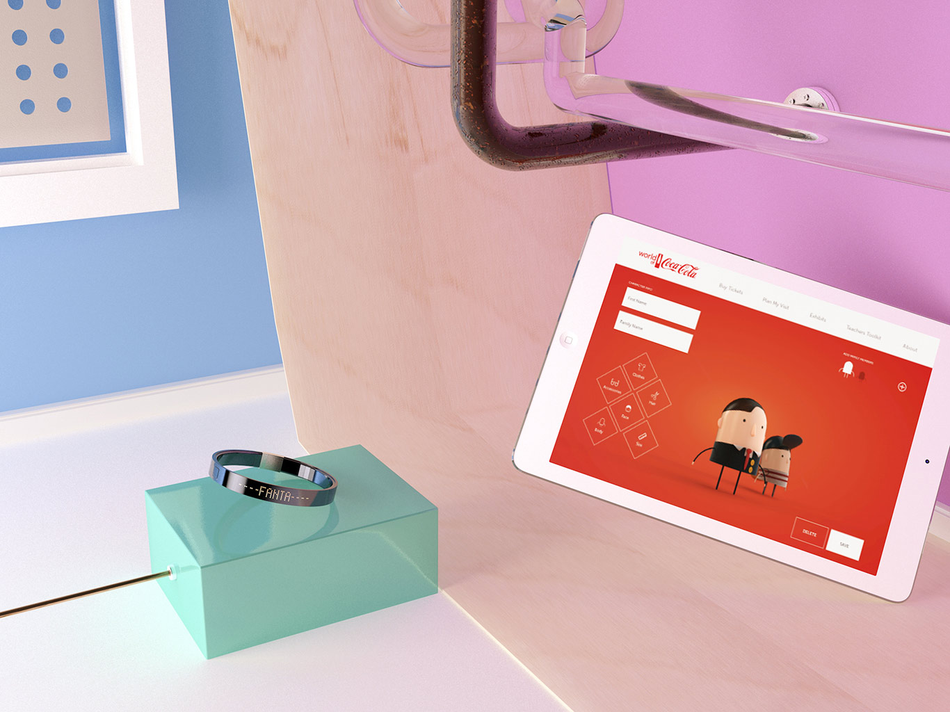
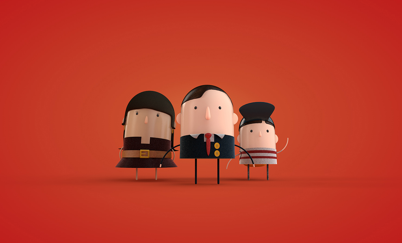
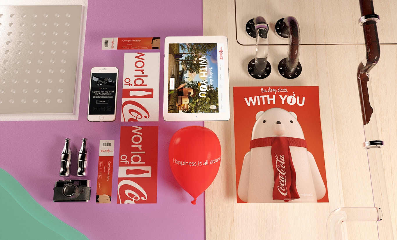
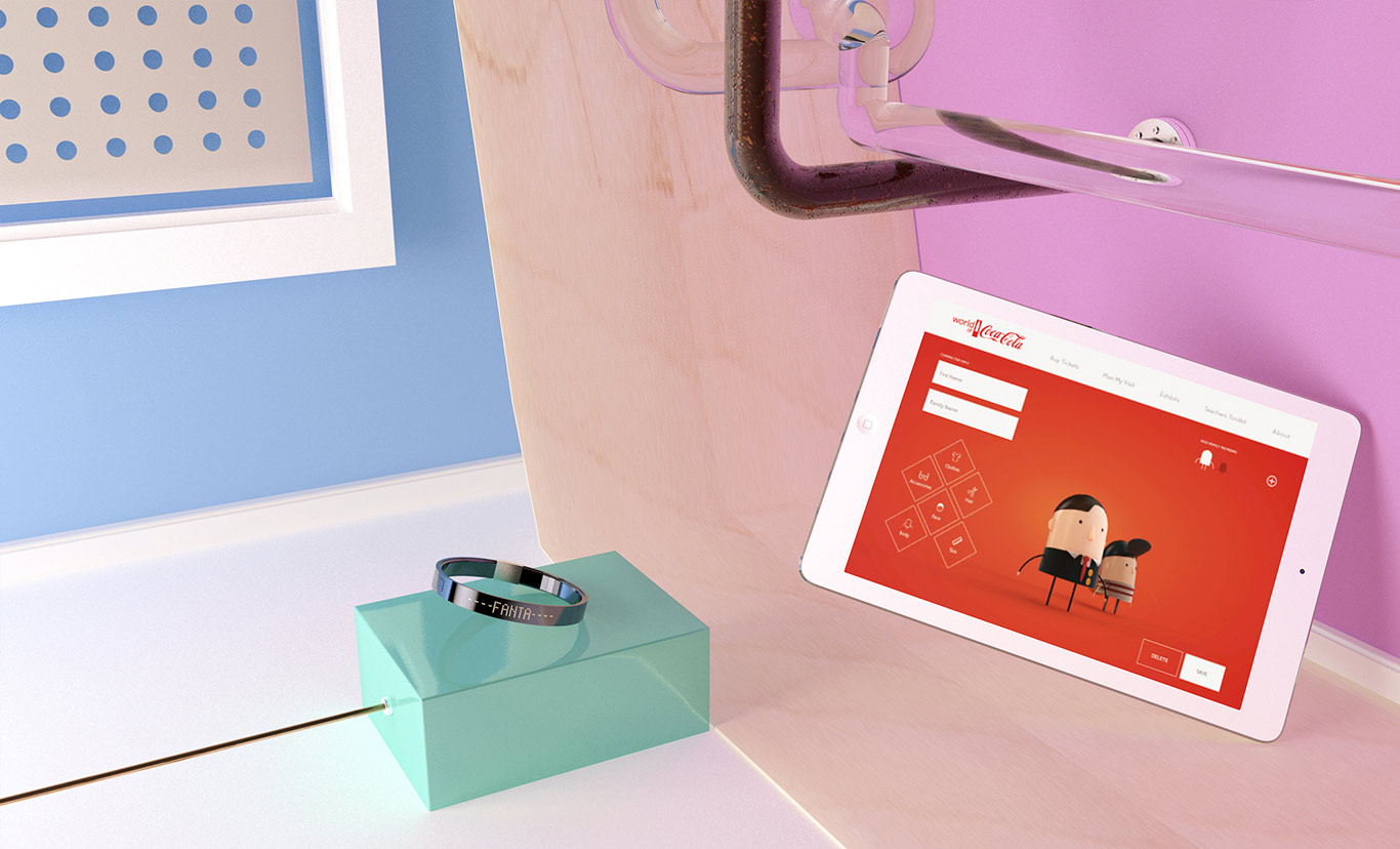
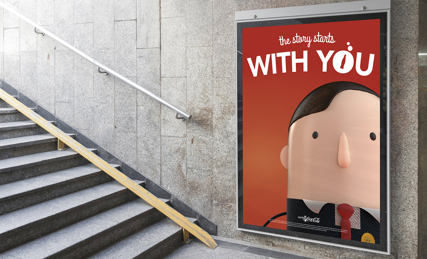
STORY STARTS WITH YOUart direction - website - 3d - packaging - digital
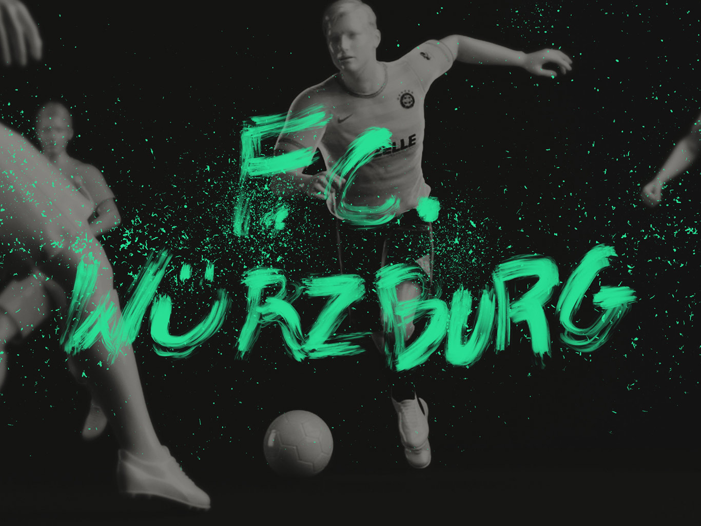
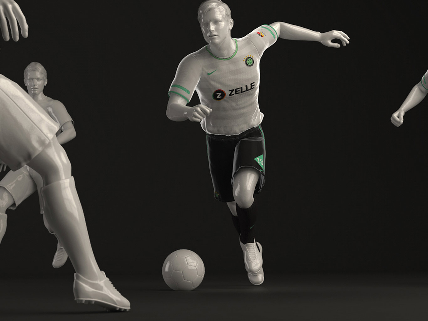
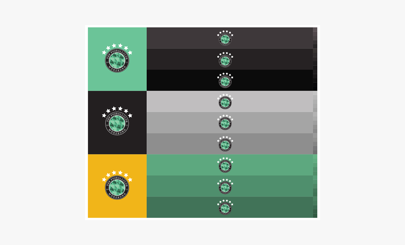
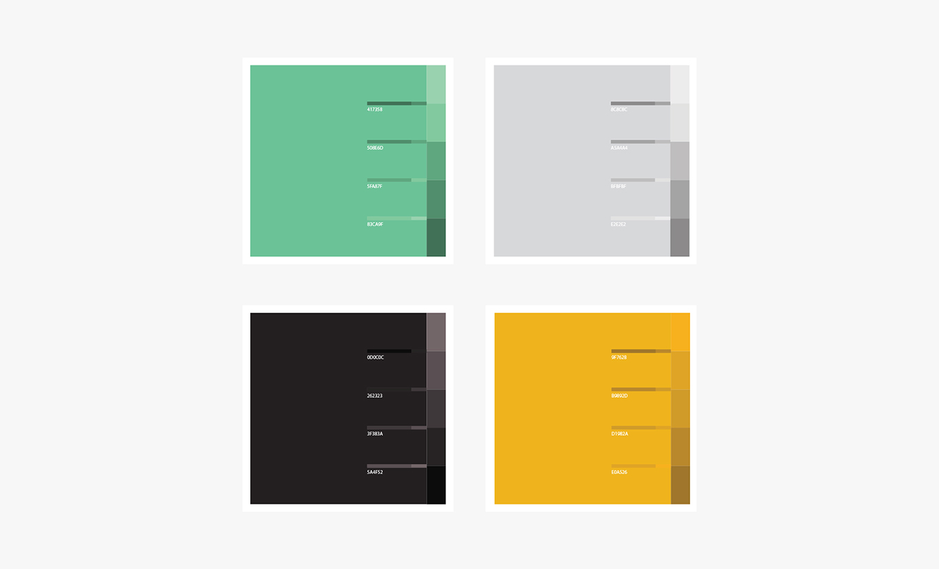
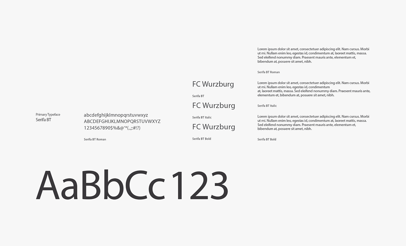
F.C. WÜRZBURGbranding - 3d - digital - kit design - art direction
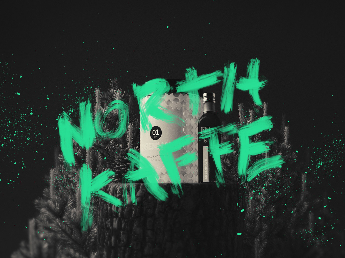
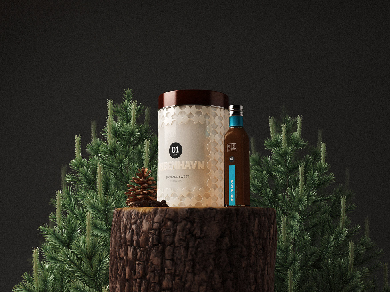
NORTH KAFFEbranding - packaging - 3d - digital - app - art direction
FLUXbranding - broadcast - 3d - digital - art direction
ADULT SWIMprint - video - billboard - tv bump
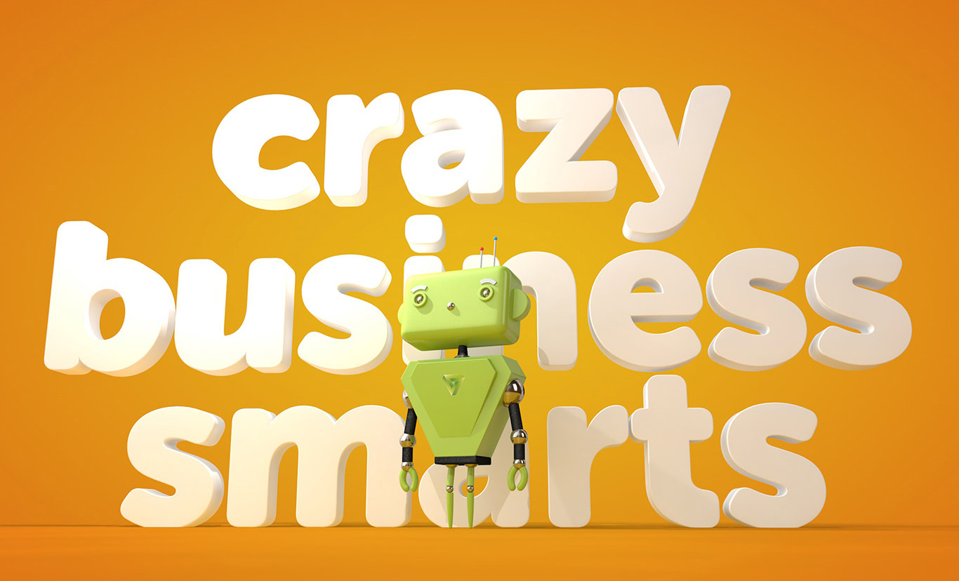
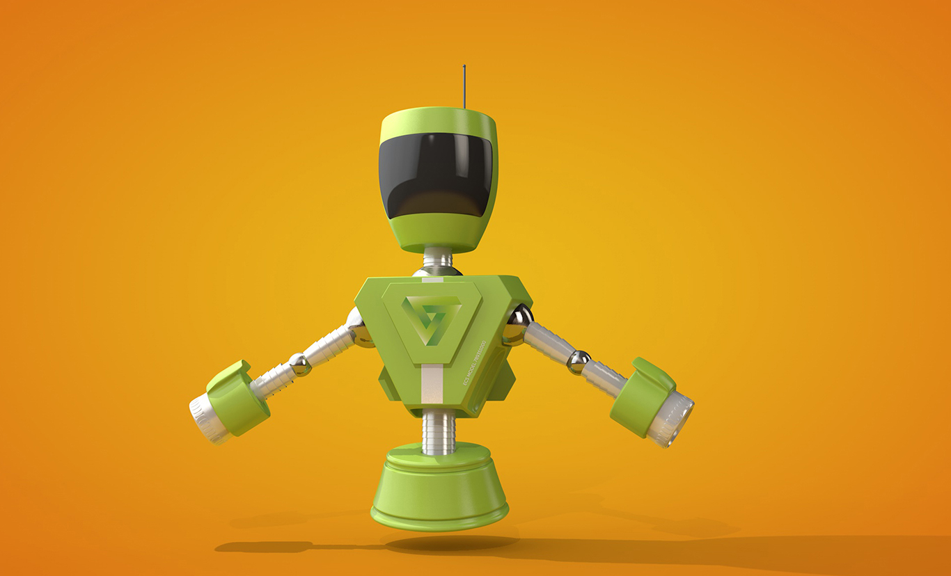
CRAZY SMARTSmotion - 3d - art direction - advertising
MADE BY FOURbranding - packaging - 3d
2011
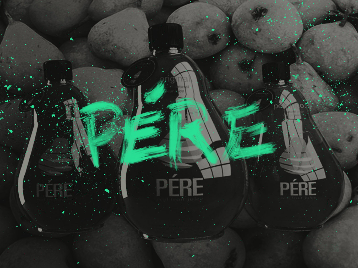
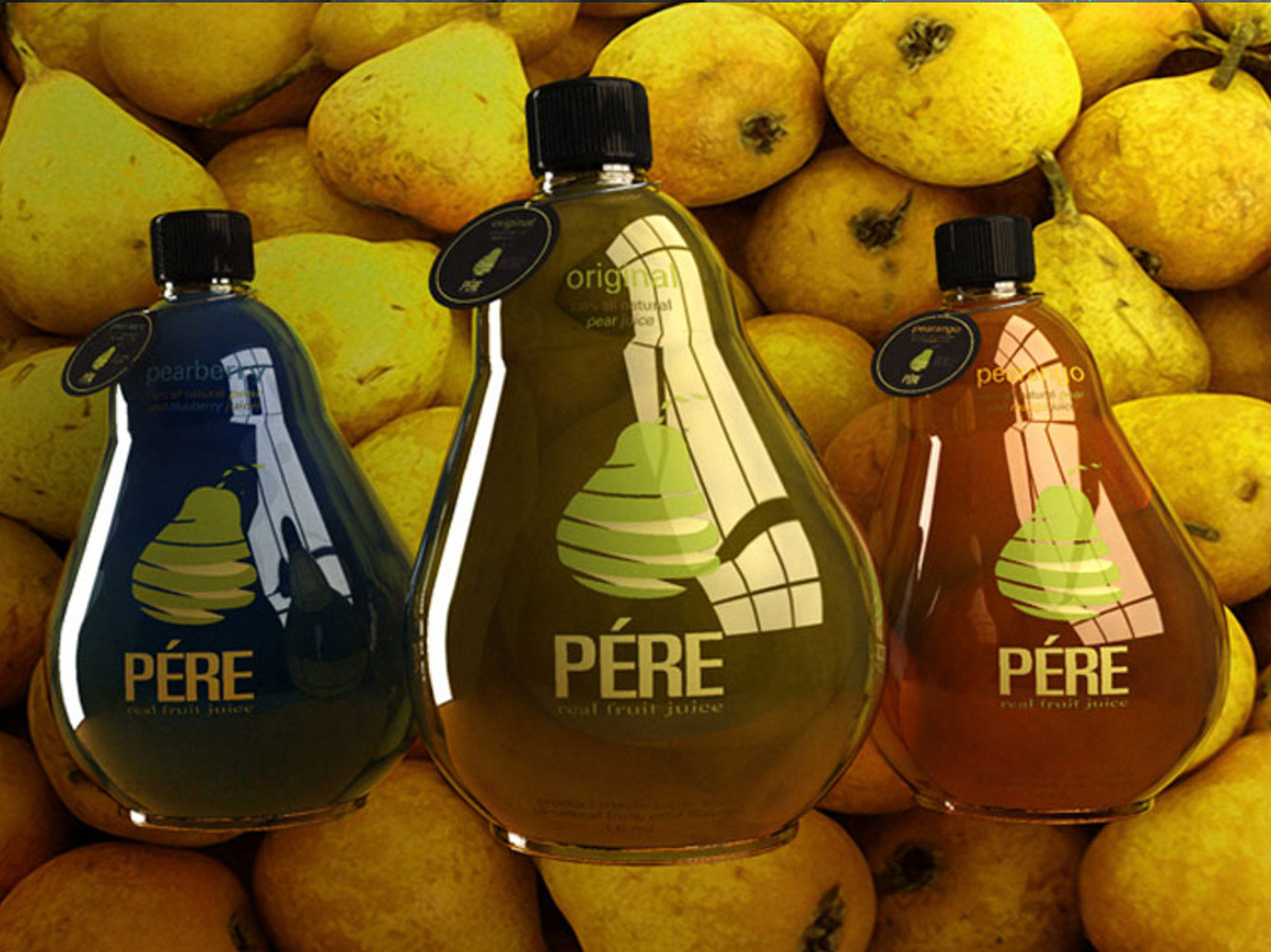
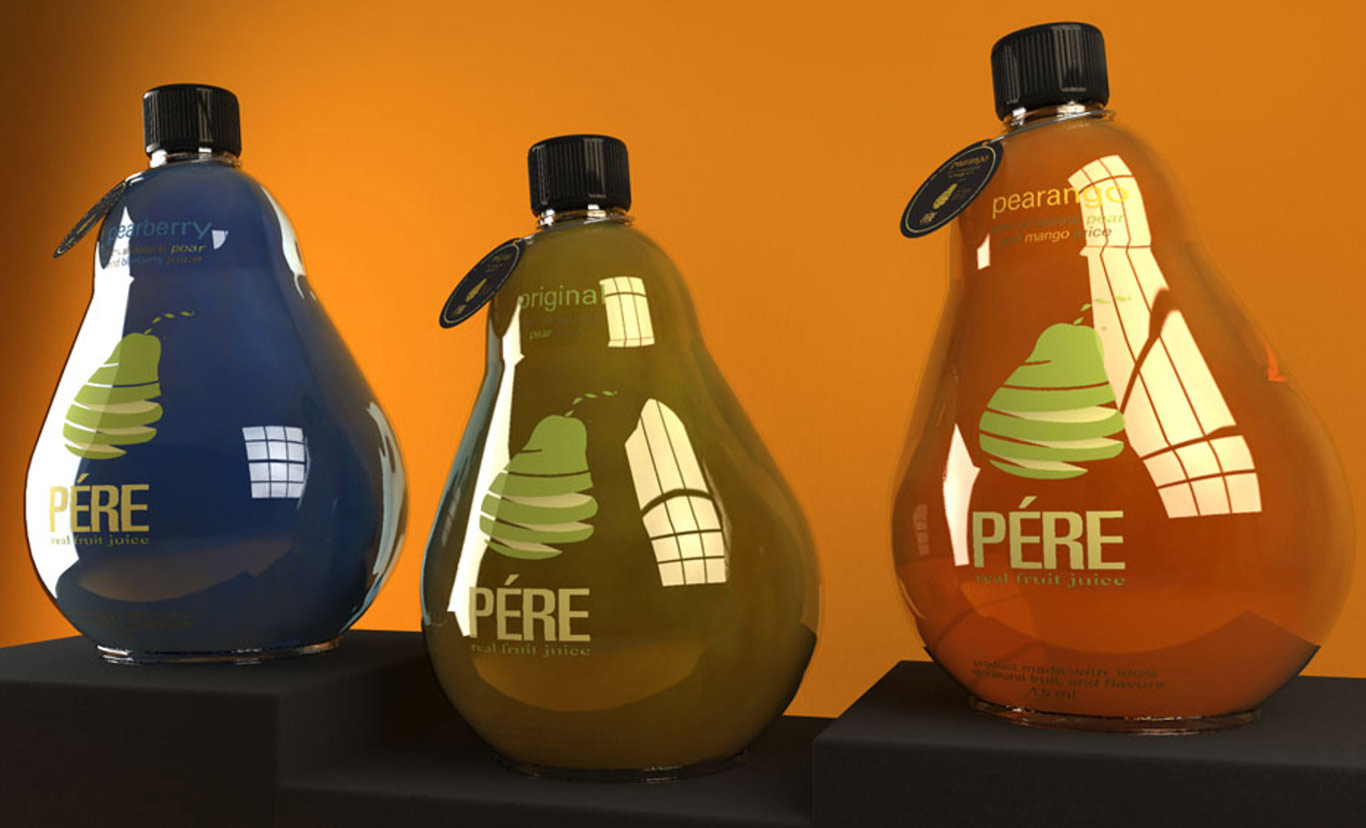
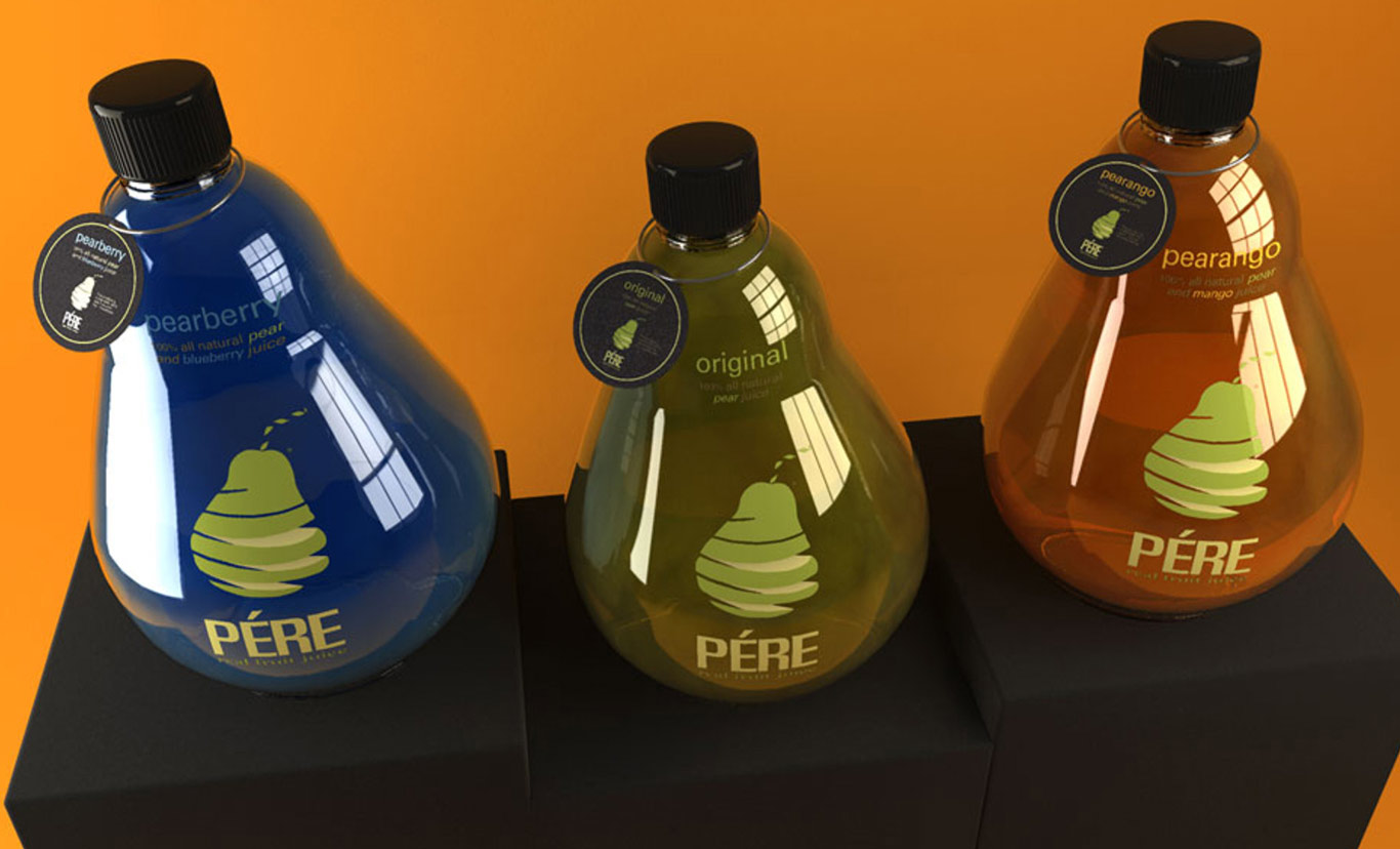
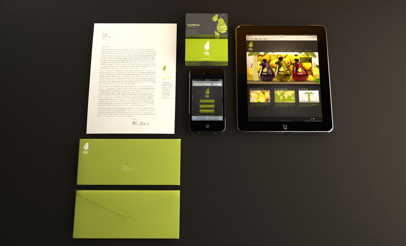
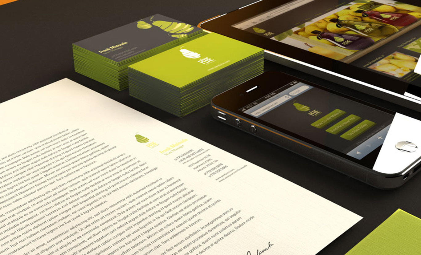
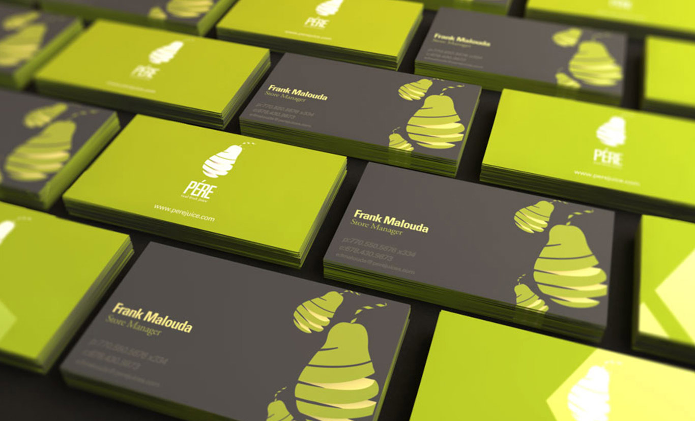
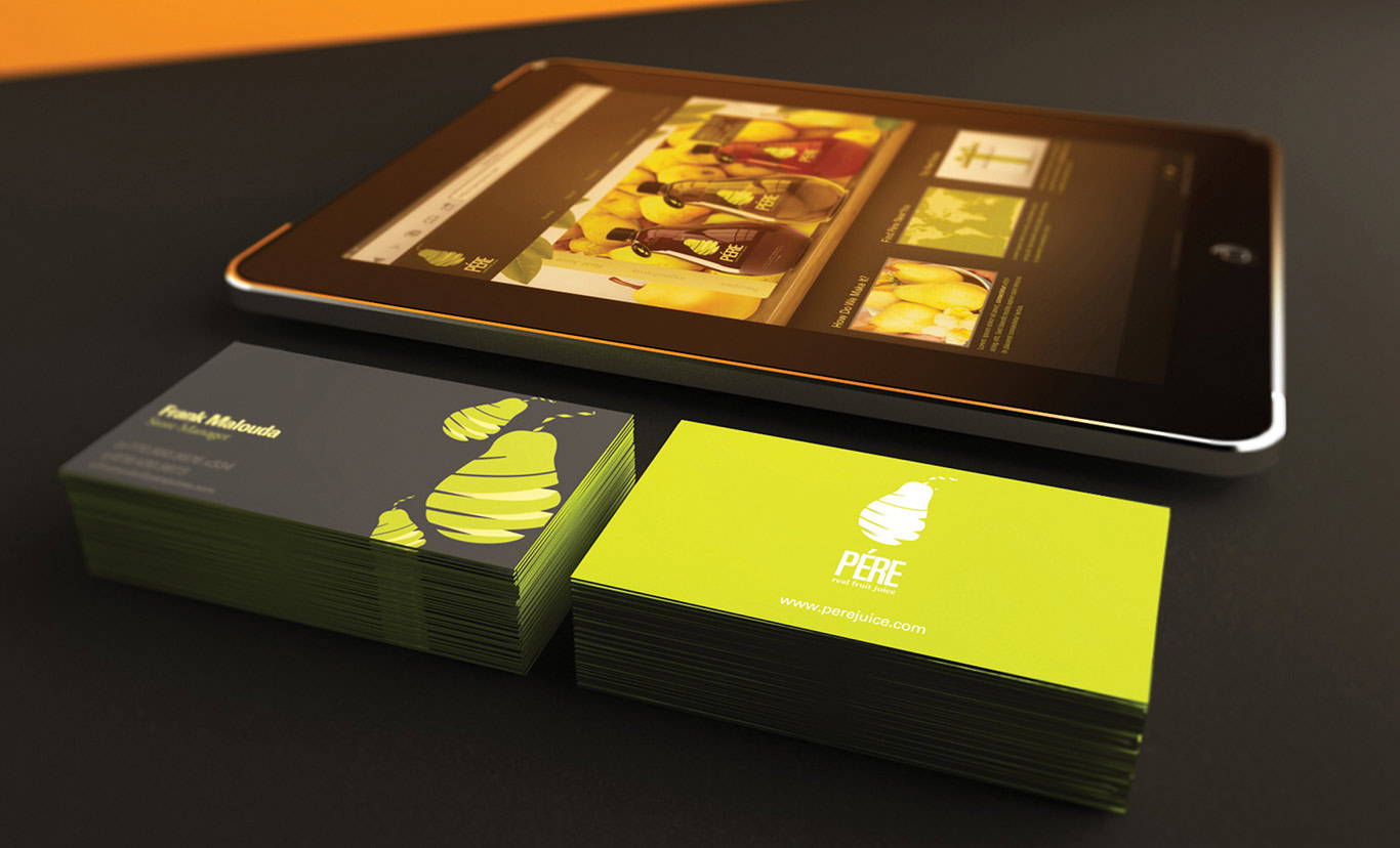
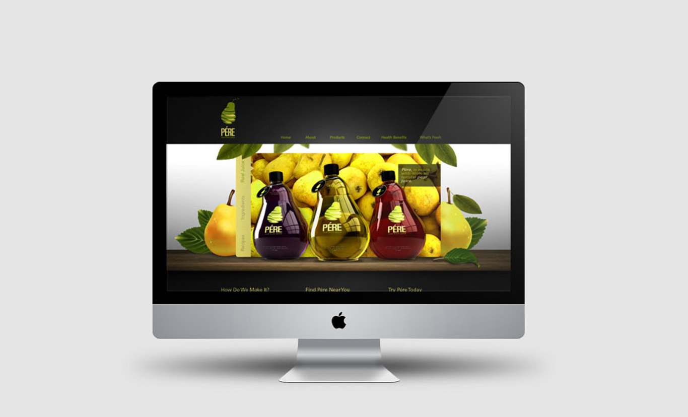
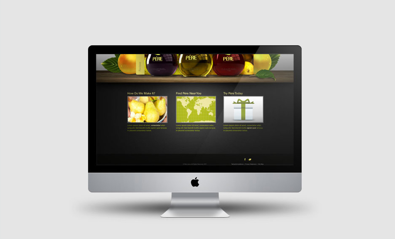
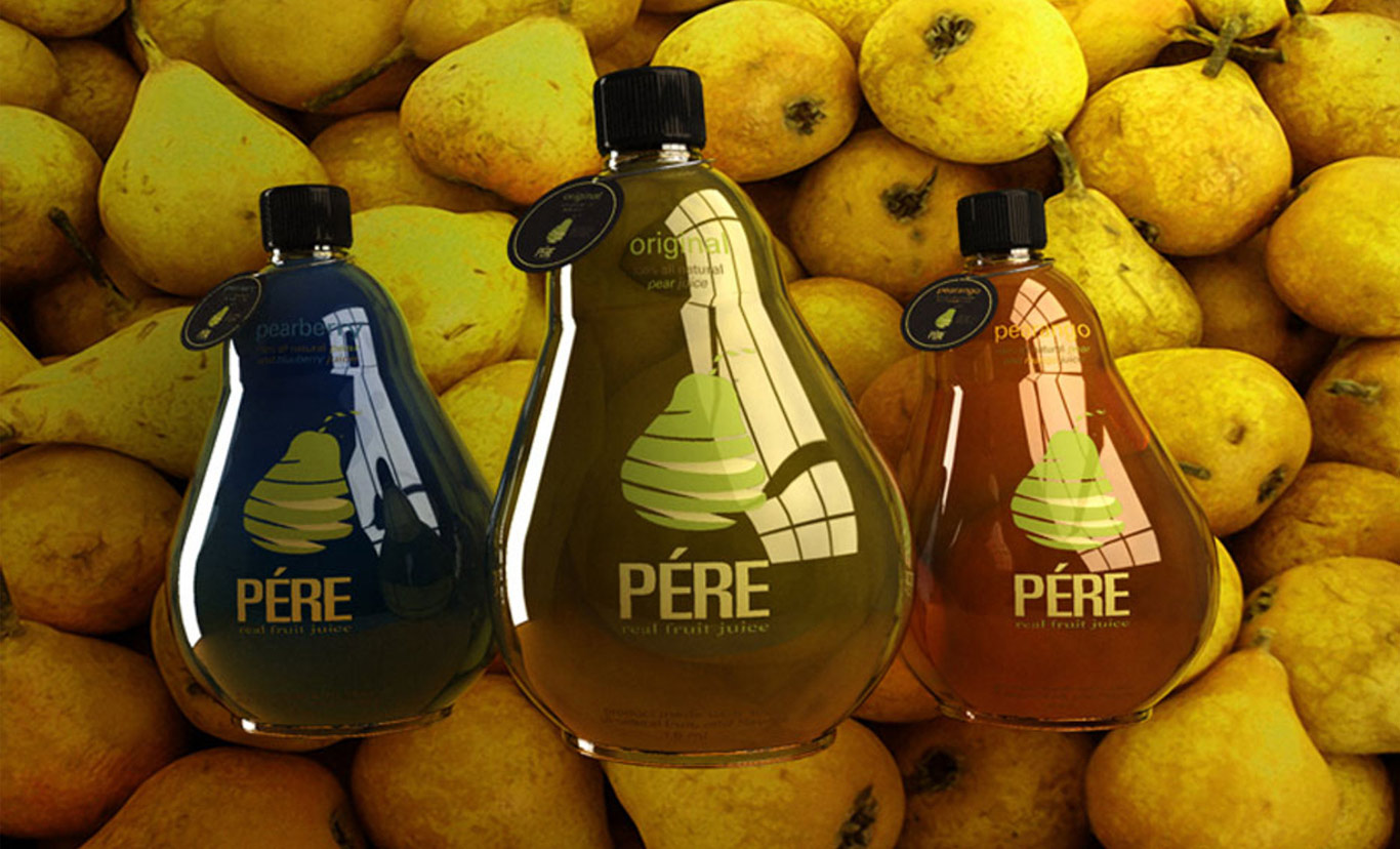
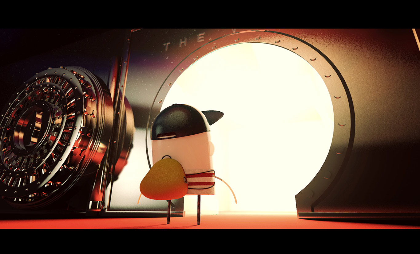
PÉRE branding - packaging - 3d - digital
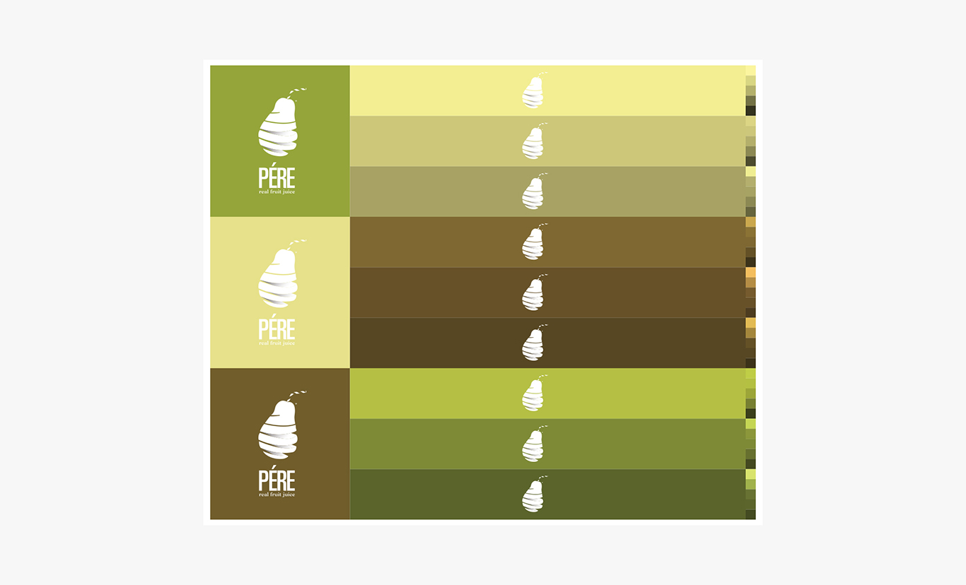
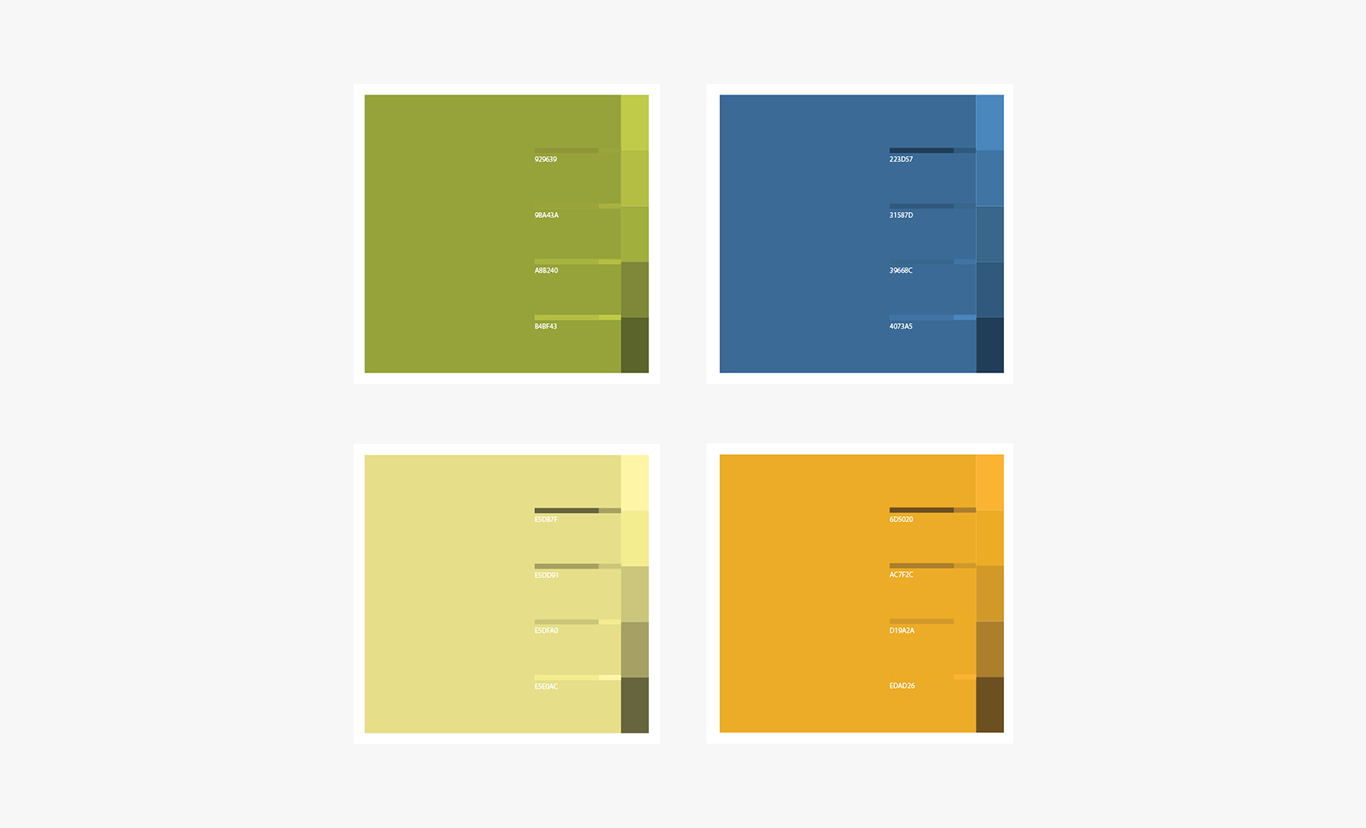
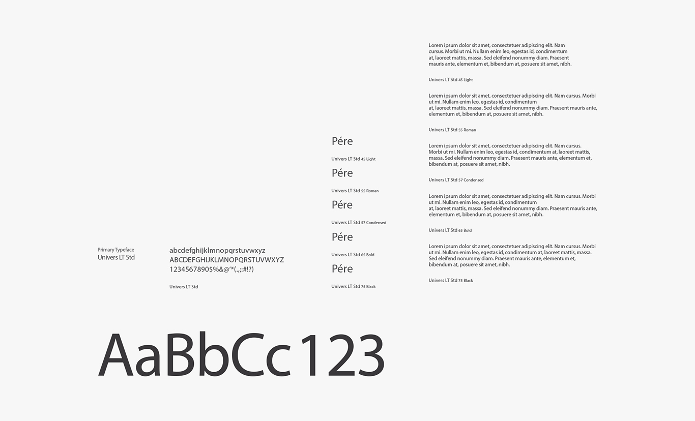
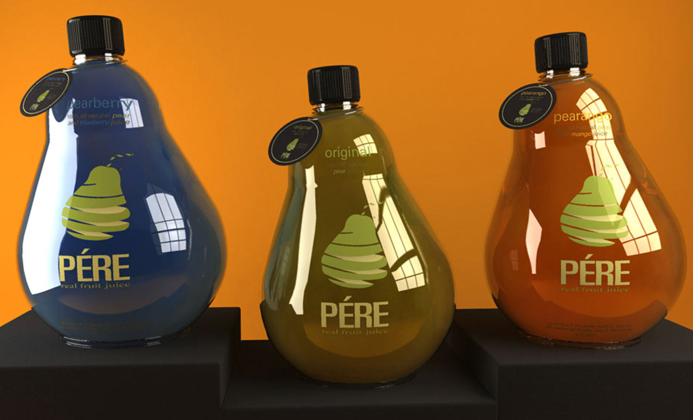
Pére is an exotic, all natural juice product. The client named his company Pére based off his father who hand-made pear juice for the client when he had a severe fever as a boy. The natural juice of the pear is good in relieving fever because of its cooling effect, so the client wanted to endeavor his future business by making a juice product that is completely 100% allnatural pear juice to share with the world. The logo symbolizes the process ofthe pear as its converted into juice, and the use of the pears peel in the production of this drink. The bottle was meant to follow the organic shape of the pear, emphasizing its true root to keeping the integrity of the all-natural product.
2015
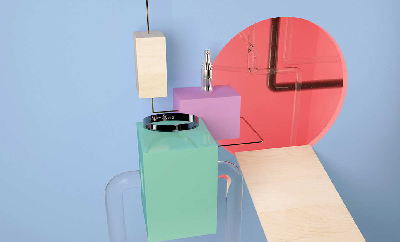
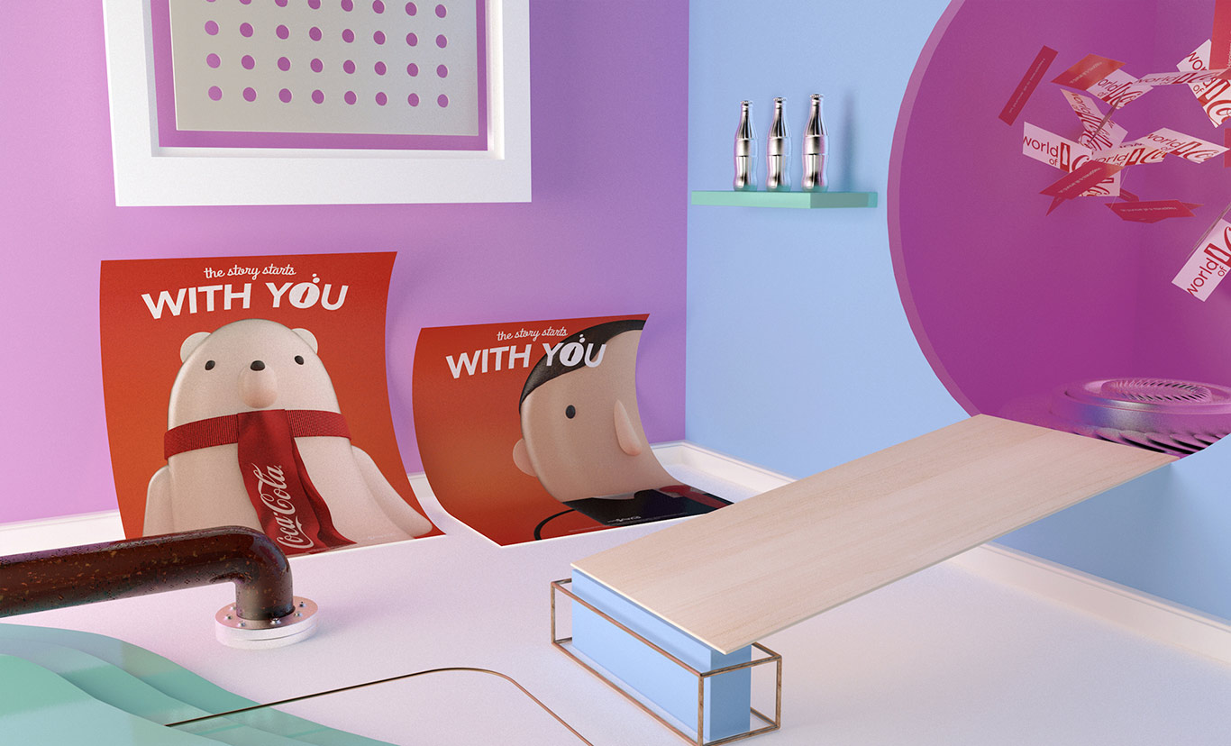
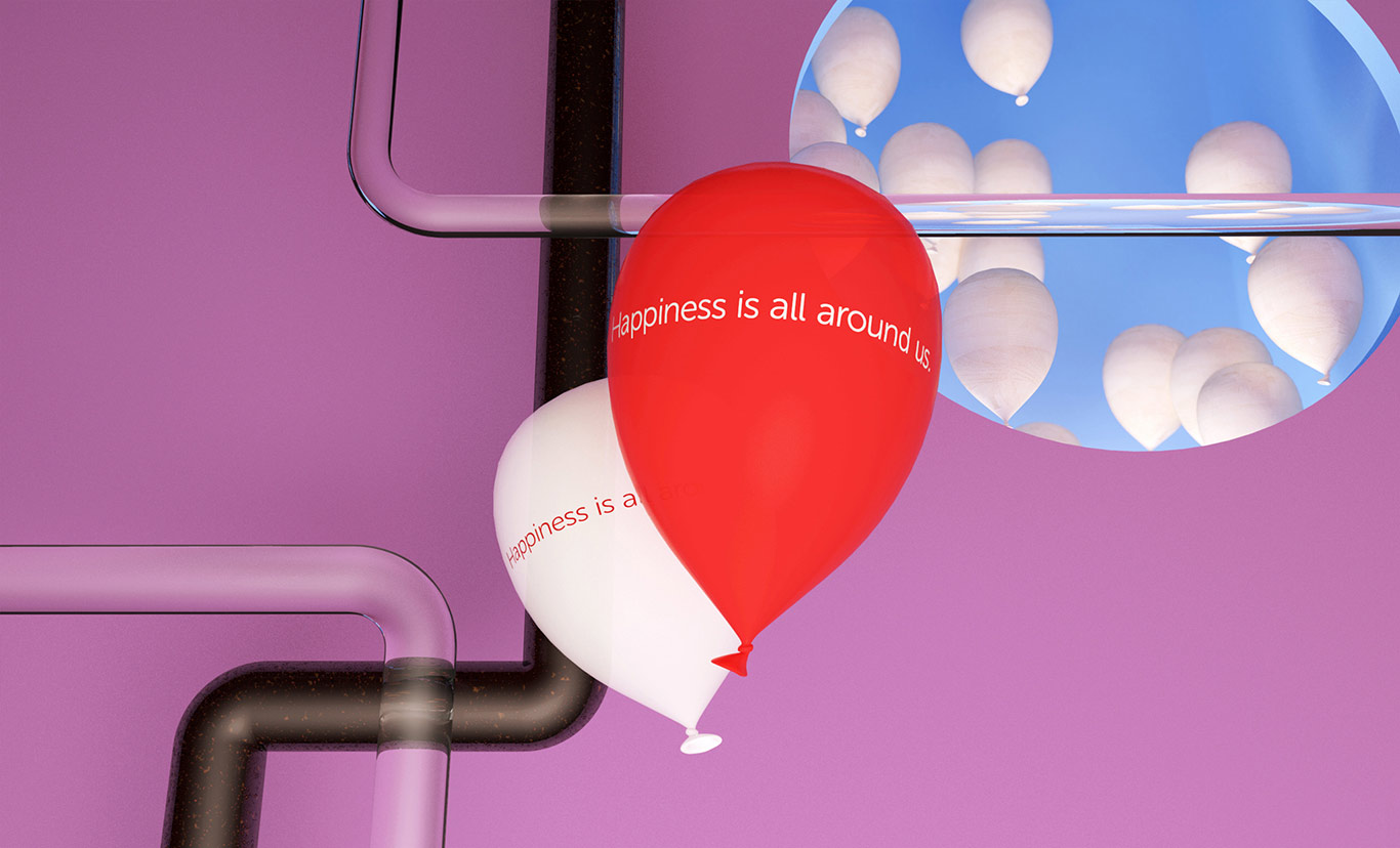
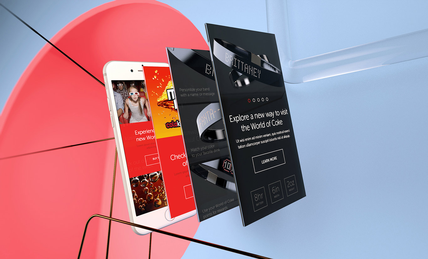
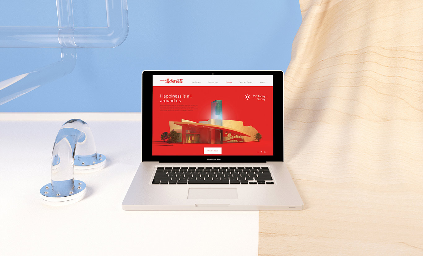
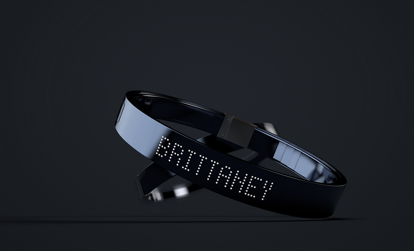
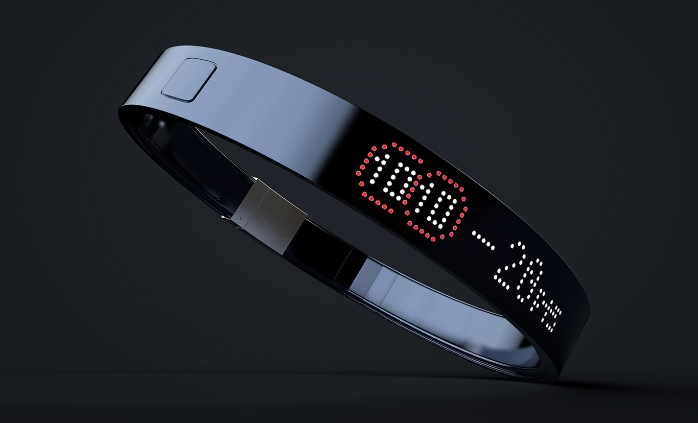
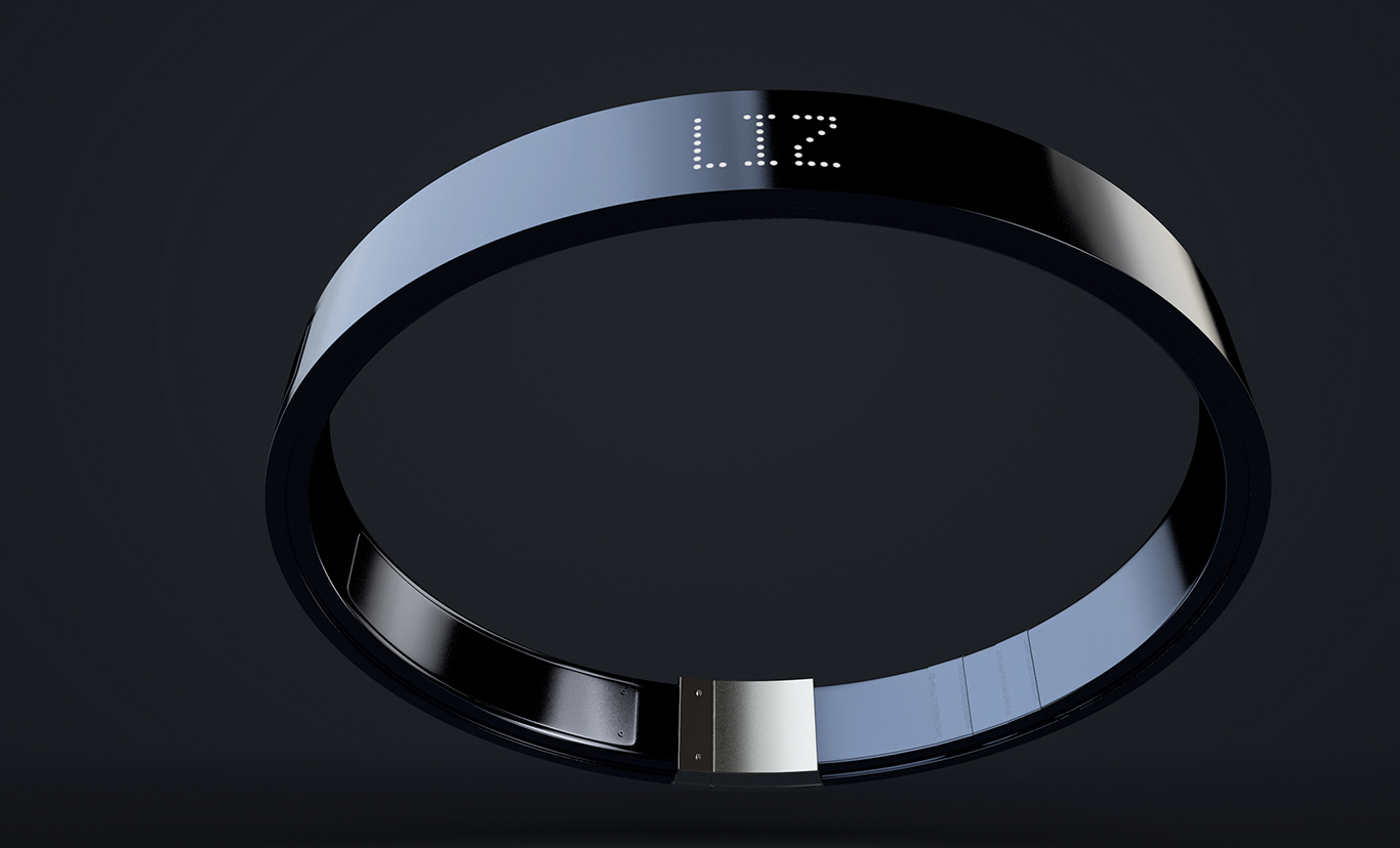
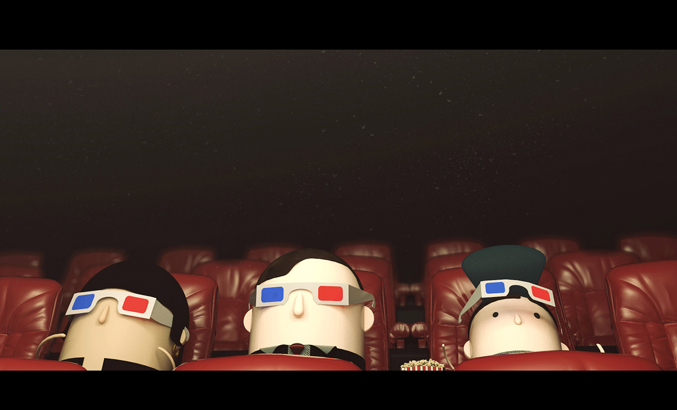
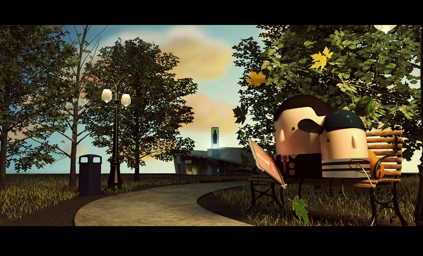
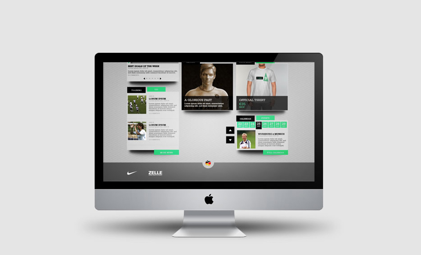
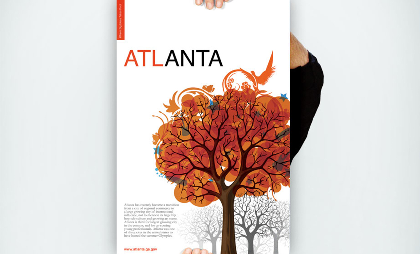
THE STORY STARTS WITH YOUart direction - website - 3d - packaging - digital
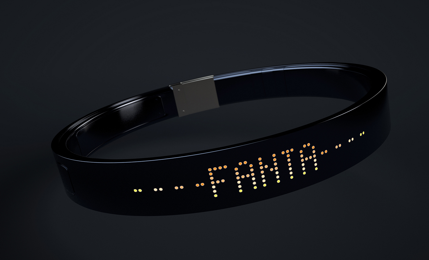
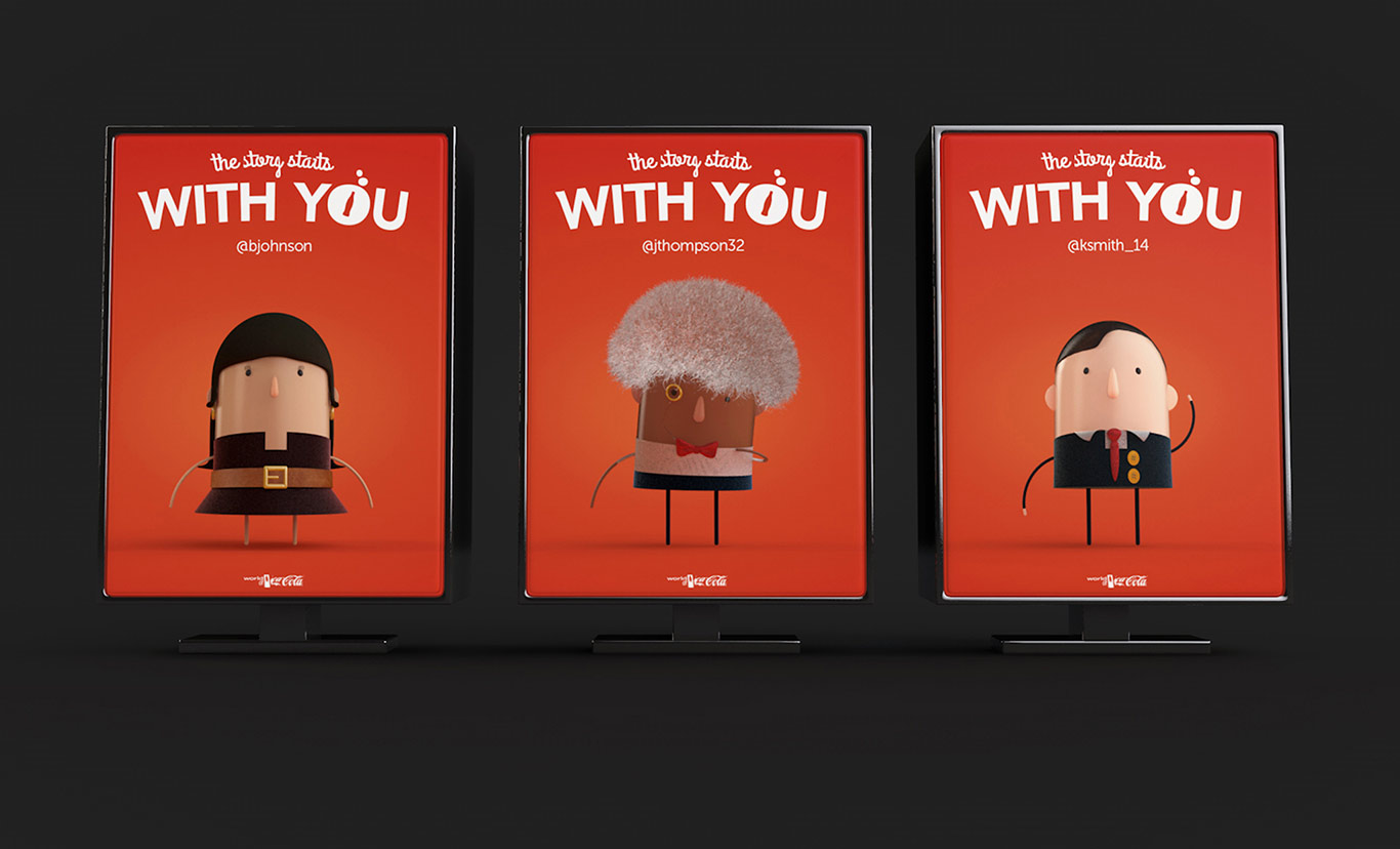
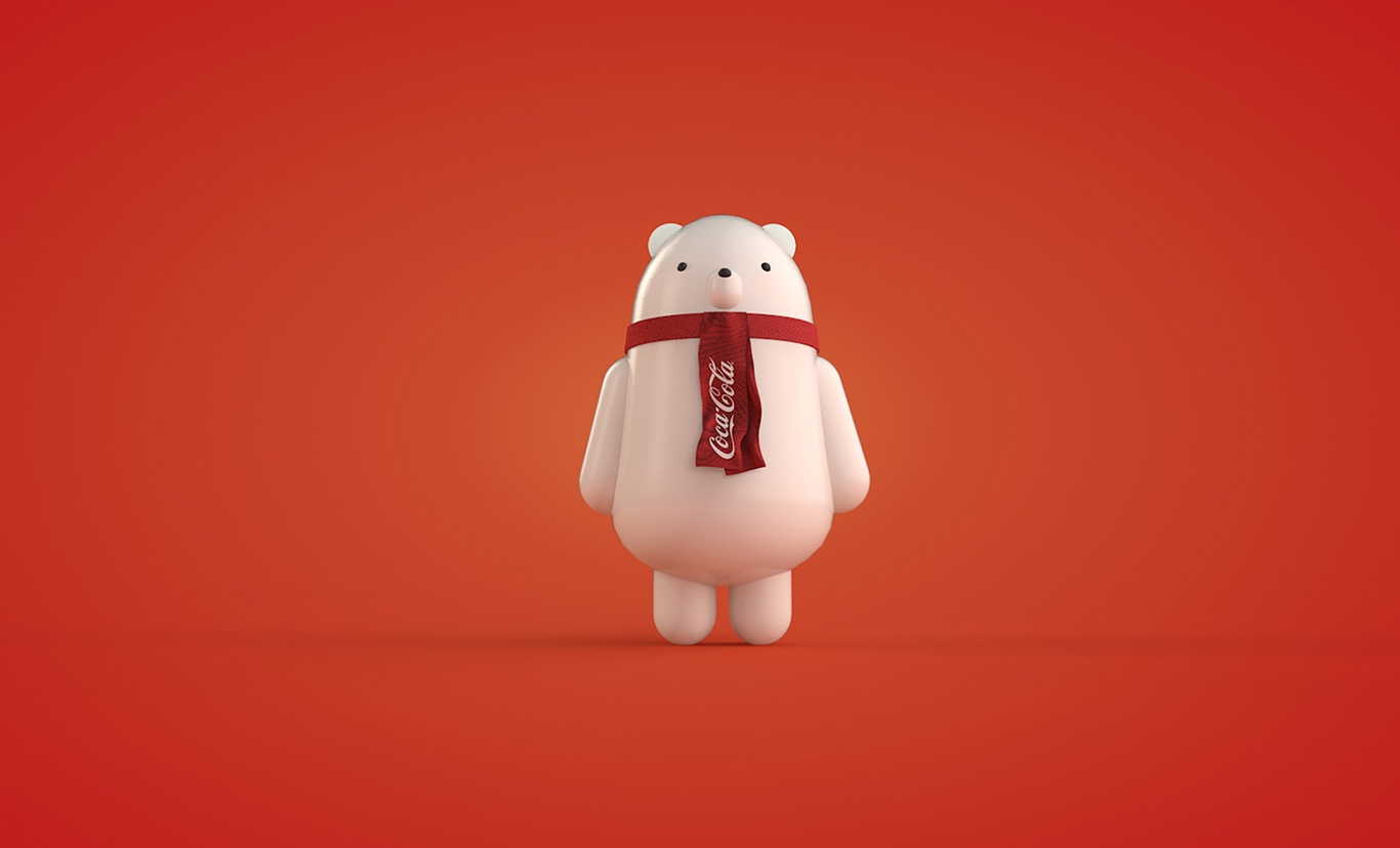
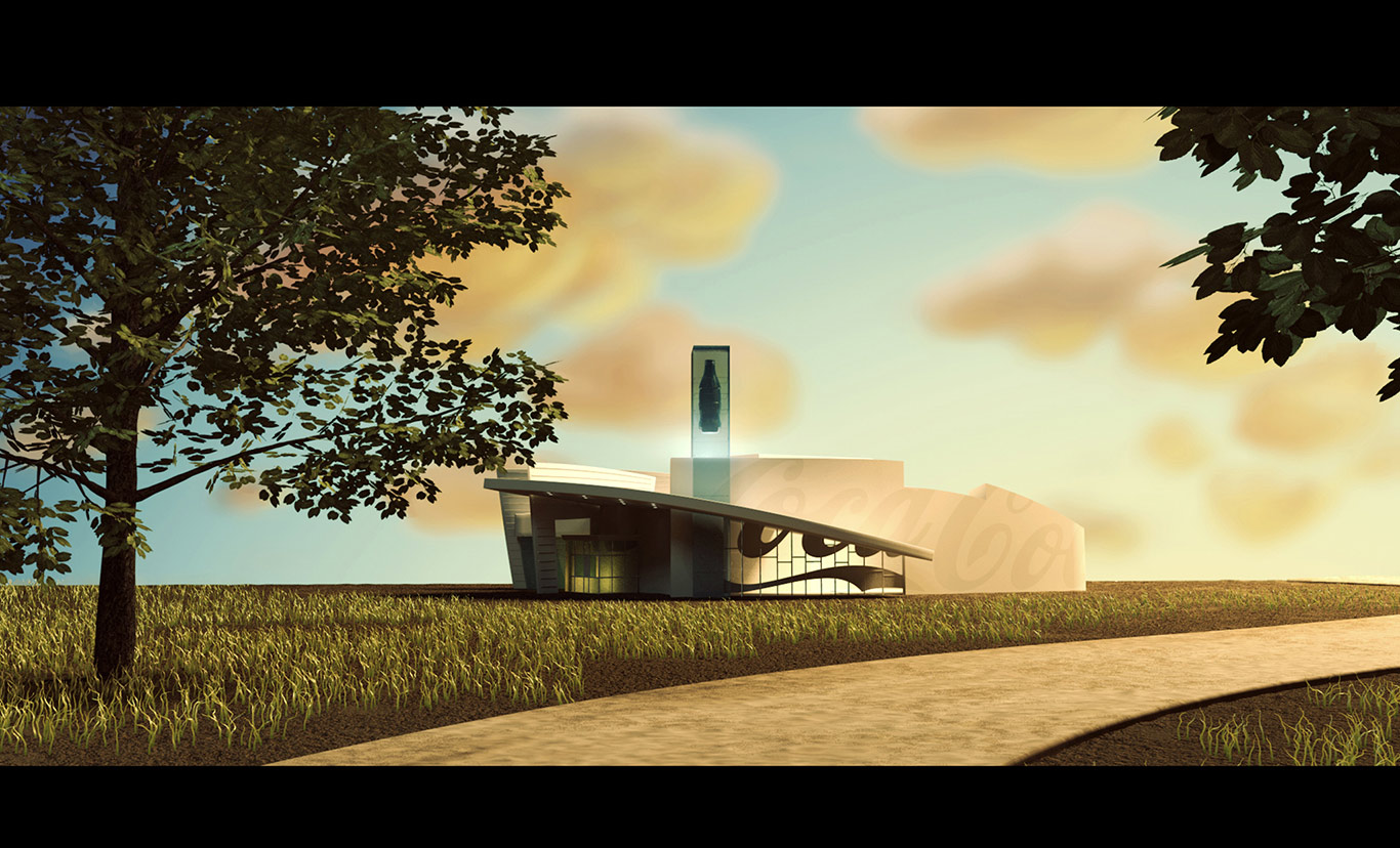
As a team, we really wanted to impress the (Large soft drink company) folks and got really excited by the opportunity to make something awesome. We started our brainstorming over the emotional connection people all over the world share with the famous soft drink. The tagline “The Story Starts With You” came to me as we continued to explore what connection is established between people and their favorite soda. The idea, and belief system is generated with each individual… that means you! Everyone shares a moment they have had with this great drink, so why not bring the family and share a new moment with your loved ones. We felt this had strong messaging as well as a fun tie-in to personifying your trip. What if you can see a glimpse of your trip by creating your family with a character creator that will then start a short movie involving your family. The characters could the represent users by matching profiles on social media, and using that visualization in advertising or merchandise. Imagine seeing your character on digital posters across town! Similarly, some of the current challenges presented to us was “How do we get people to come back?” Our answer was to use wearable technology. We figured wristbands could keep trackers to deliver traffic data into which exhibits where most popular. We thought the bands could also be currency to purchase soft drink products through any vending machine that showcases this particular brand. The user can also change colors, animation styles, and receive badges as to how many times you return.
2011
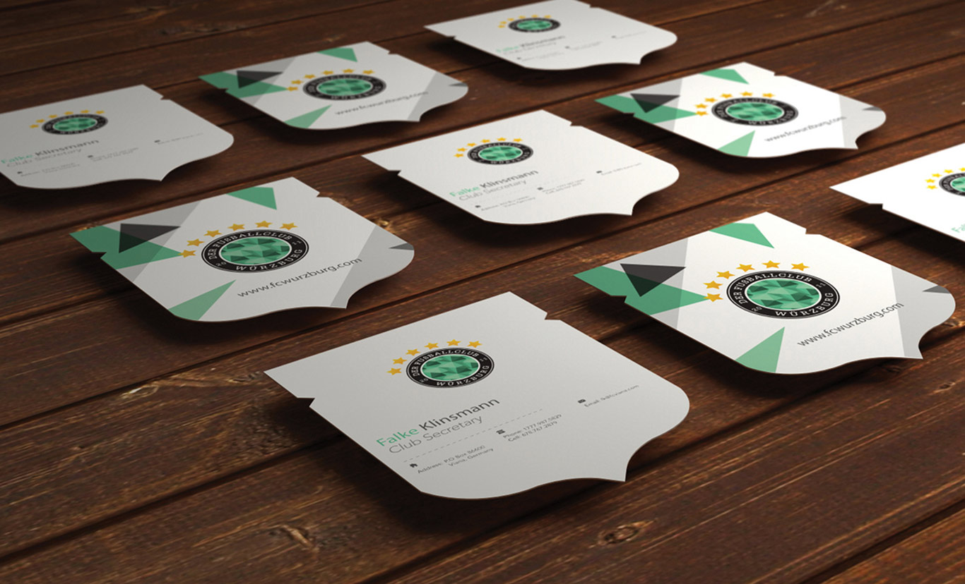
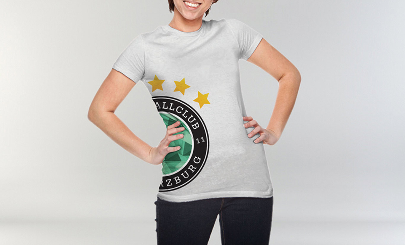
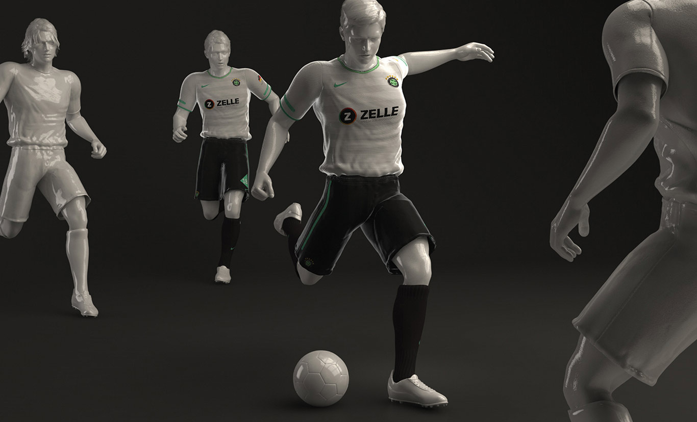
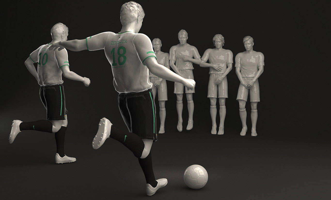
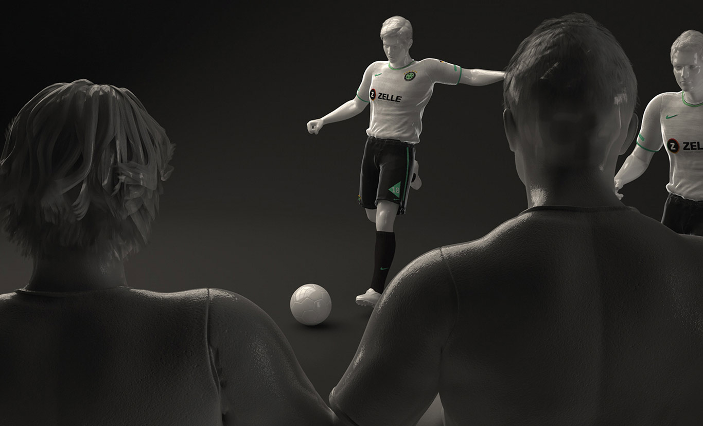
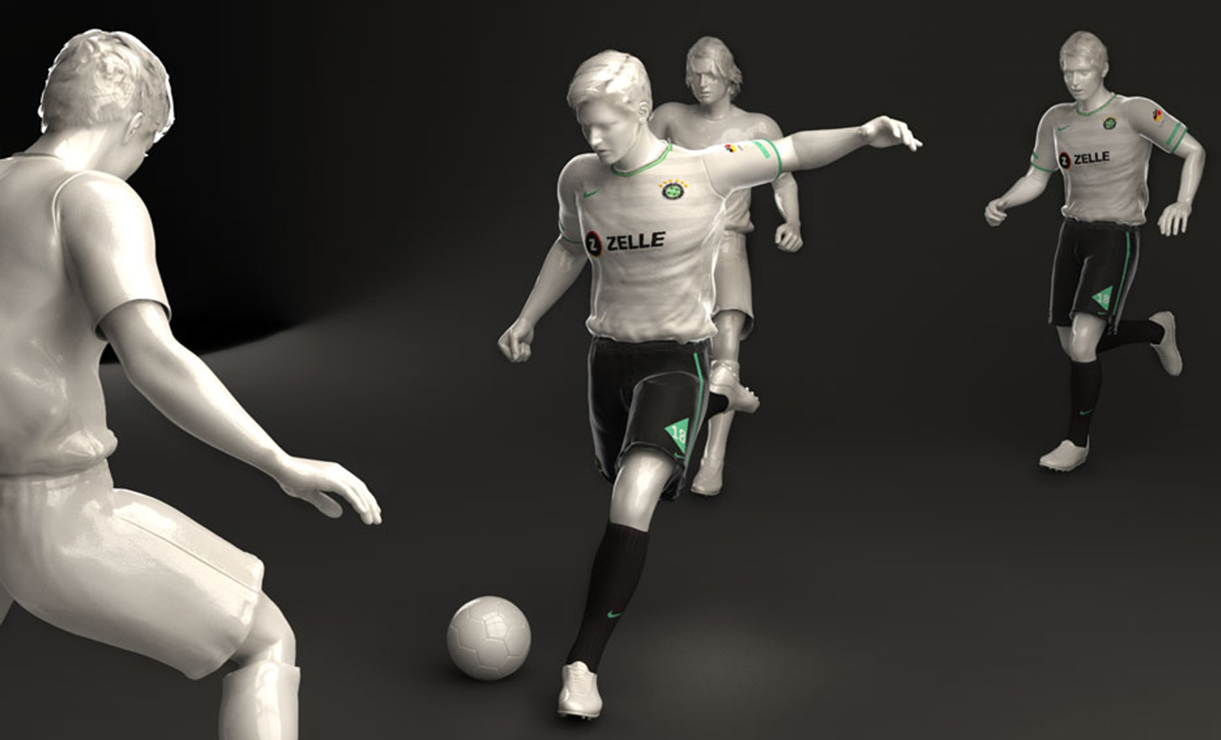
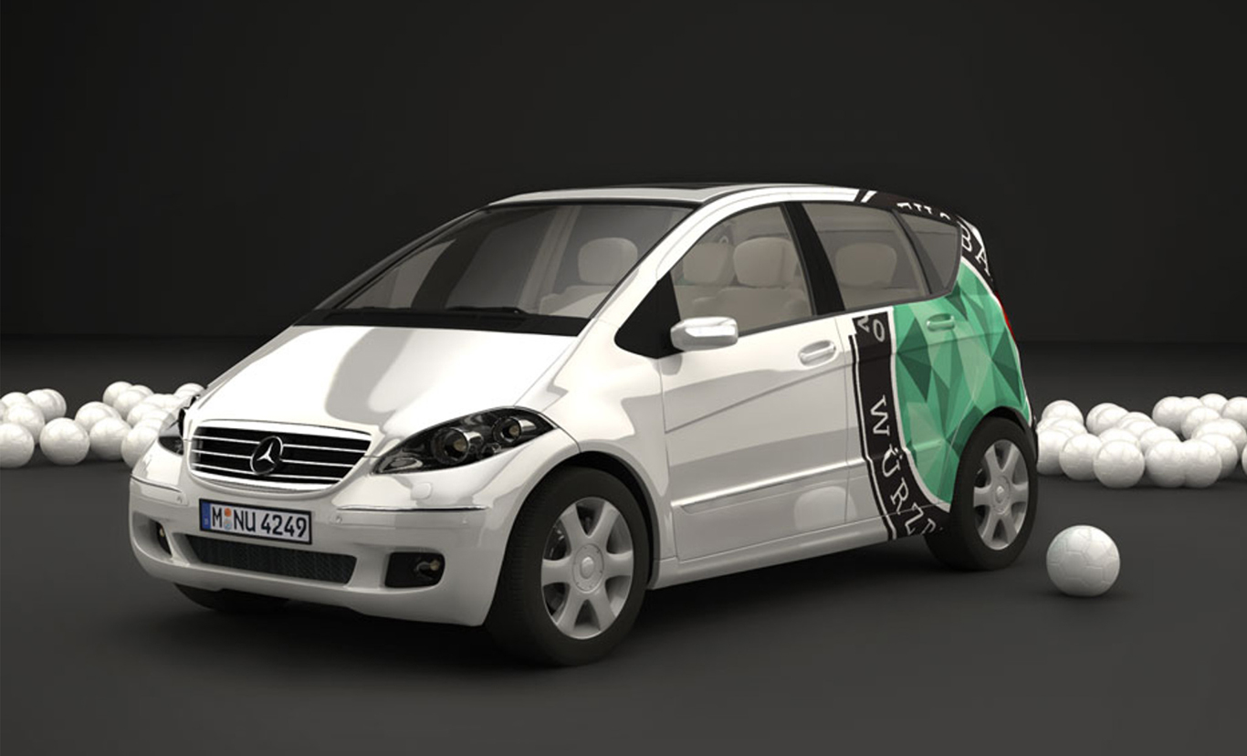
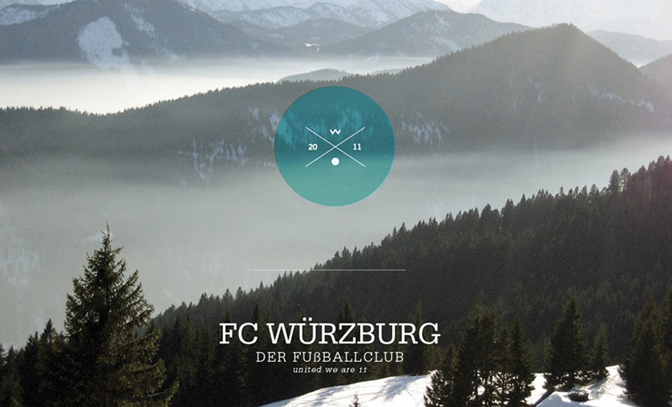
F.C.WÜRZBURGbranding - 3d - digital - kit design
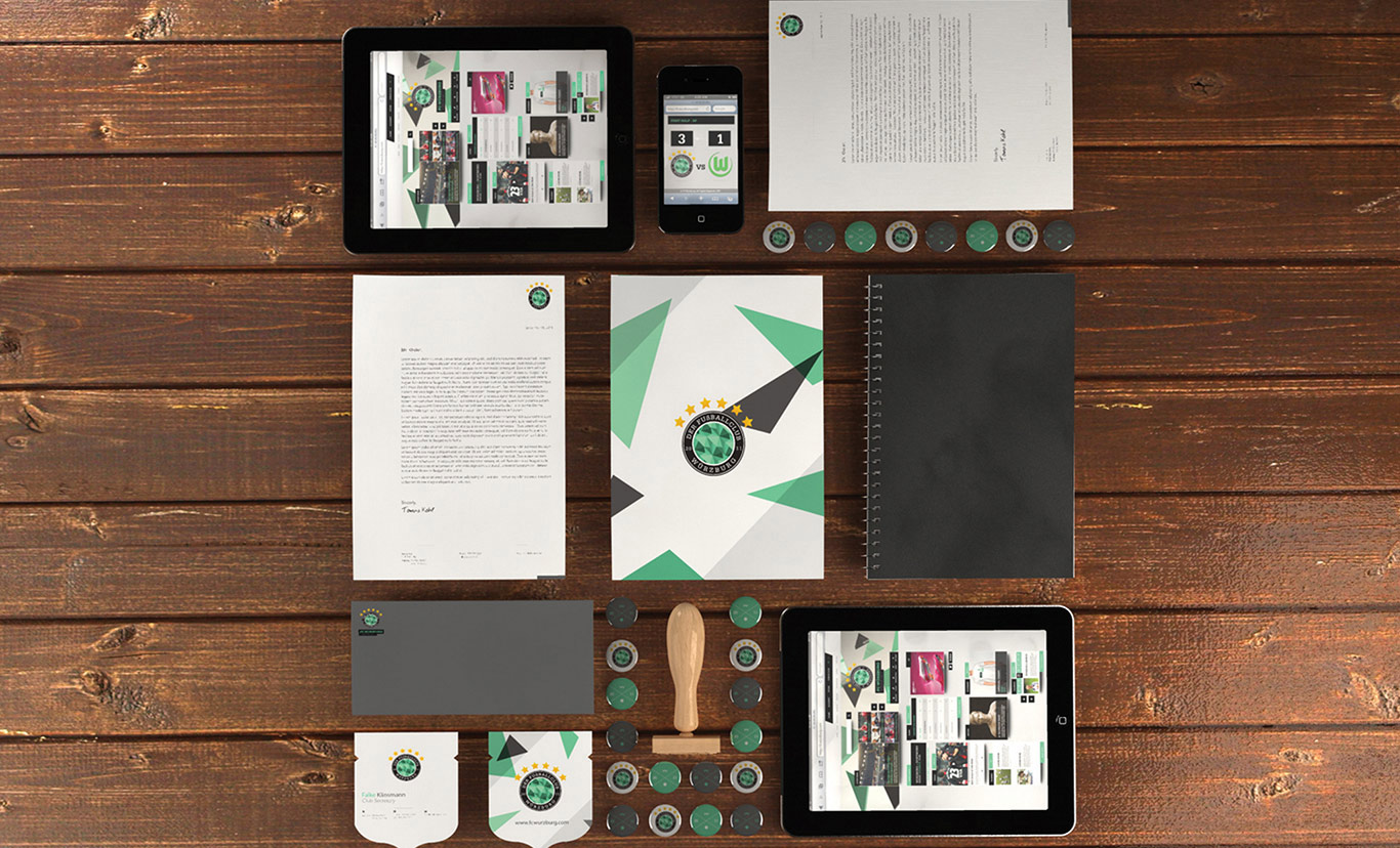
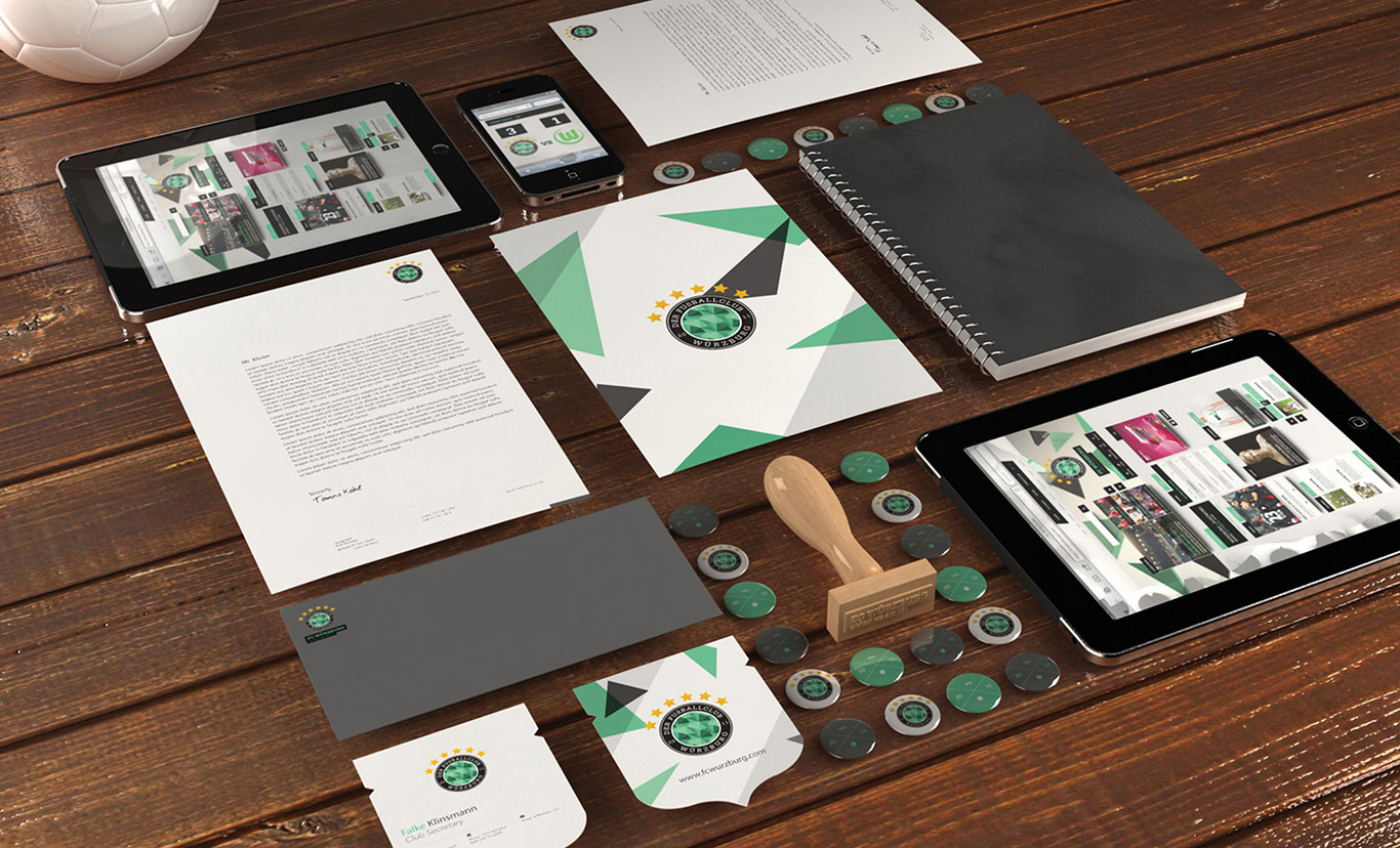
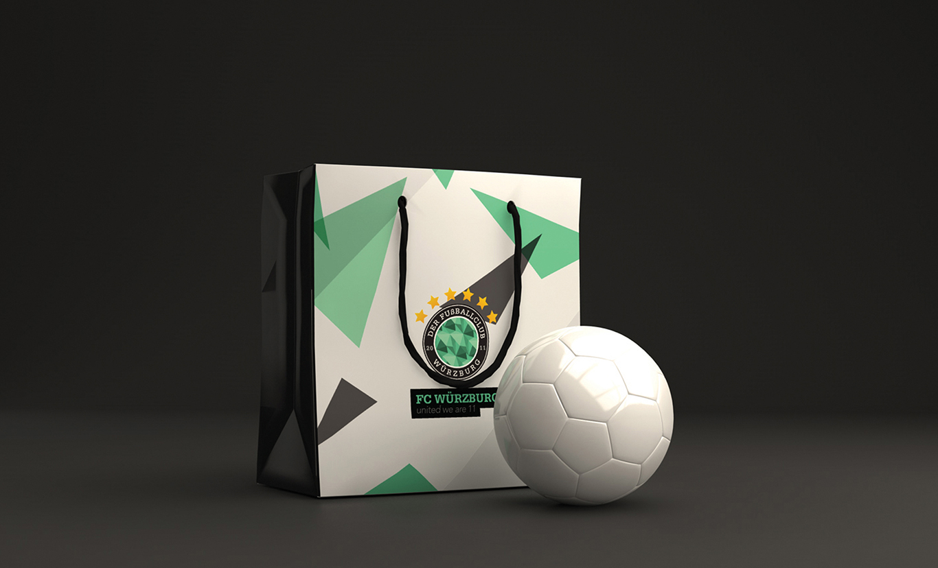
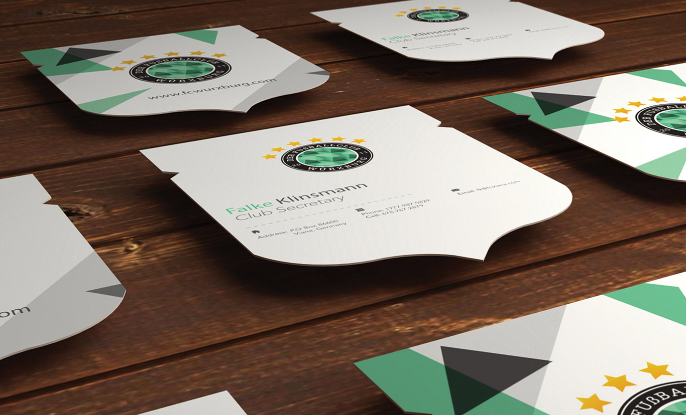
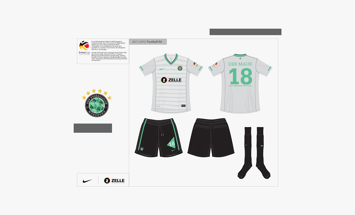
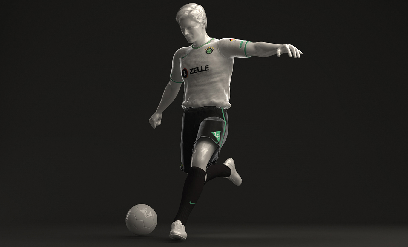
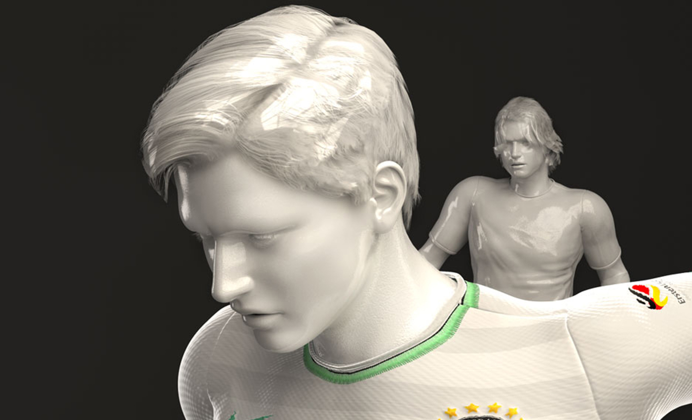
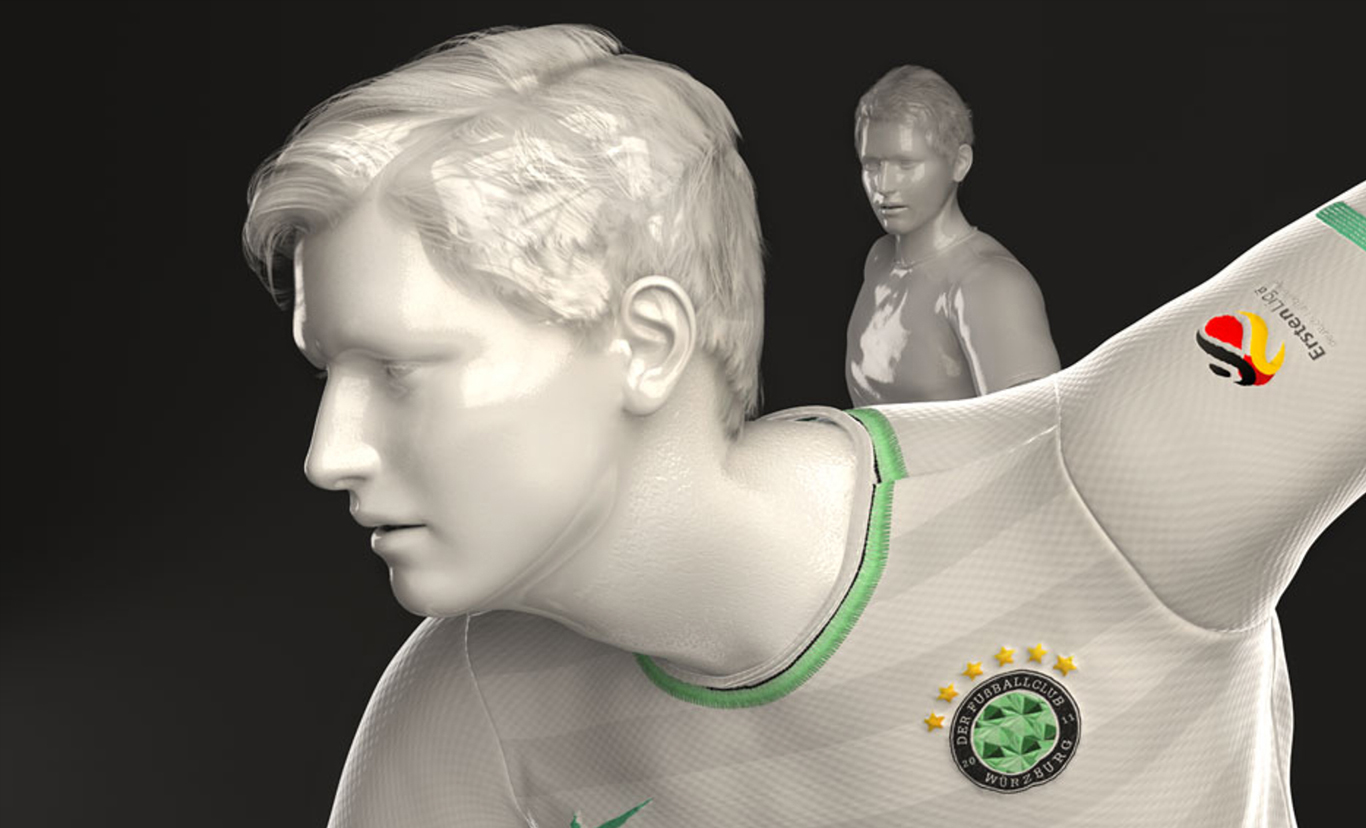
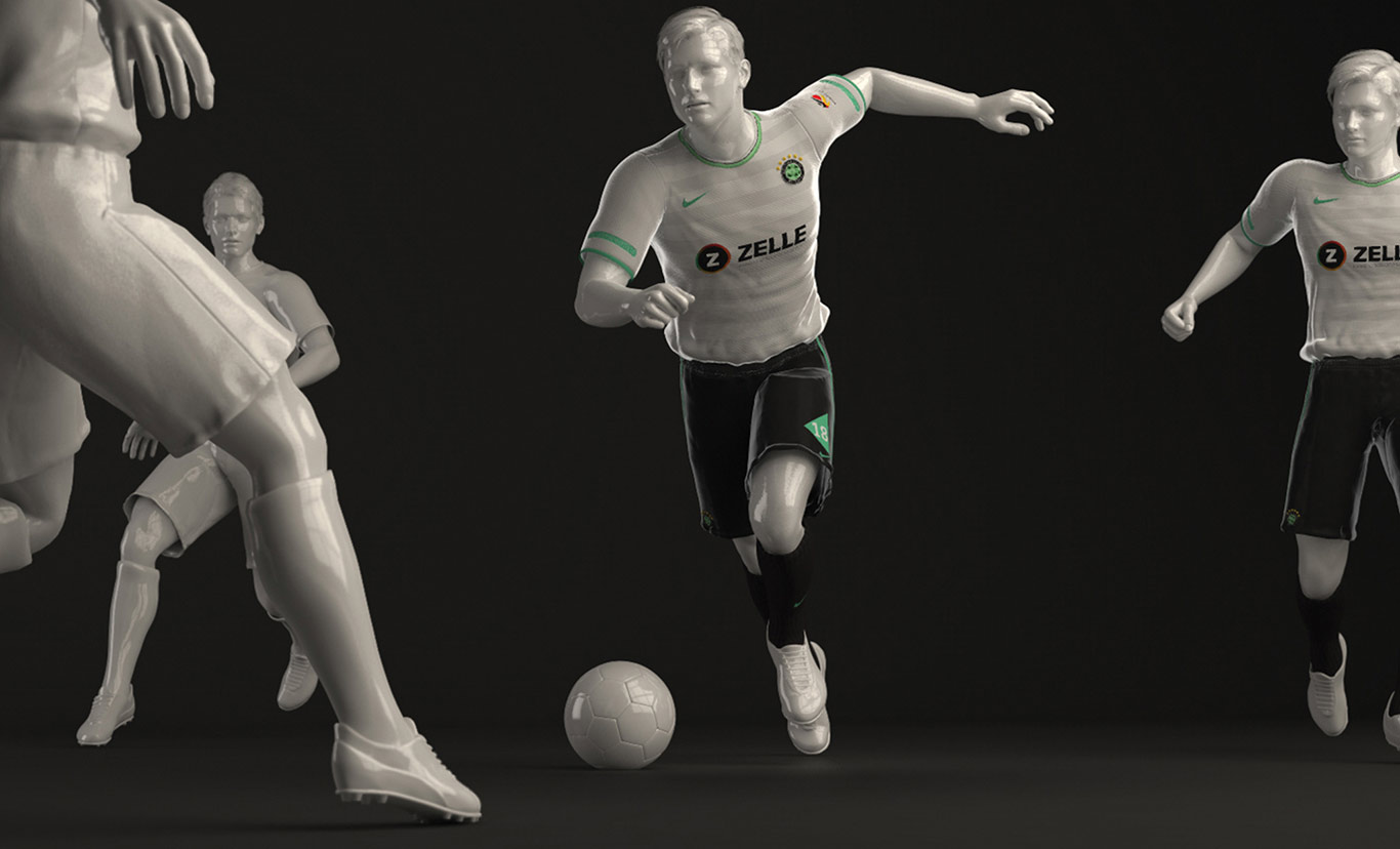
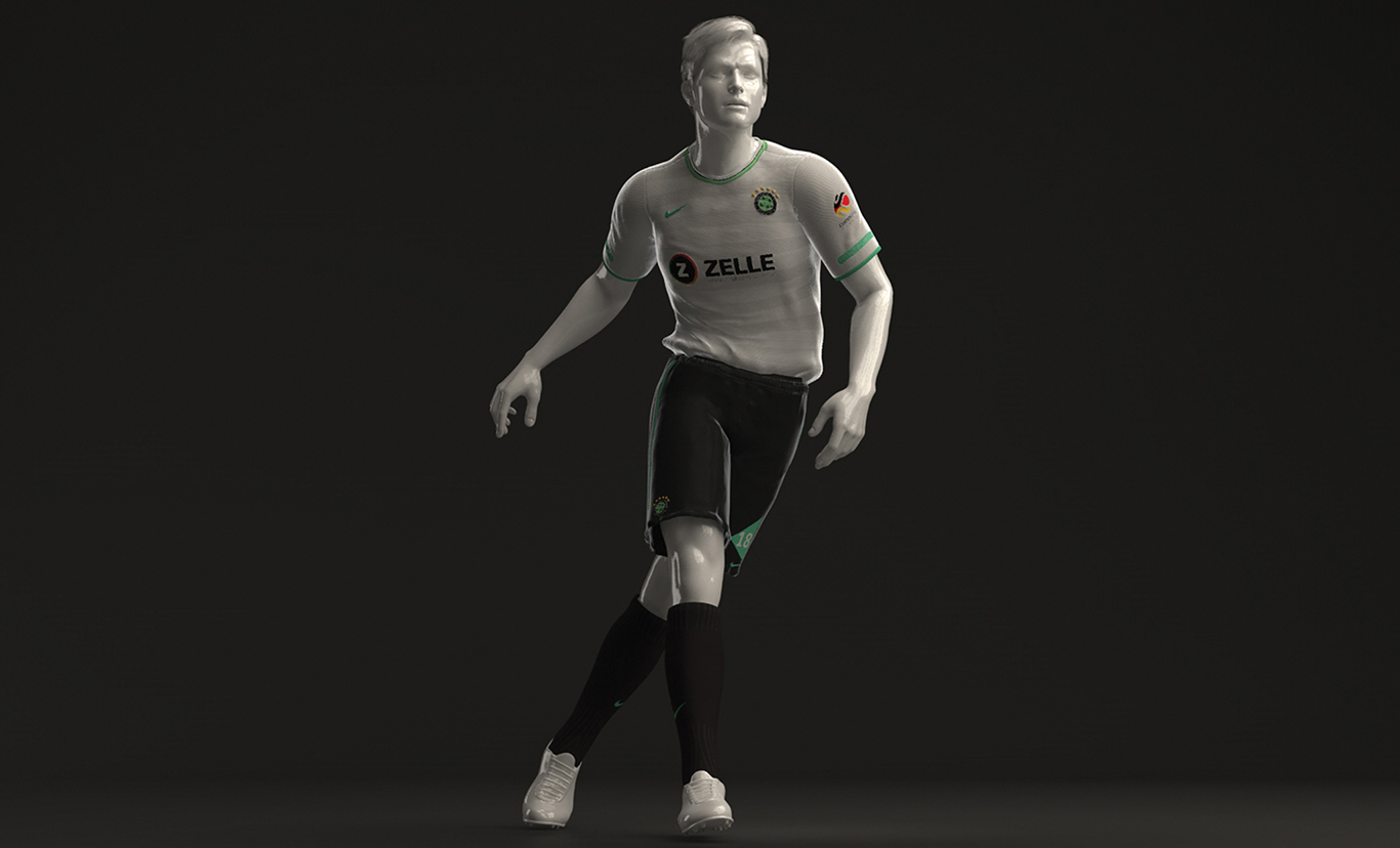
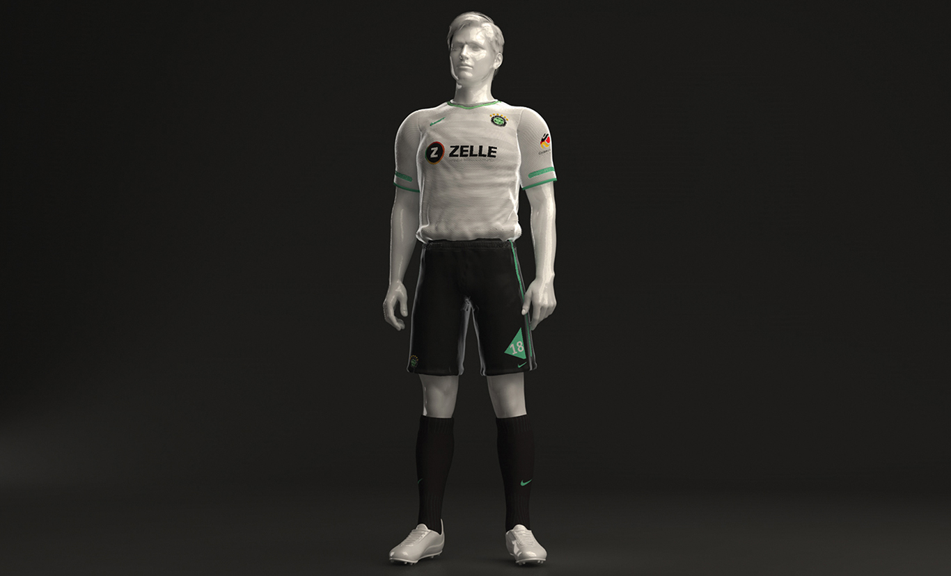
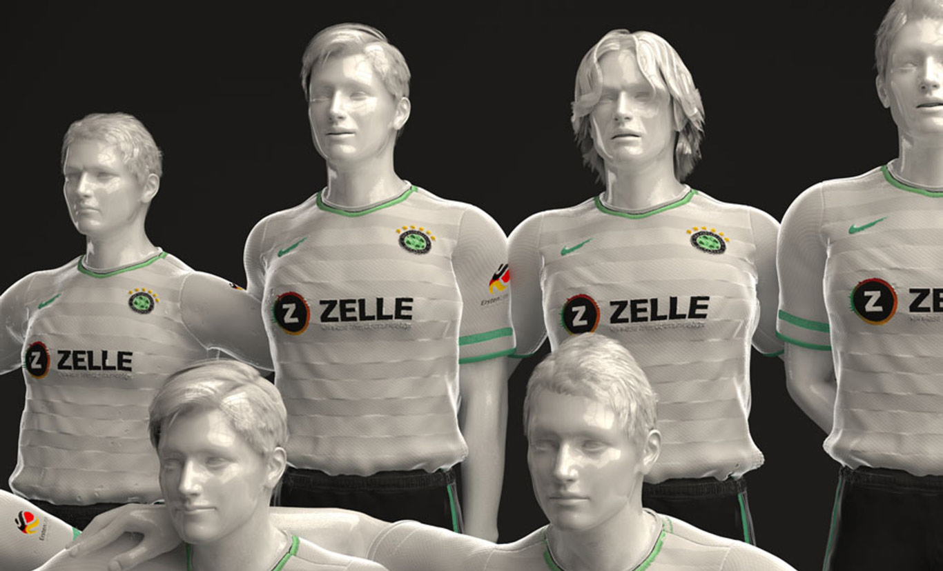
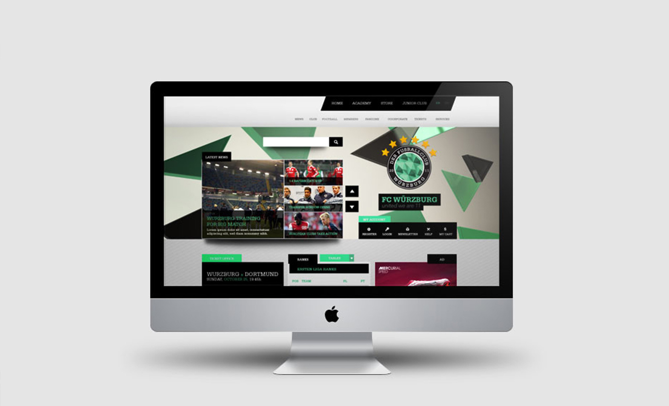
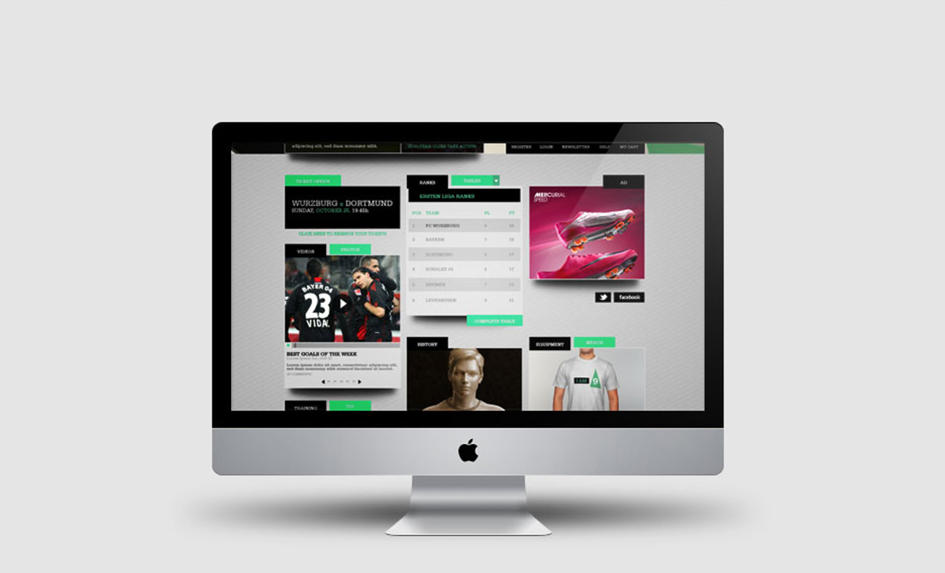
FC Wurzburg is a fictitious football team based in Germany. The concept was to try to make an identity based off a culture, and design style that is completely foreign to me. The logo was designed to resemble the Bavarian Mountains with a contemporary abstract assembly of triangles, that form the mountain range while integrating a cool color pallet of greens, and blues. The Wurzburg tagline is "United we are 11", this grants a form of unity and harmony amongst the players for Wurzburg, and fans. This way, the viewer can place themselves within the players "boots", and become apart of the team. "We are all Wurzburg". The complete style of Wurzburg was outside my comfort zone, this was one of the challenges of unifying the project. The re-design of the Bundesliga logo was also taken into consideration by using the colors of the German flag, and making a abstract shape of a football. As a result of the new logo design, the newly created German league is called the Ersten Liga. Nike and Zelle(a logo also designed for the identity project) are the sponsors and makers for the Wurzburg kits.
2014
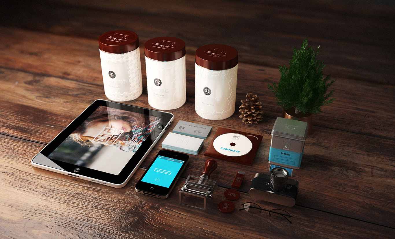
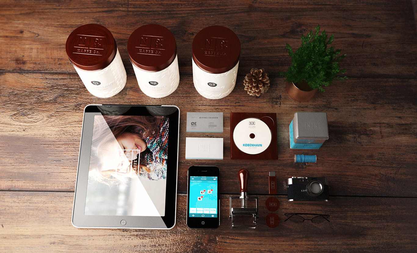
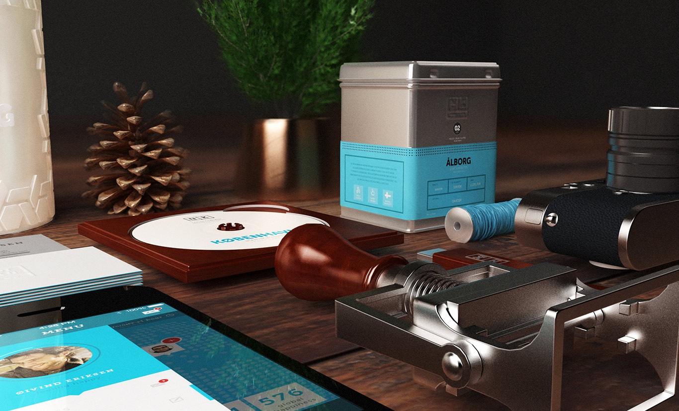
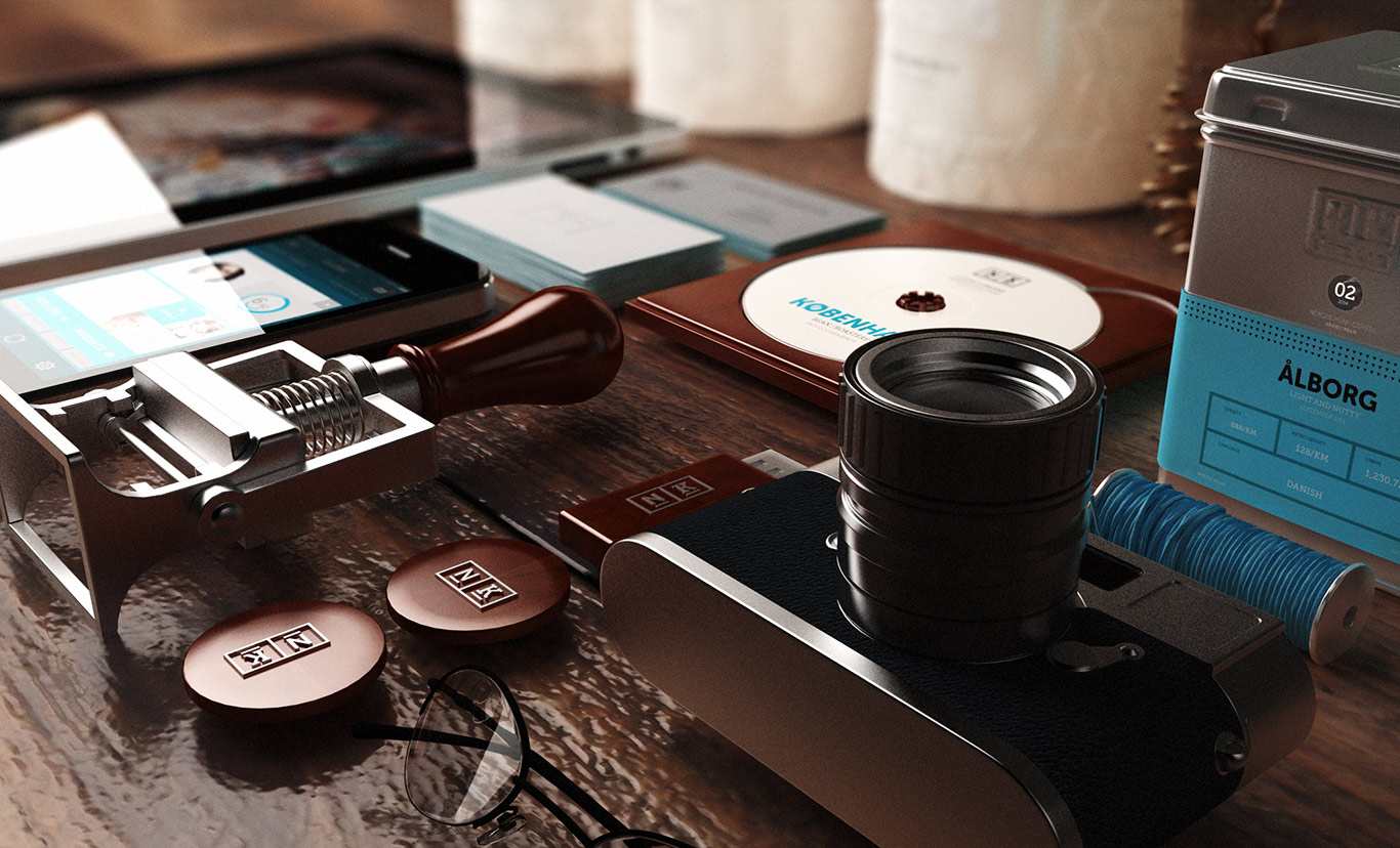
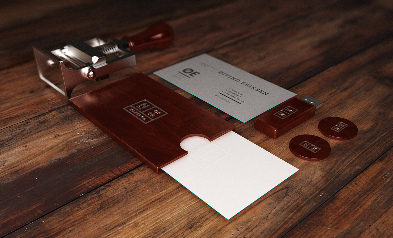
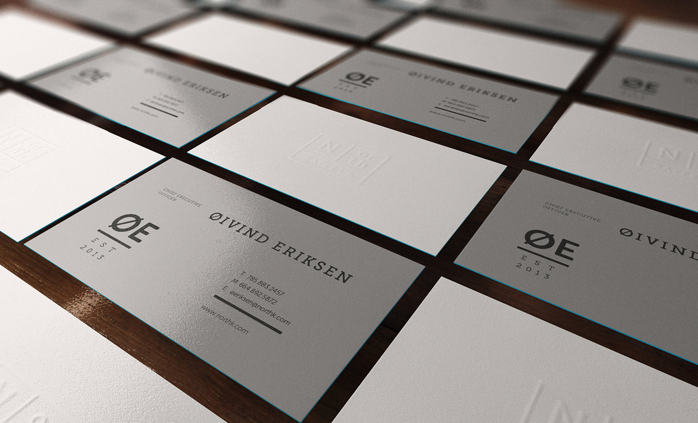
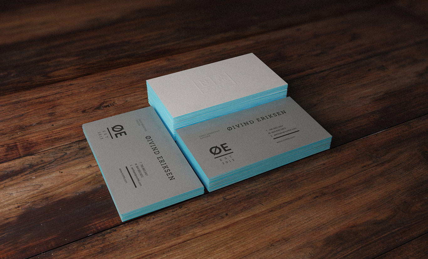
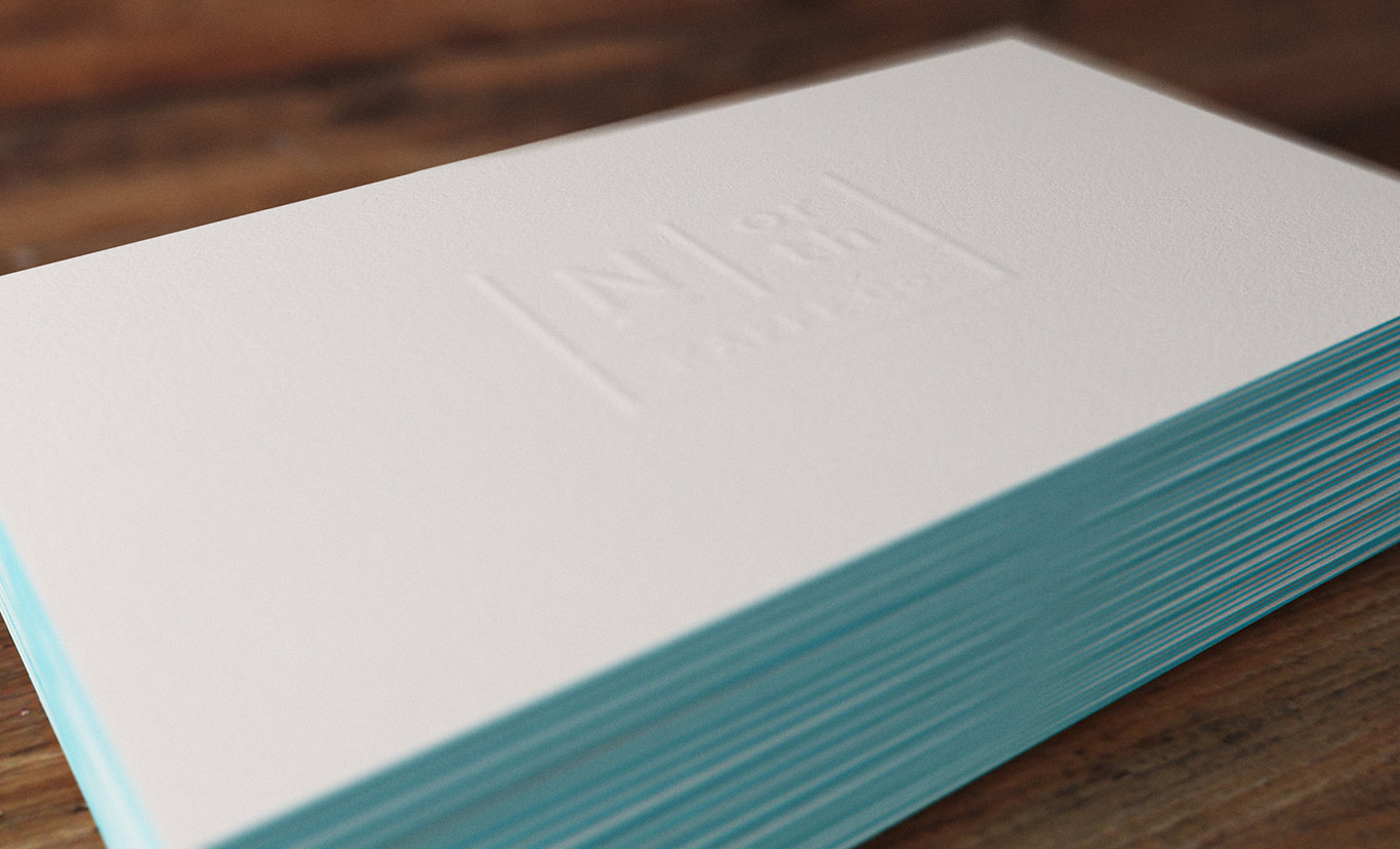
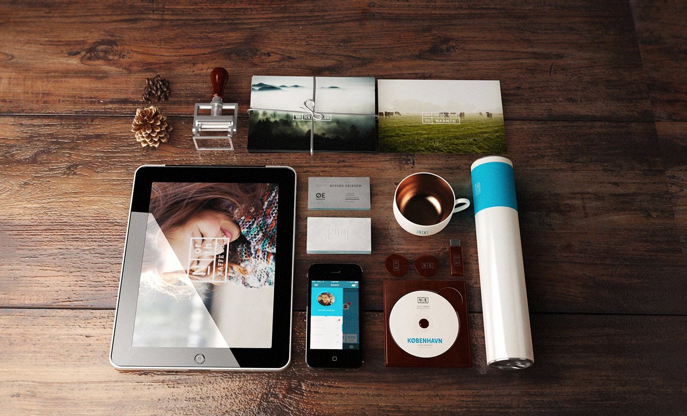
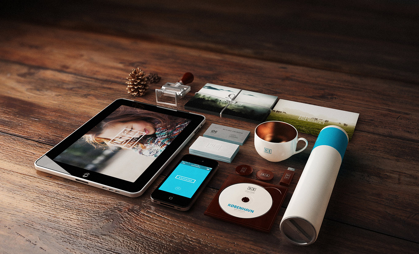
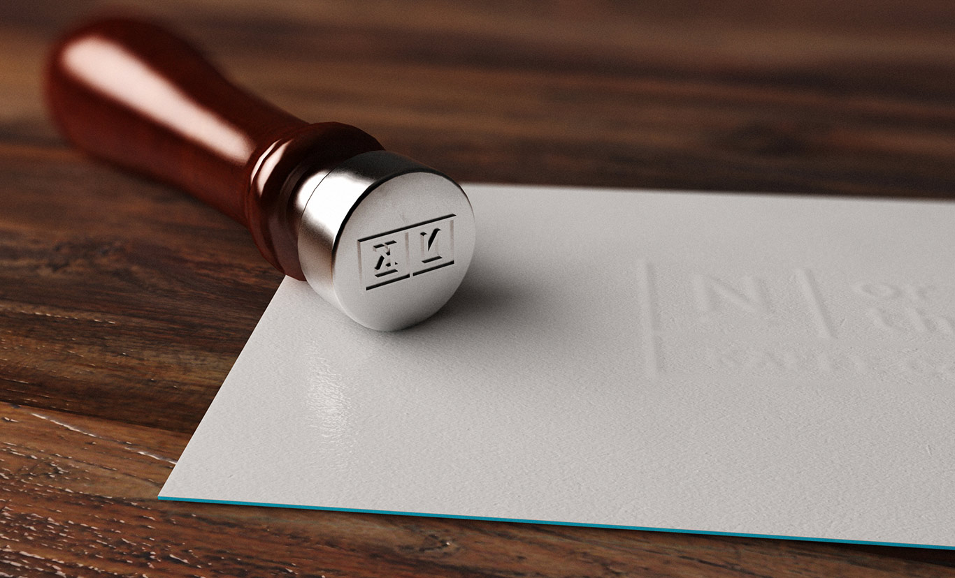
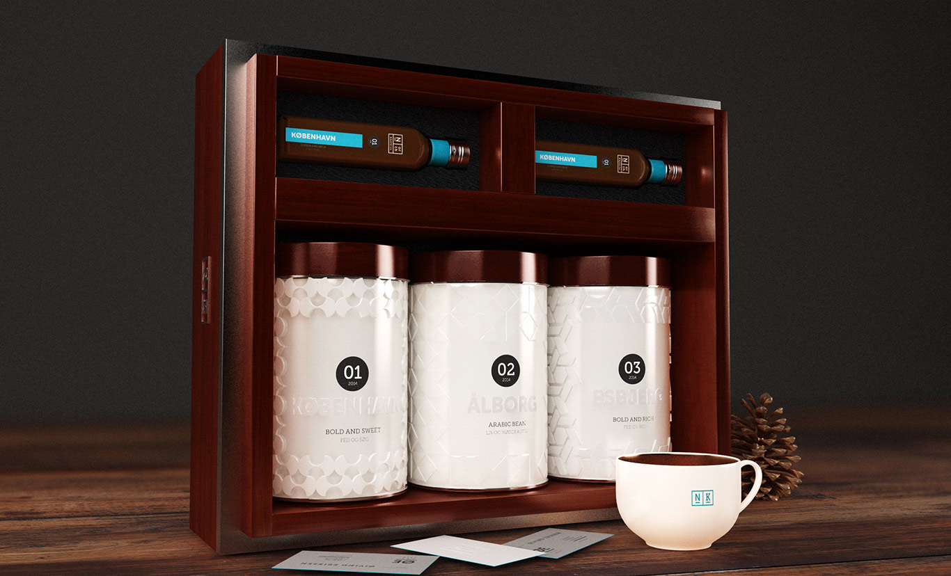
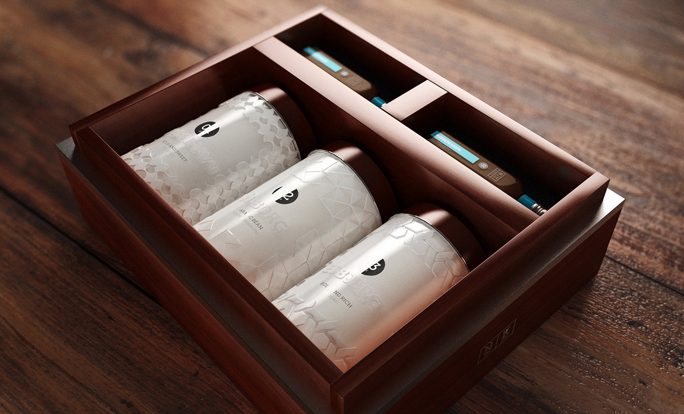
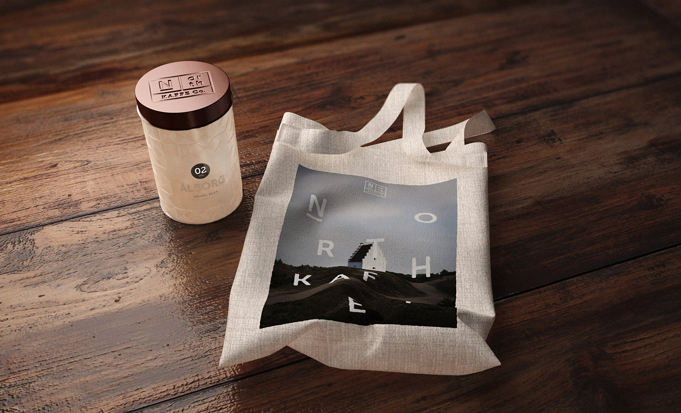
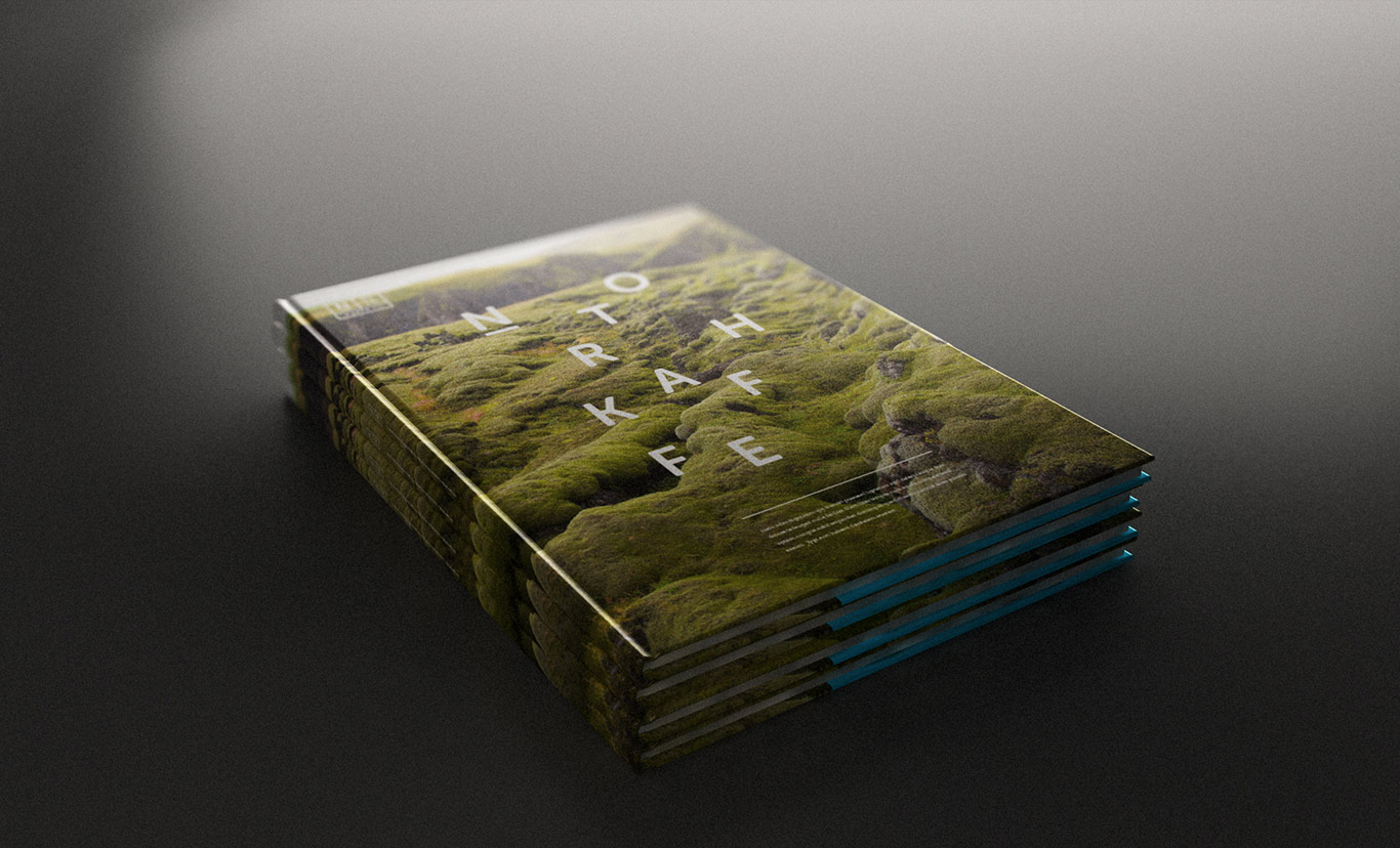
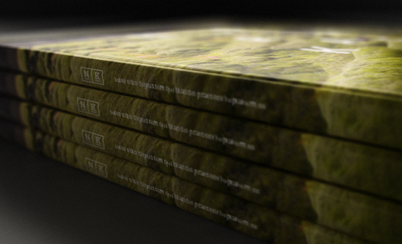
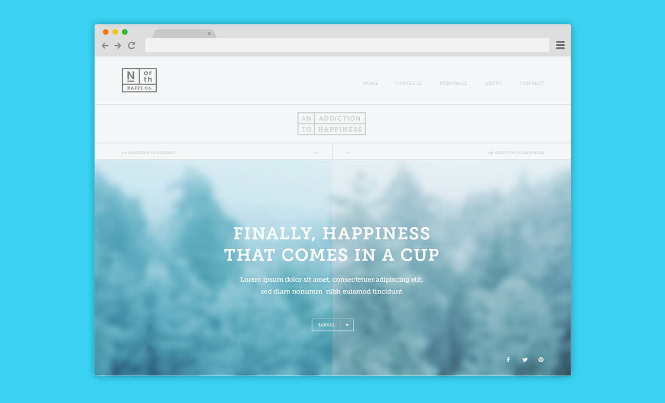
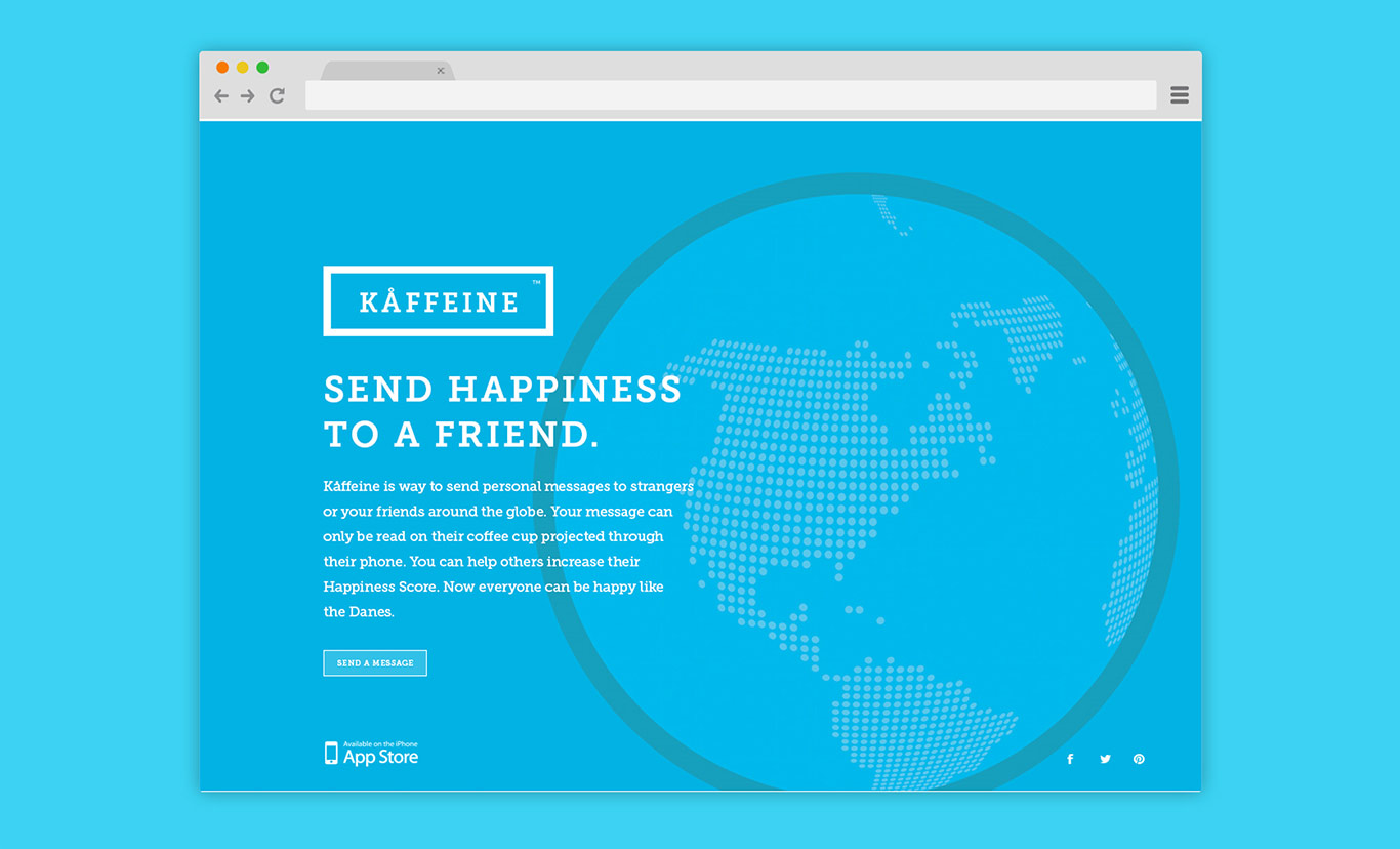
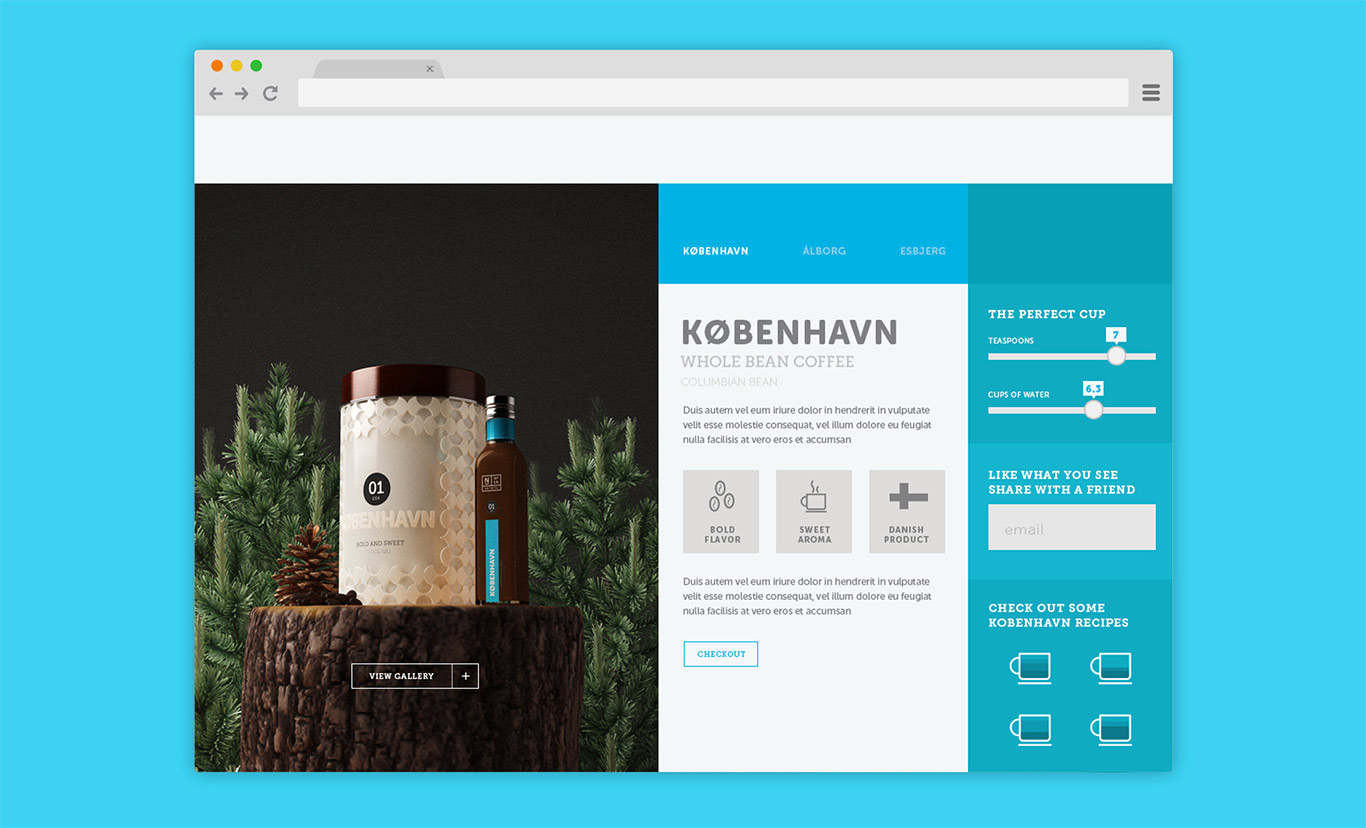
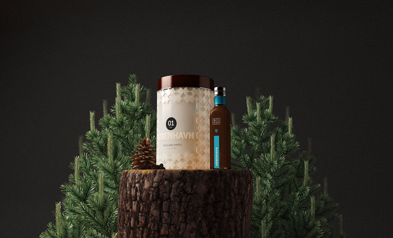
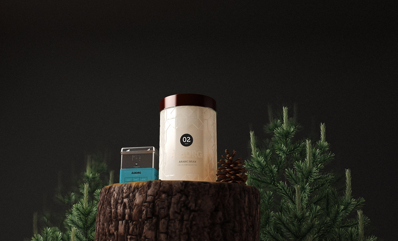
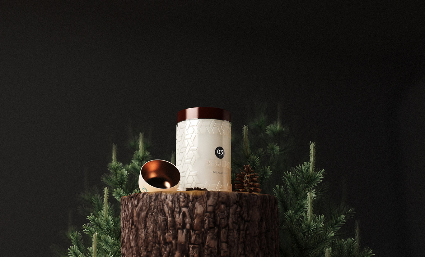
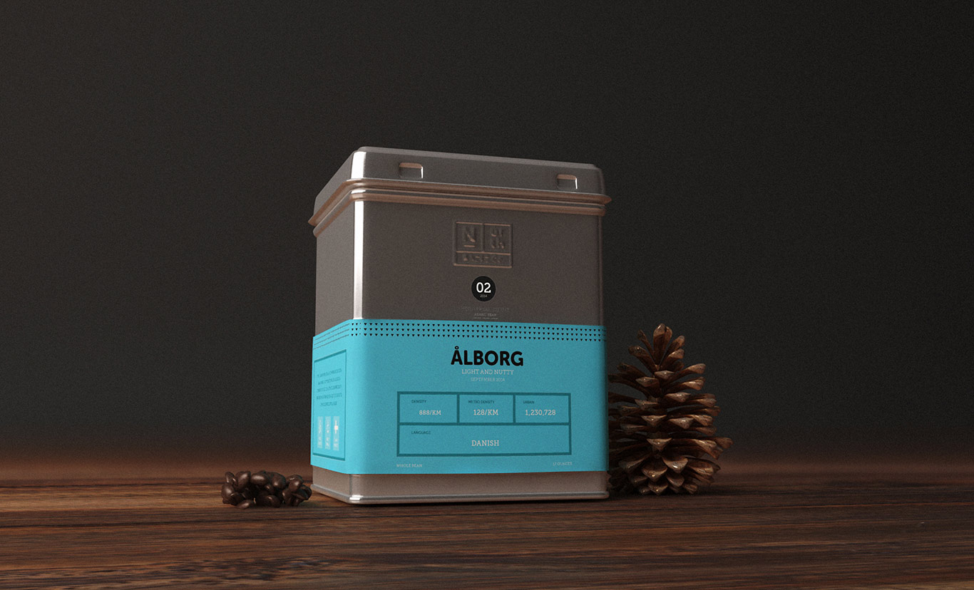
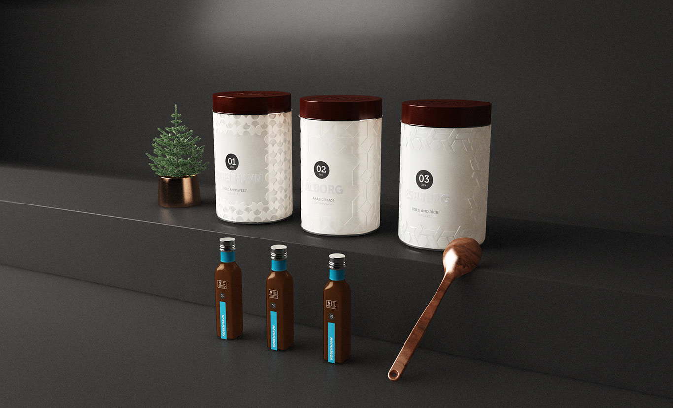
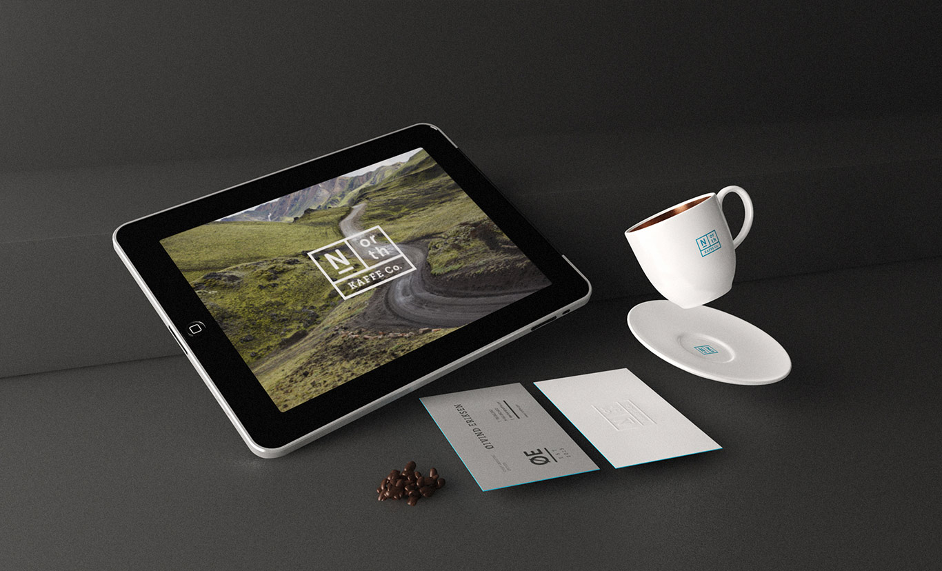
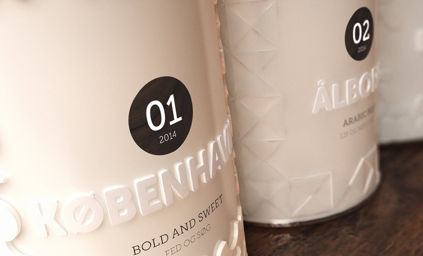
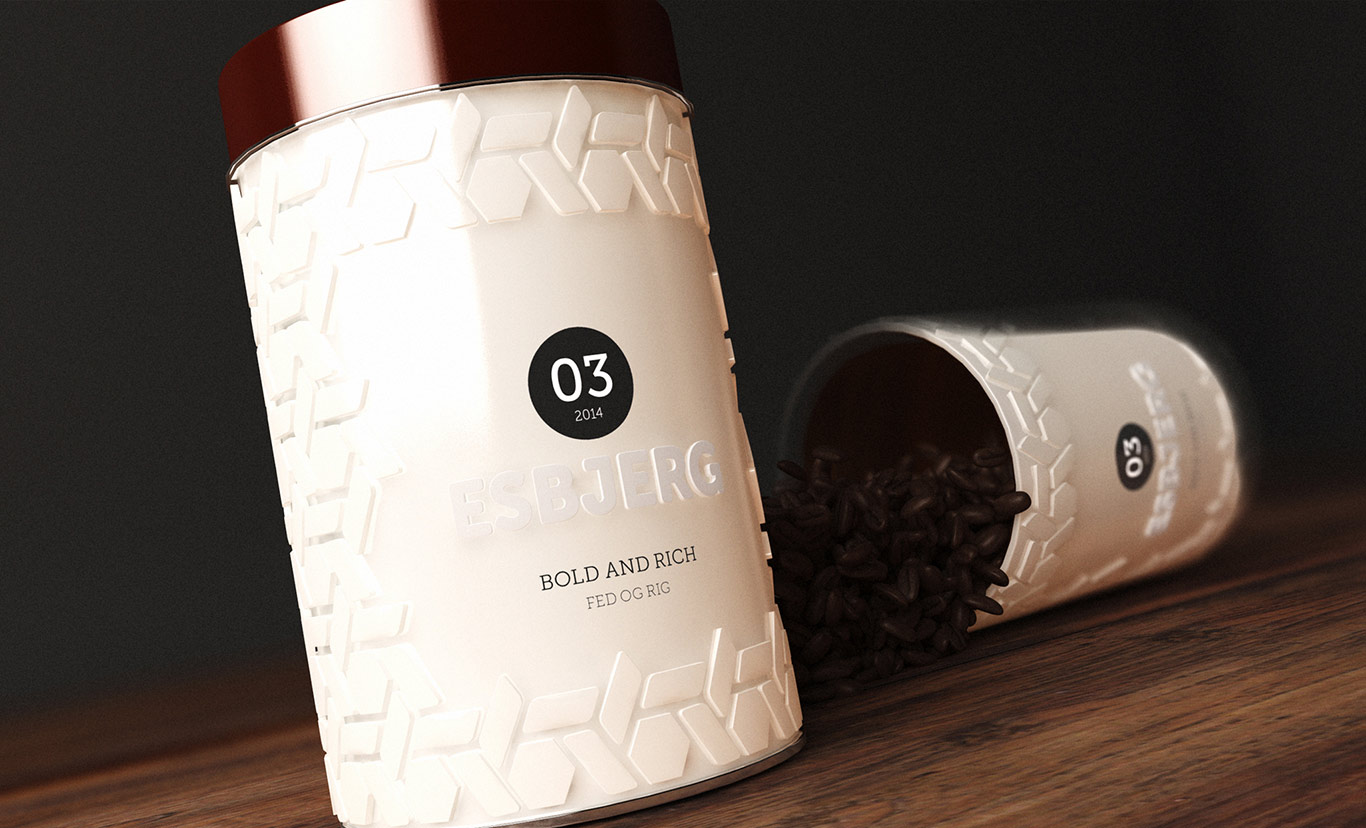
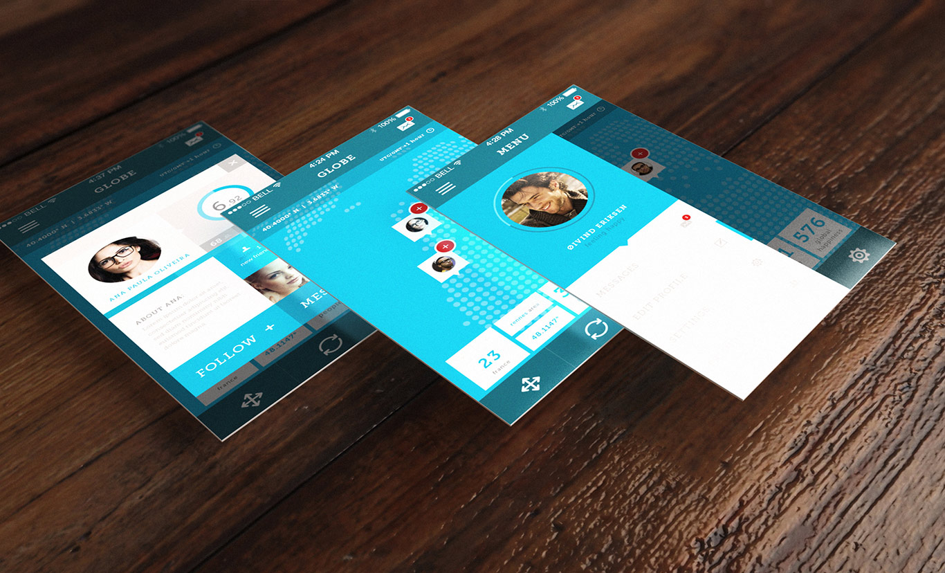
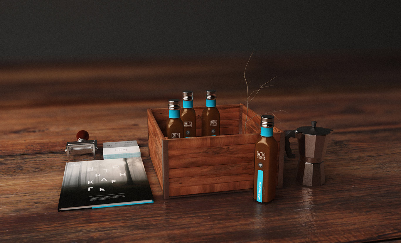
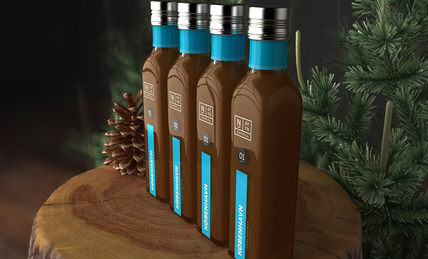
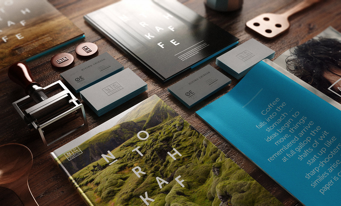
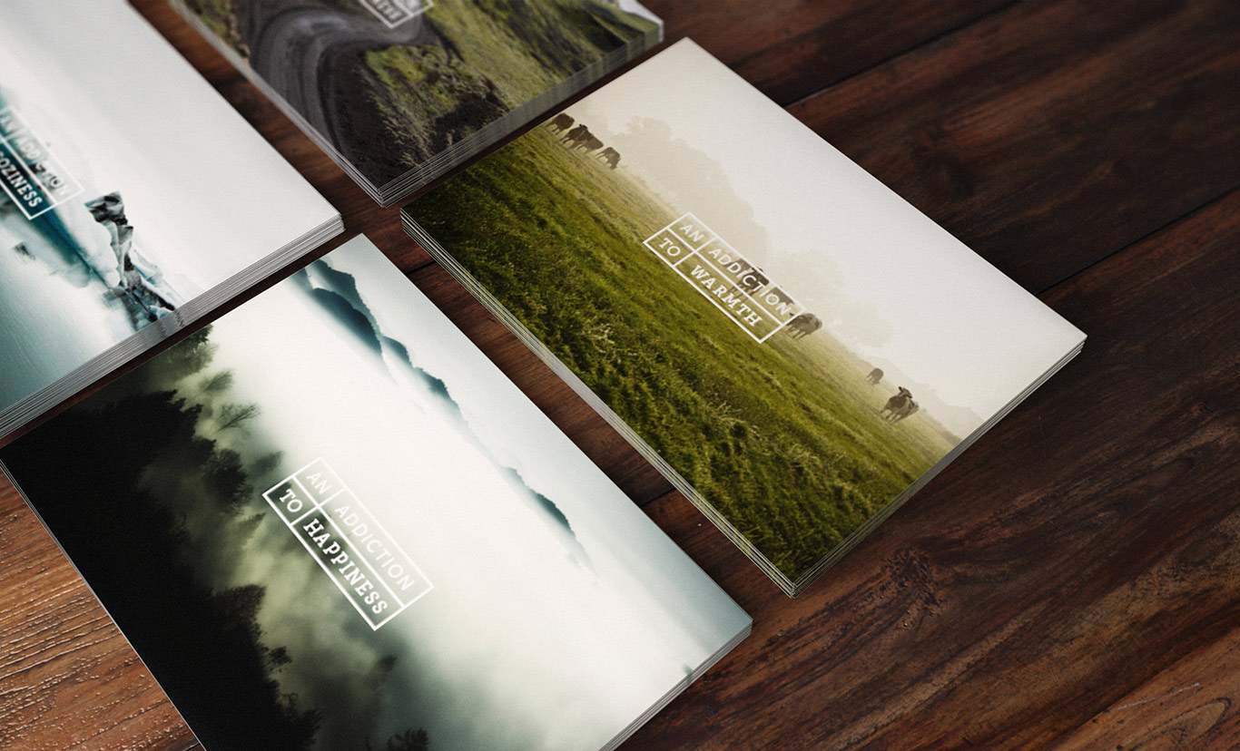
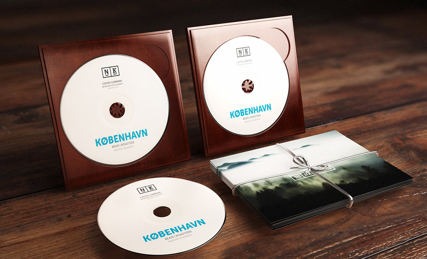
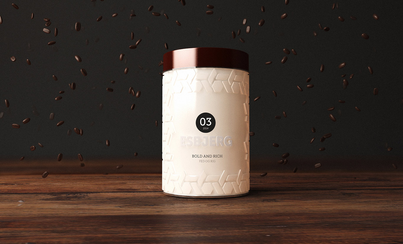
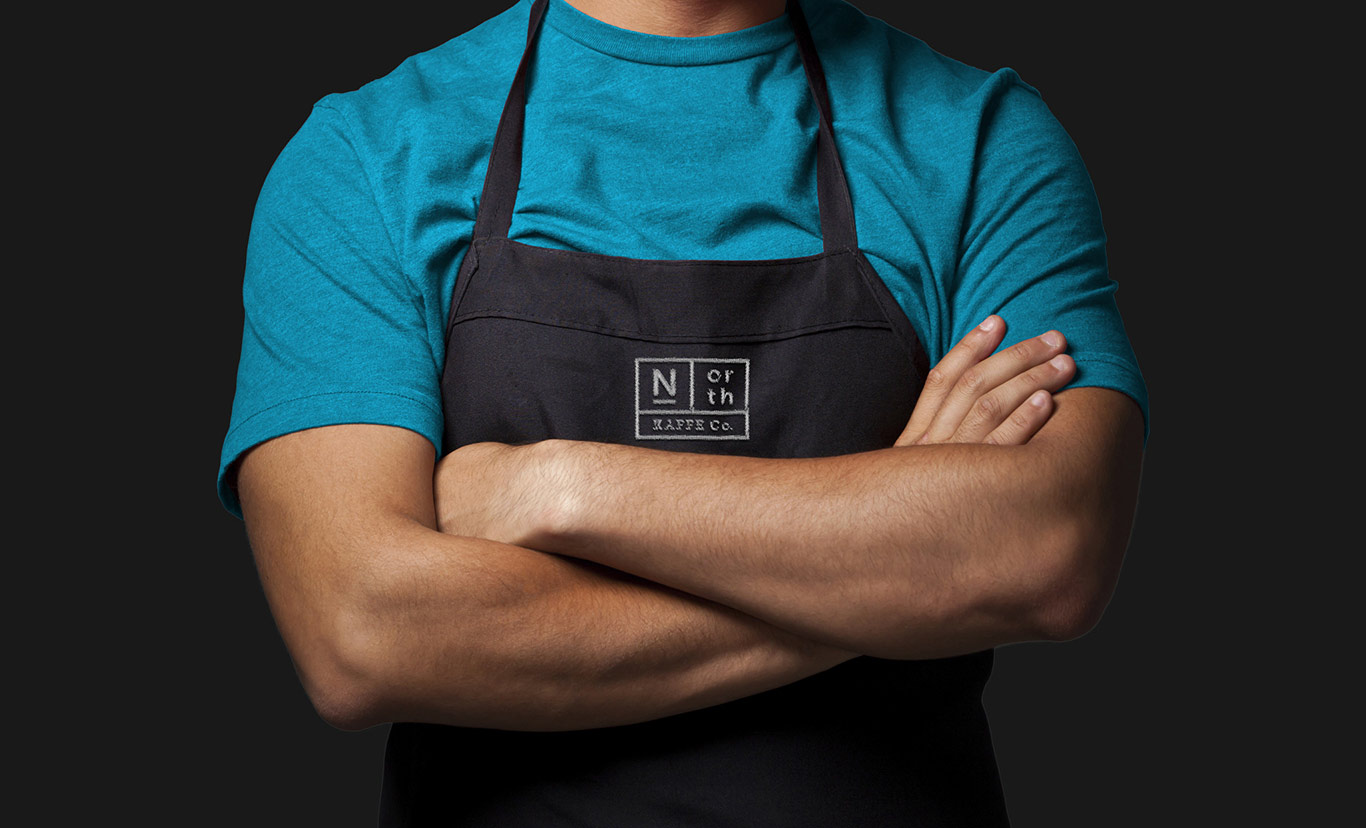
NORTH KAFFEbranding - packaging - 3d - digital - app - art direction
North is a fake brand that was put together under a simple (yet rather difficult) concept— positive and negative messaging. I wanted to tie a brand to an emotion, or crave. Similar to same feeling you get when curling up to a good TV show and having the sudden urge to eat popcorn. Or when you watch a movie where wind slightly nips the snow off the tip of an icy mountain (hint: like in “The Lord Of The Rings”), you suddenly feel cold inside. With some research I found that Denmark is one of the happiest places on Earth. This bit of information was a great place for me to start. Everyone wants to be happy, and everybody wants to find a way to obtain it. An Addiction to Happiness was the tagline that came to mind when exploring these options. It uses the positive and negative initial concept, but brings everything together with a single phrase. Incorporating different variations to the tagline helped make it more human. For example, I used words like coziness, and warmth for the tagline. The variation of using these words makes the brand relatable to everyone. With the development of the visuals, I tried to keep everything “Danish”. That includes (at least to me) wood textures, soft whites, light blues, maybe some reflective silvers to accentuate the elegance of the people. I wanted to make this brand feel cold, but inviting. I wanted the animations on the website to feel smooth and comforting. Most importantly the visuals show almost no reference to coffee. The photography and design tries to bring awareness to an emotion, rather than a product. The North Kaffe brand is a feeling you get before drinking coffee, rather than an actual cup of coffee.

2012
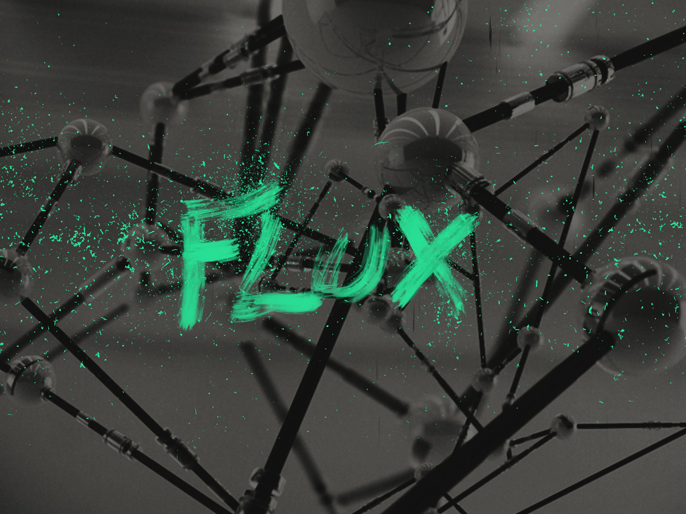
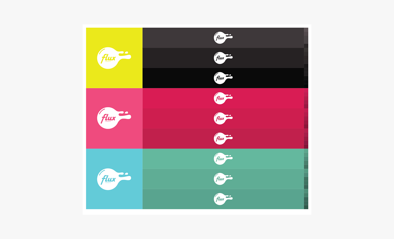
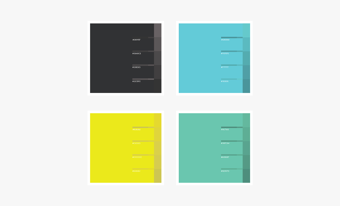
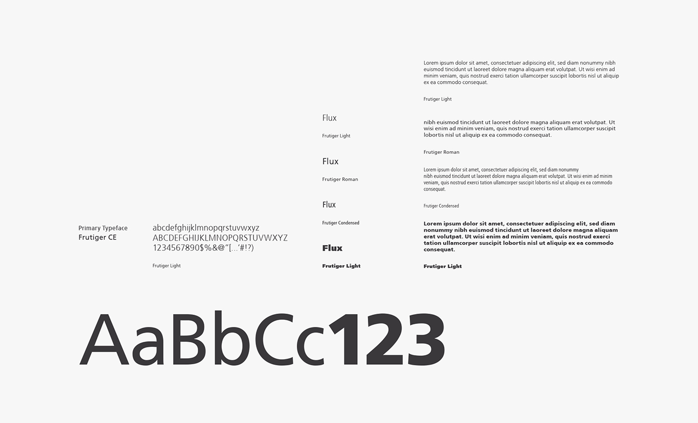
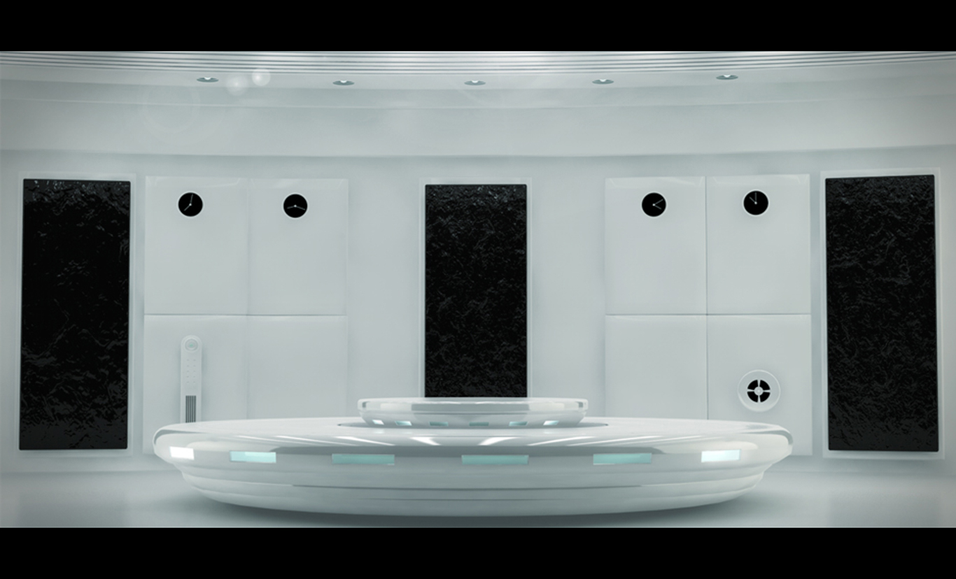
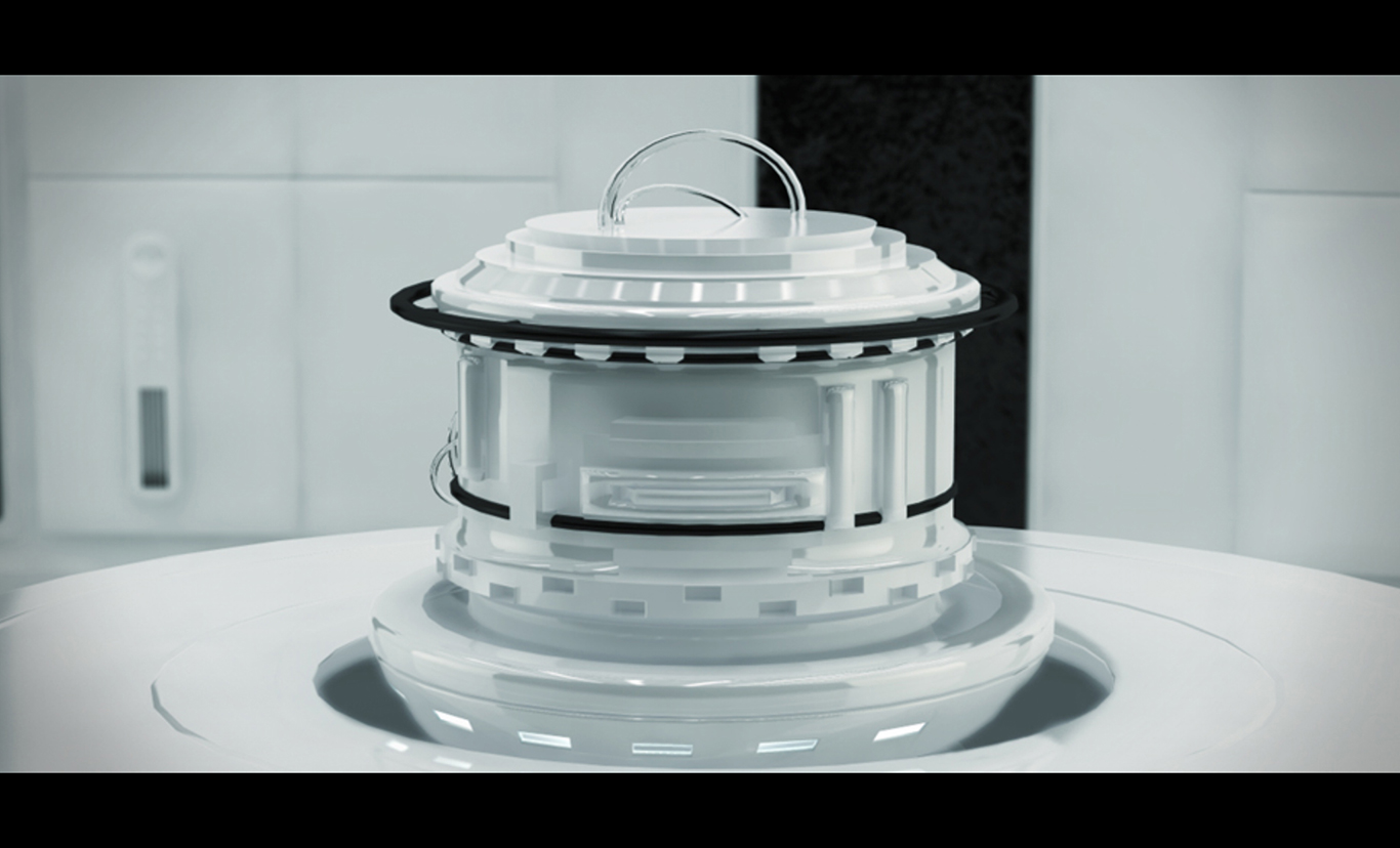
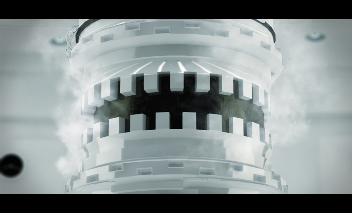
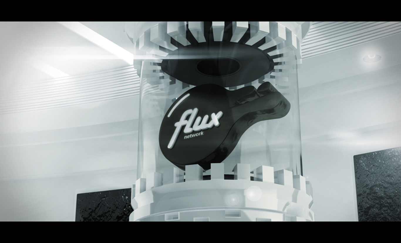
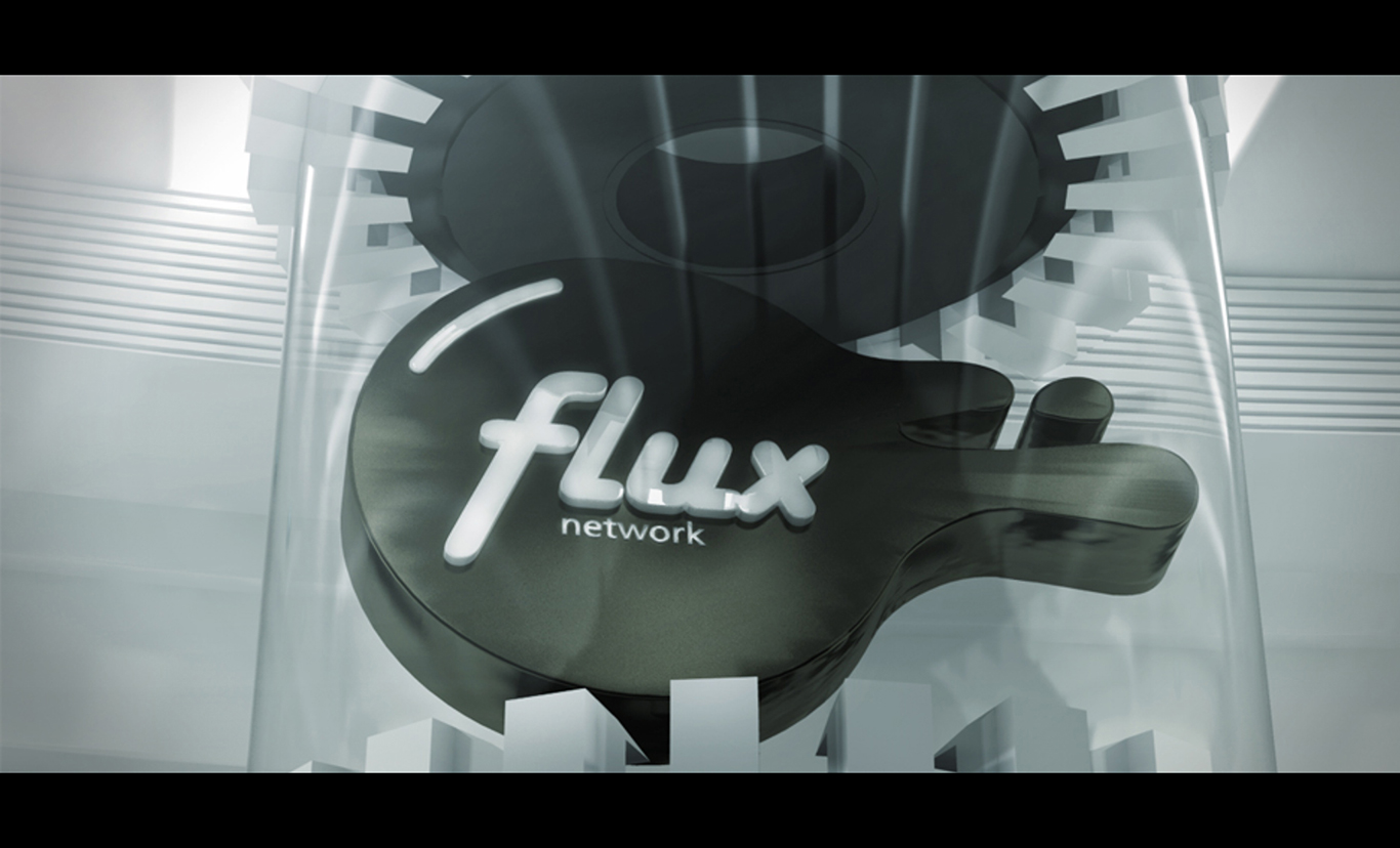
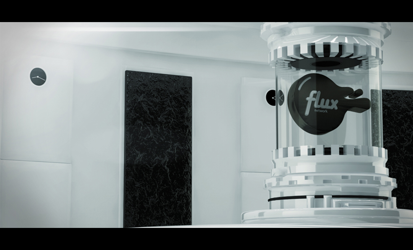
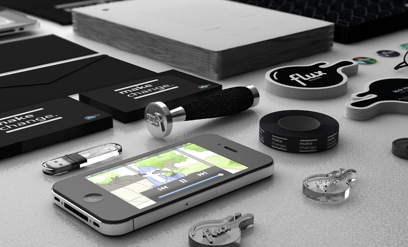
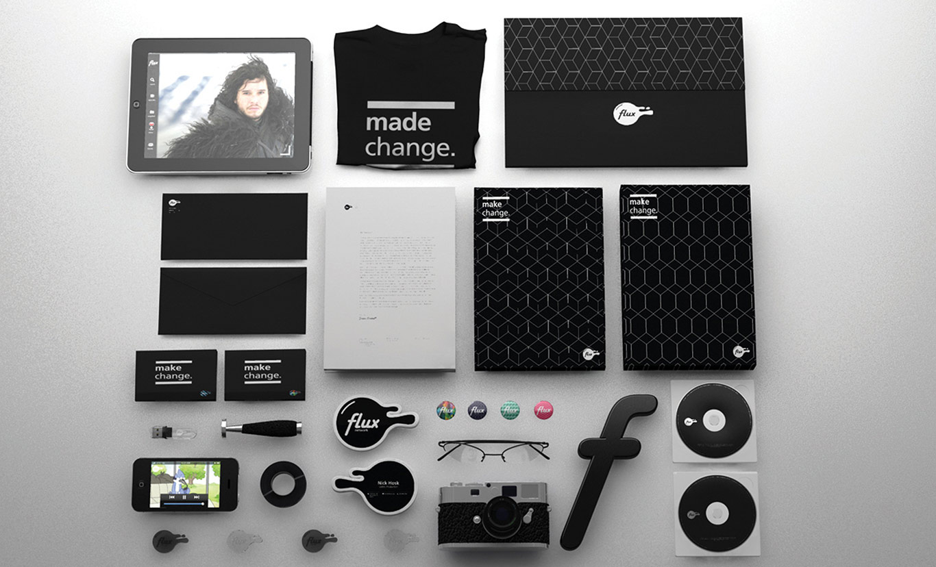
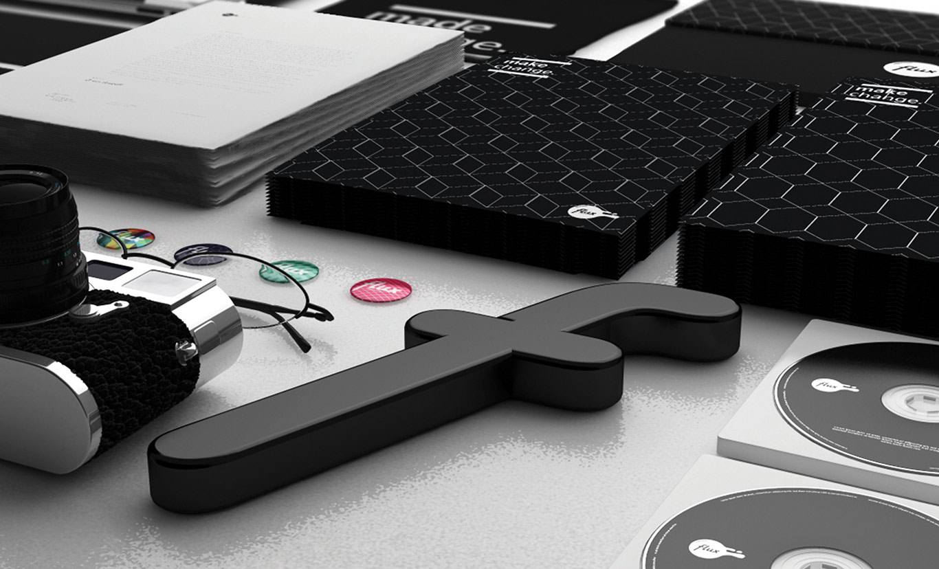
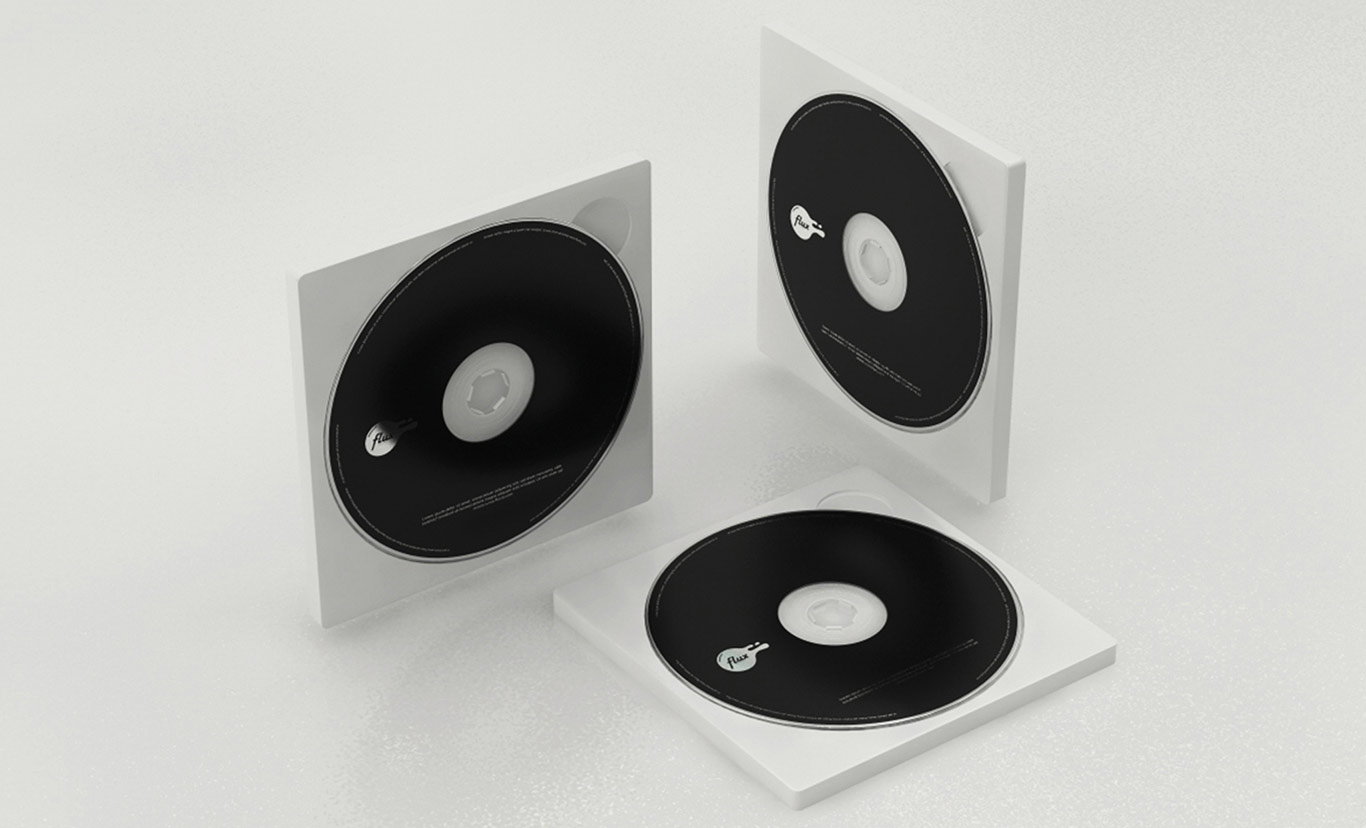
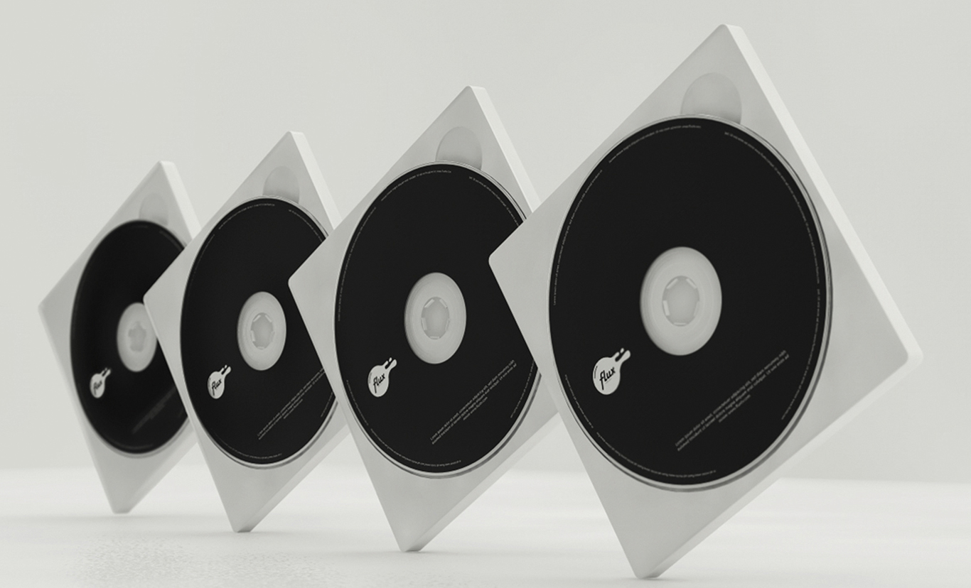
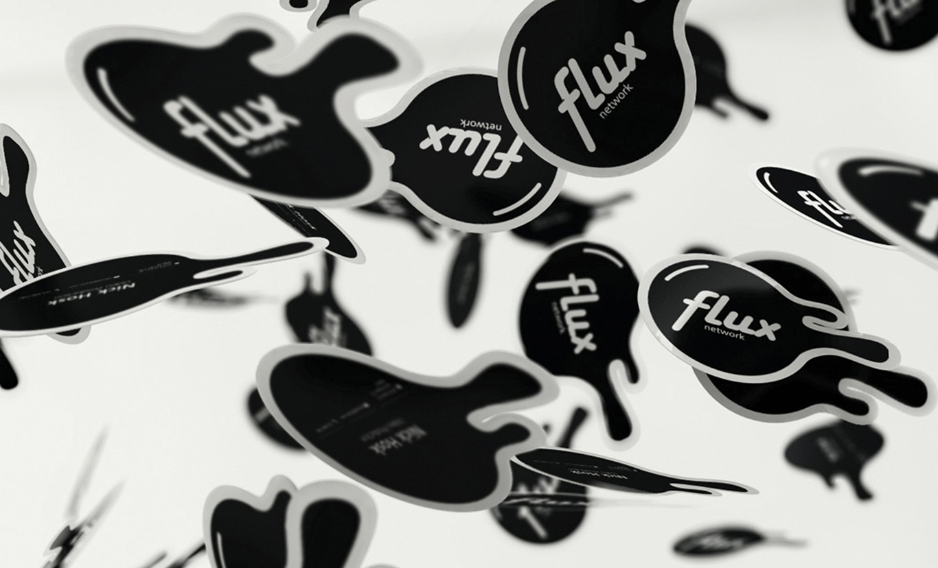
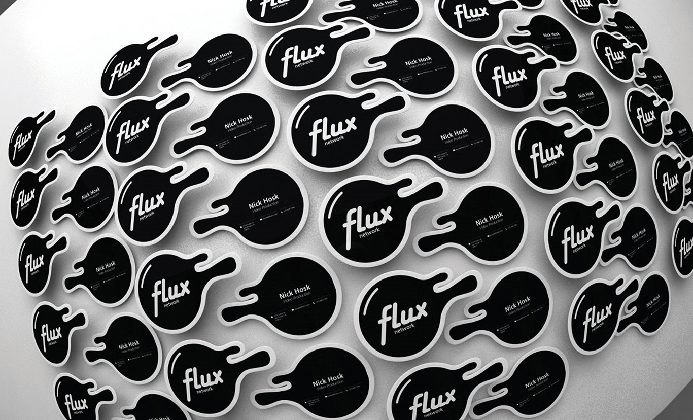
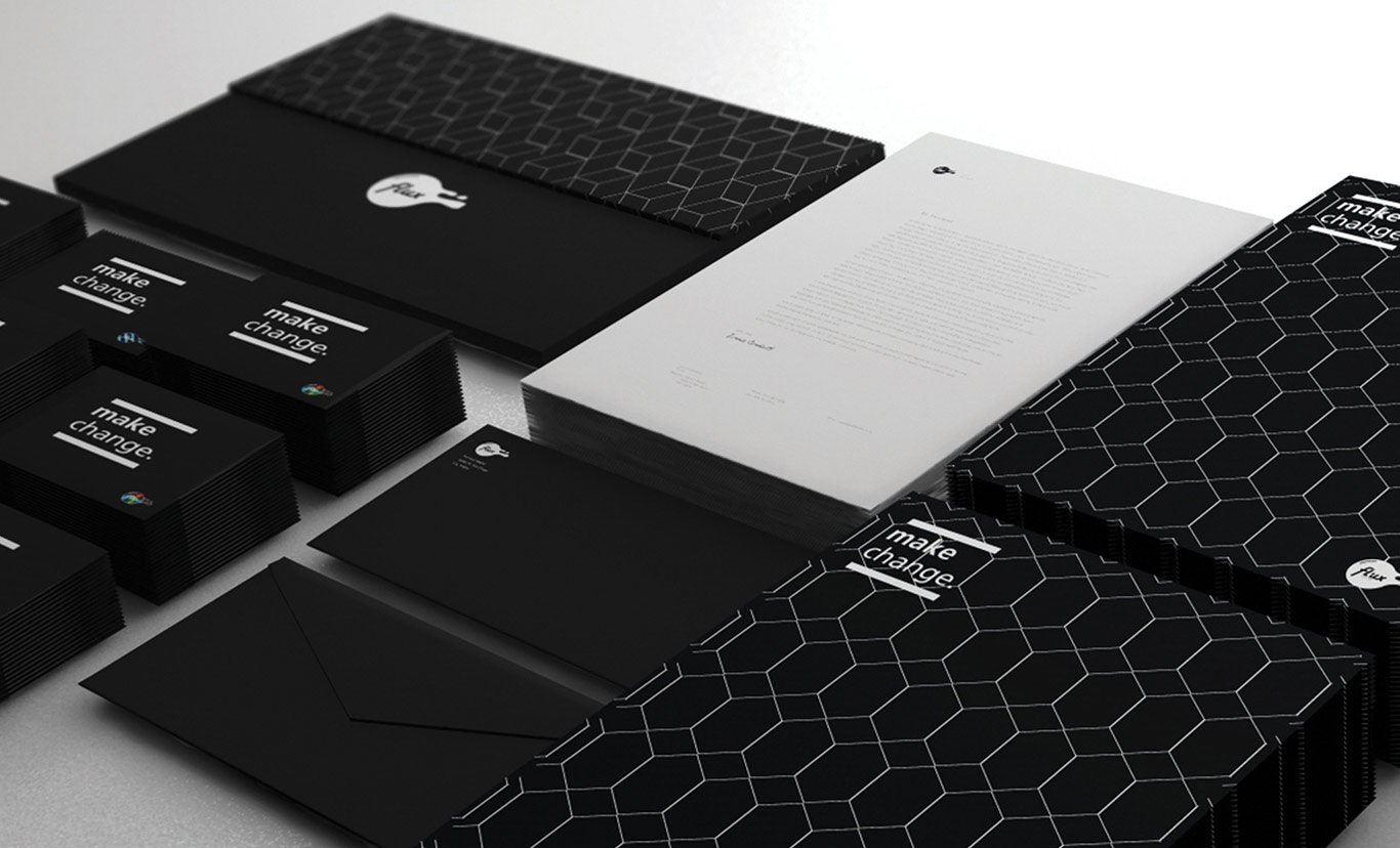
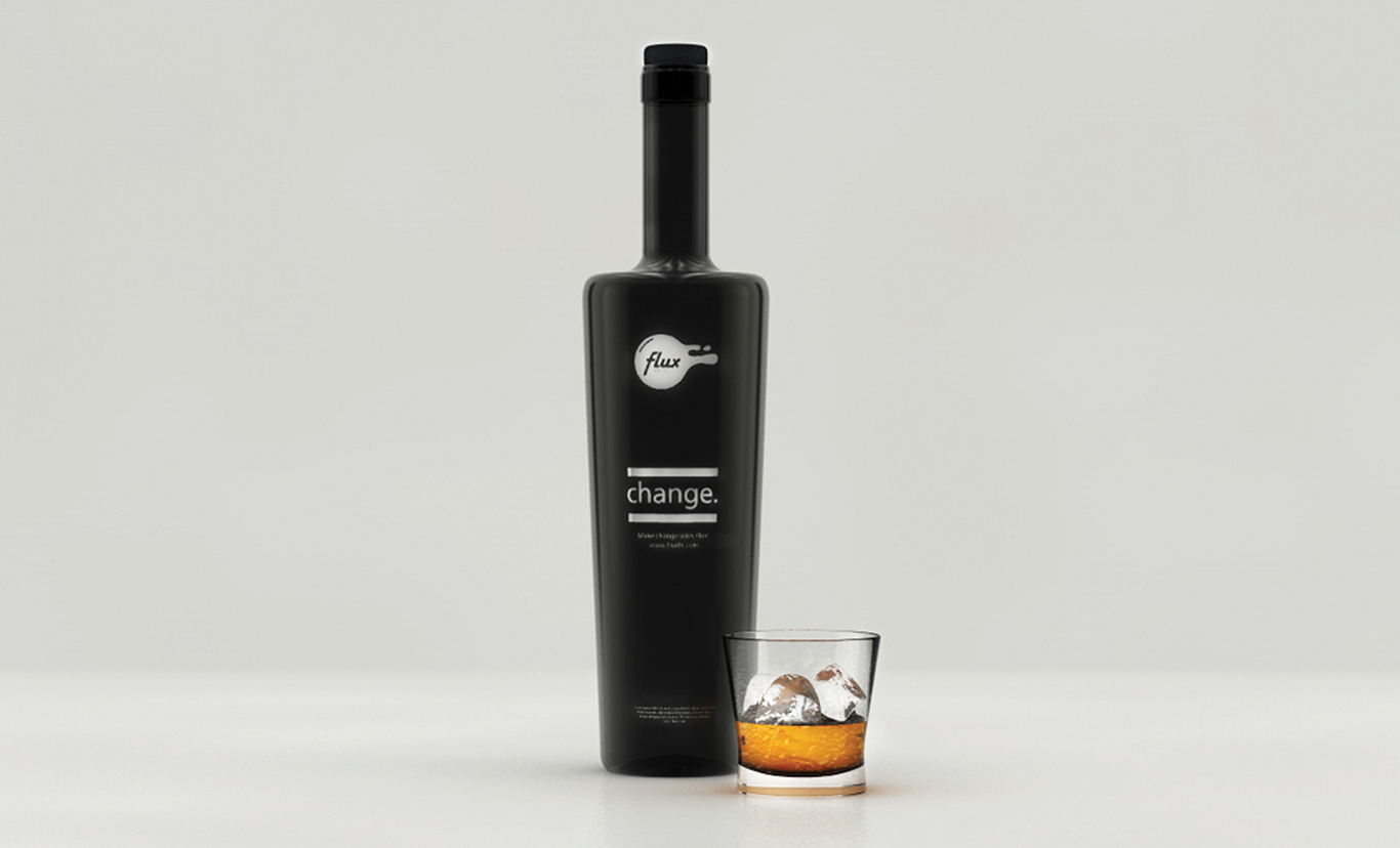
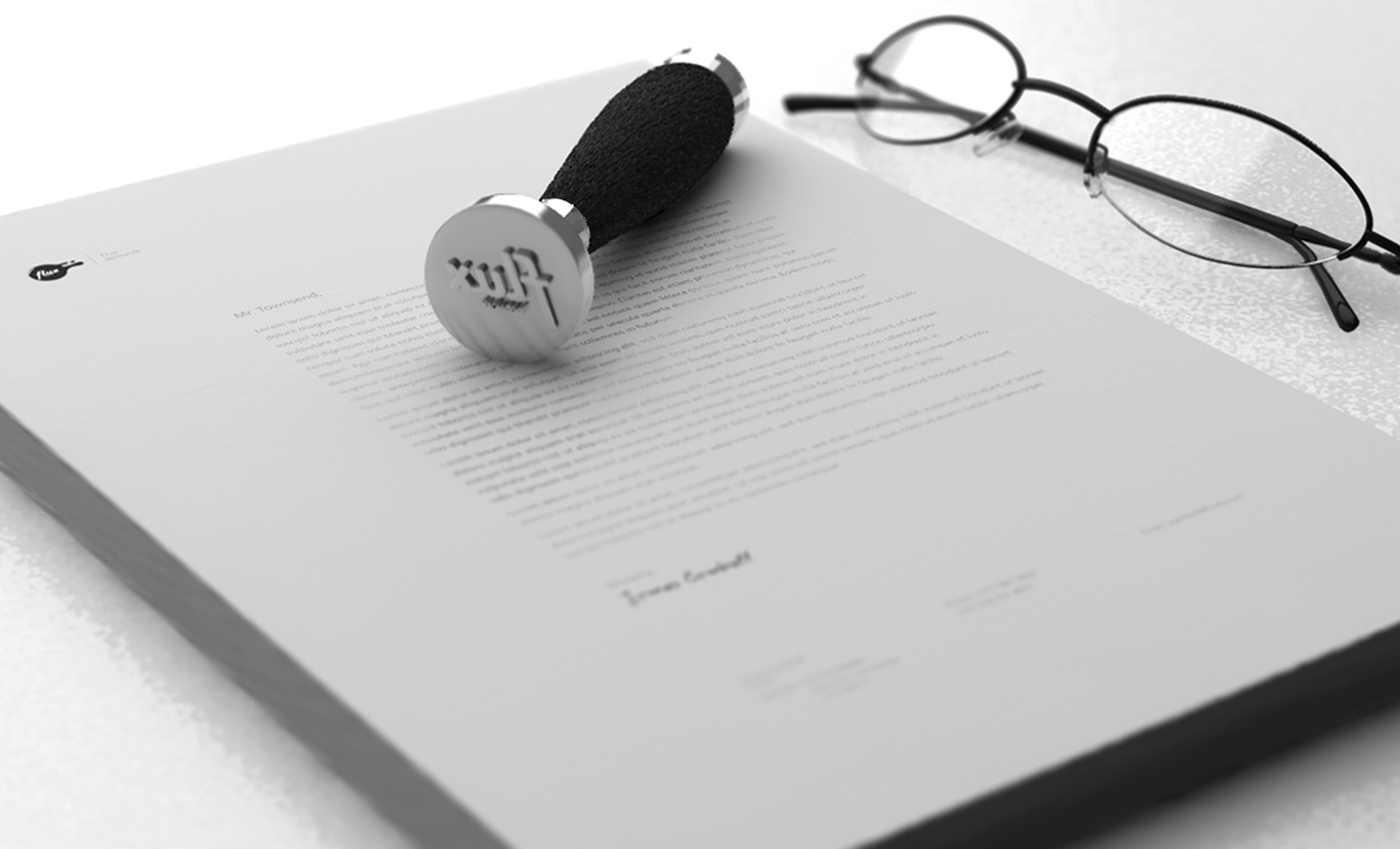
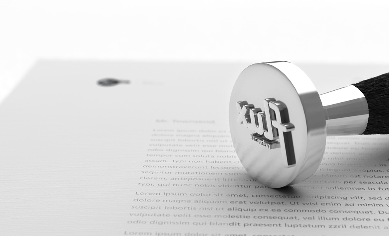
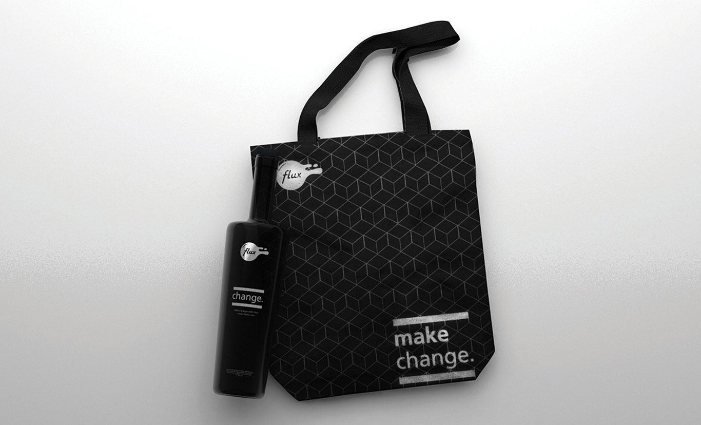
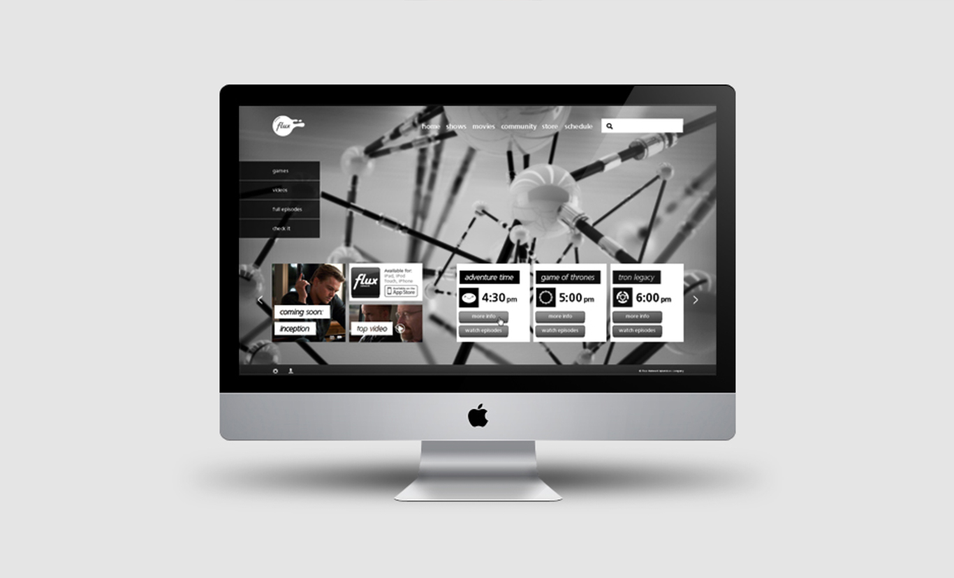
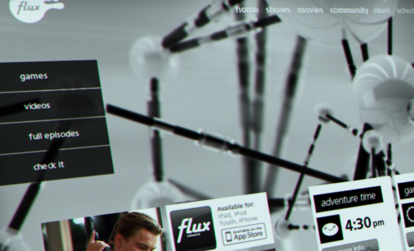
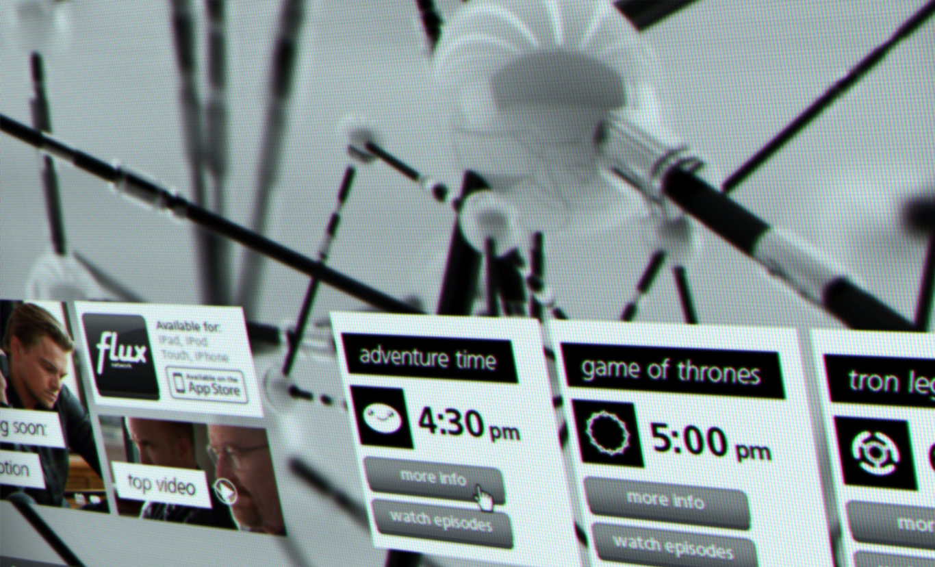
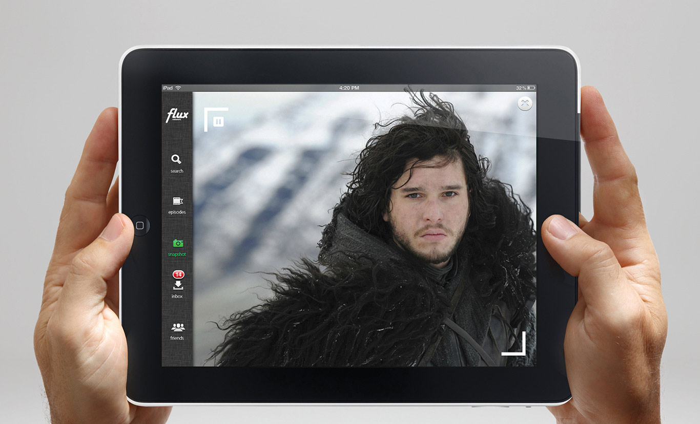
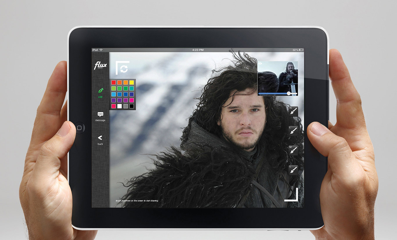
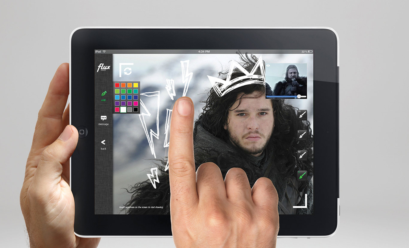
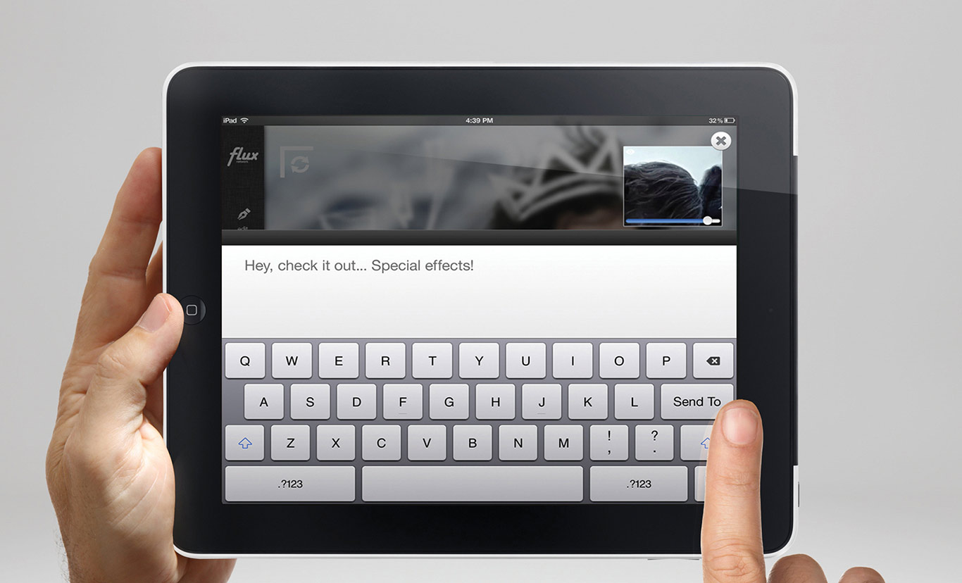
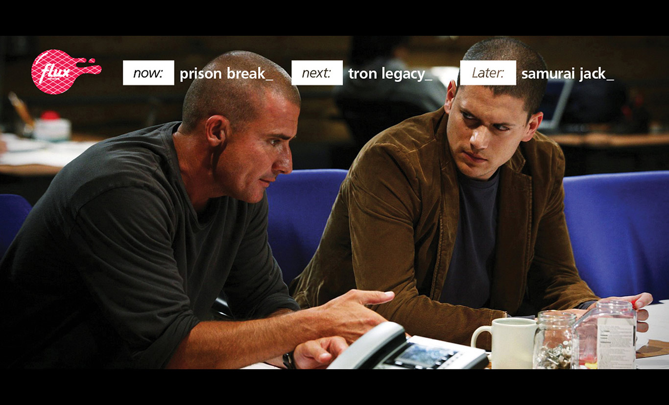
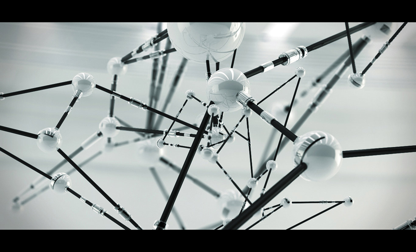
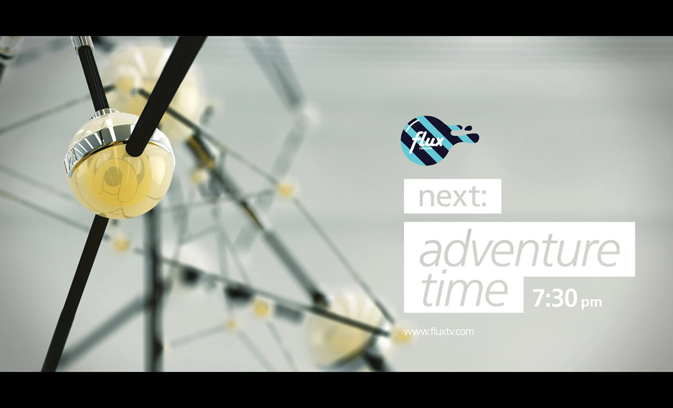
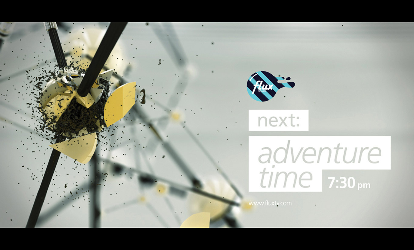
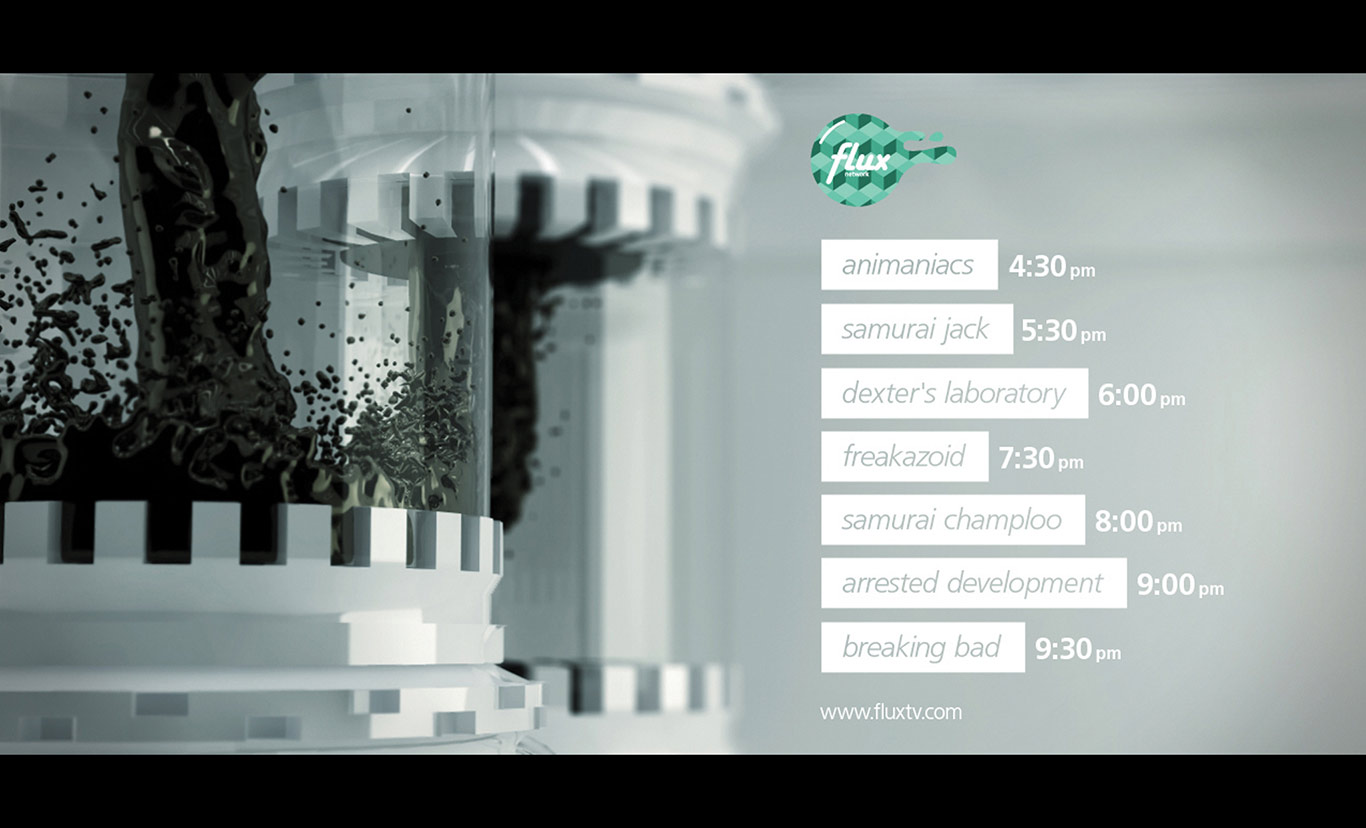
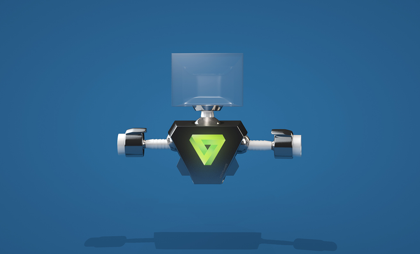
FLUXbranding - broadcast - 3d - digital - art direction
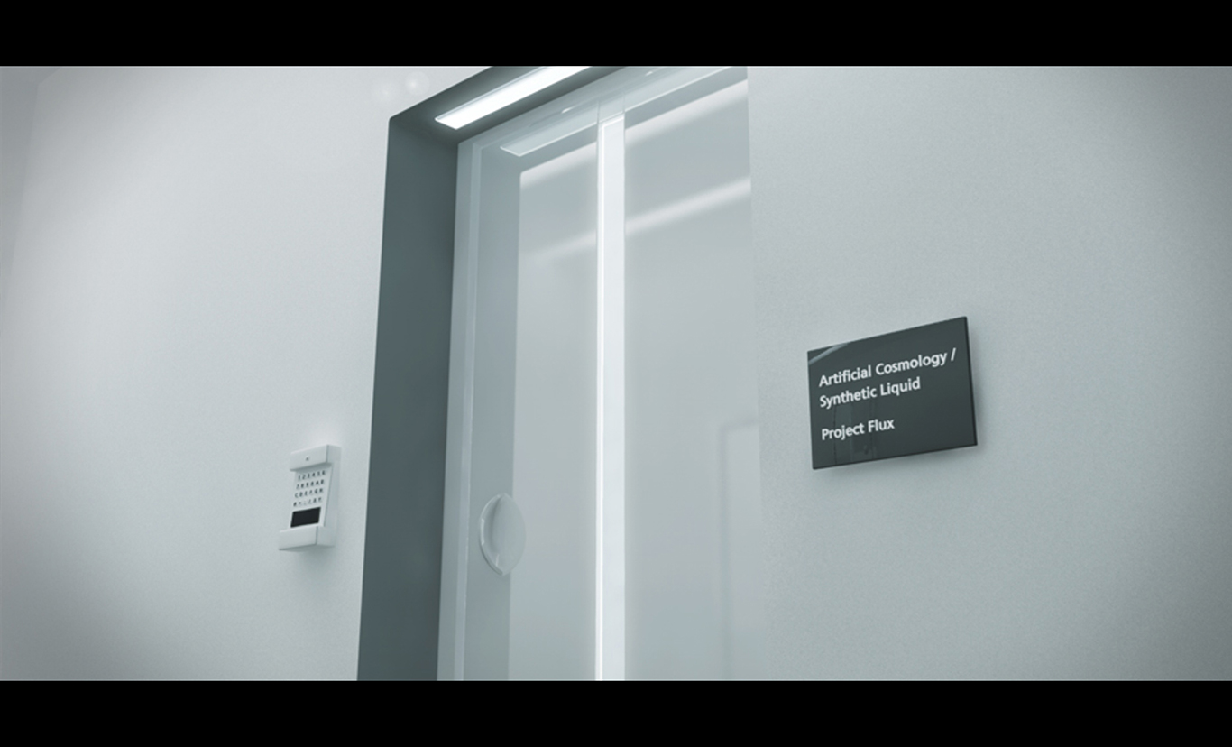
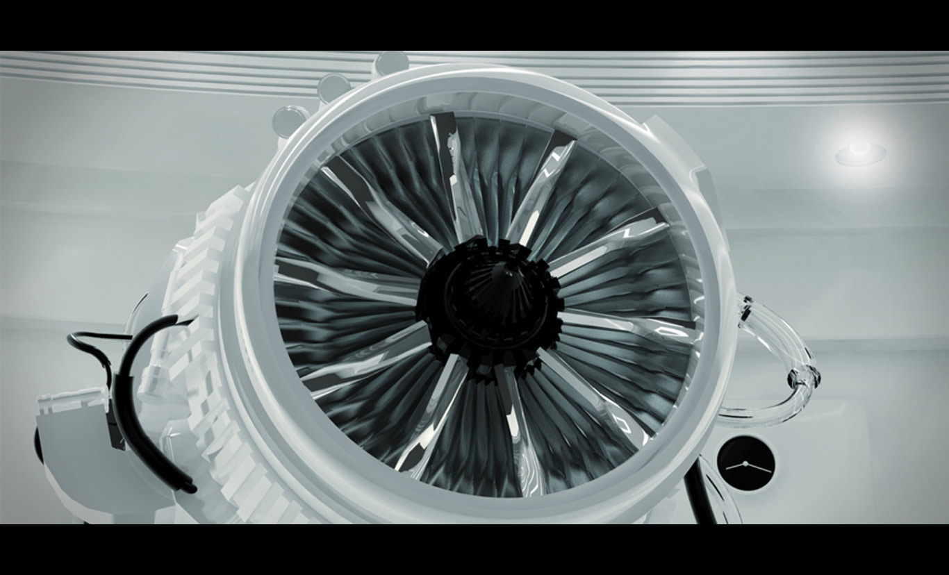
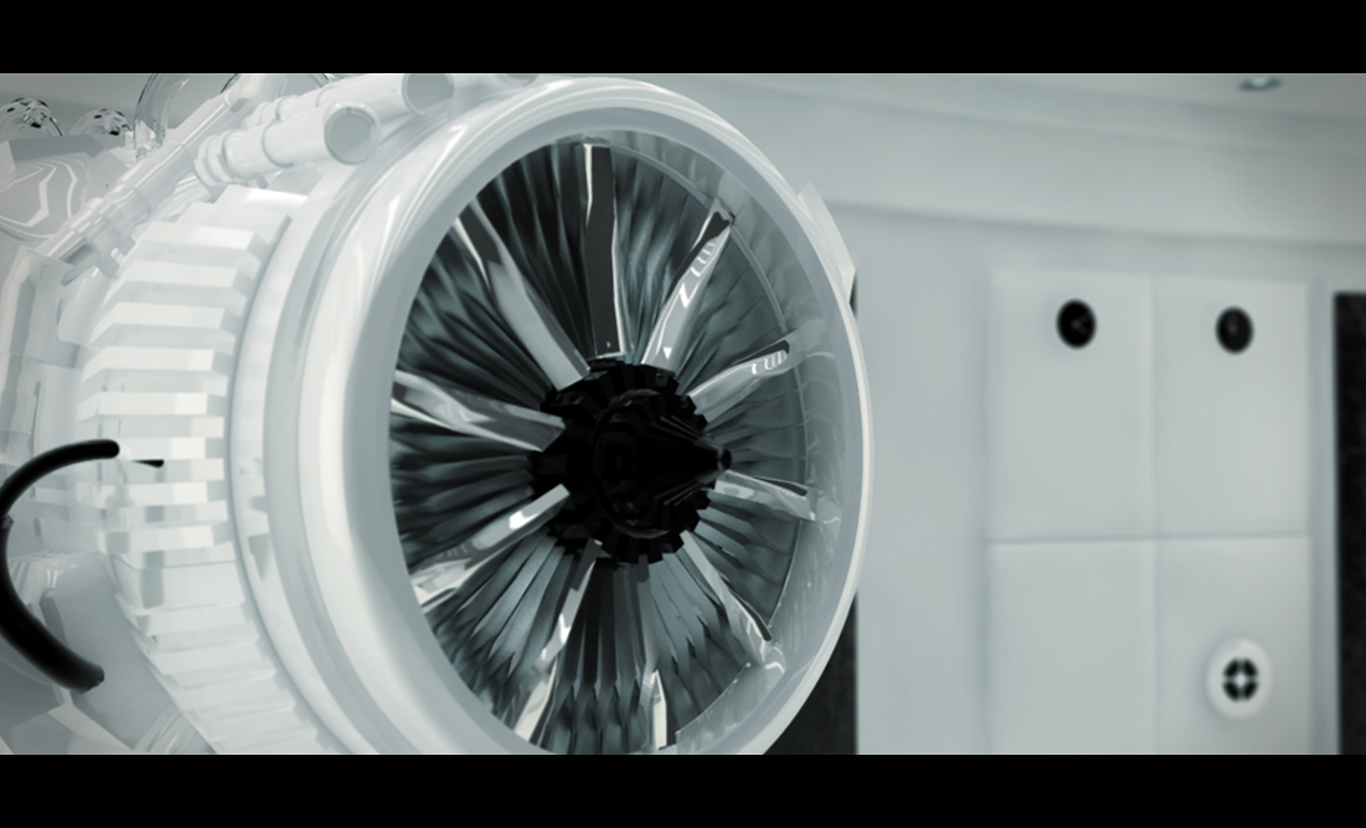
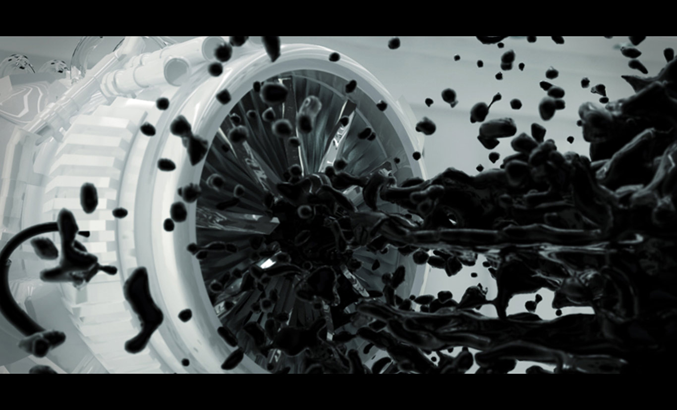
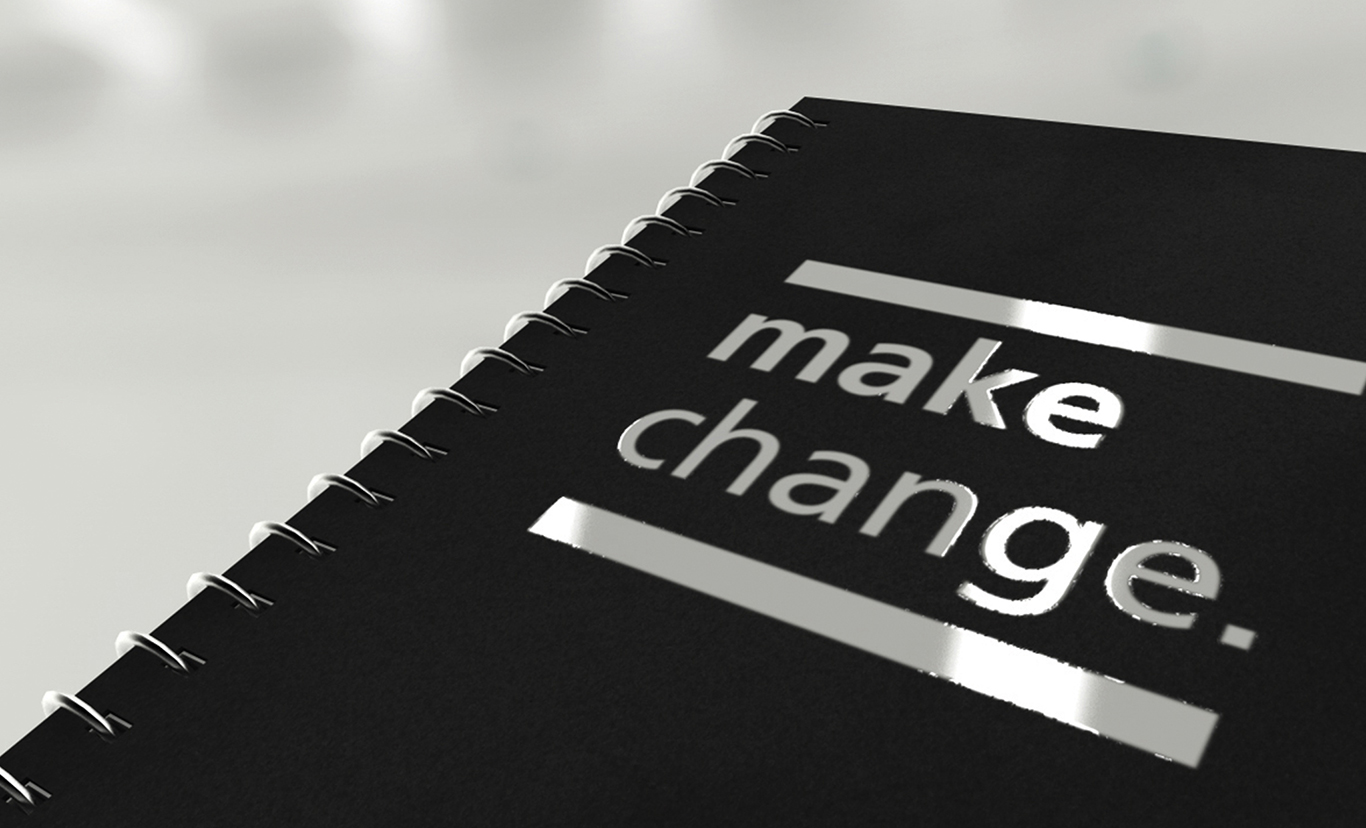
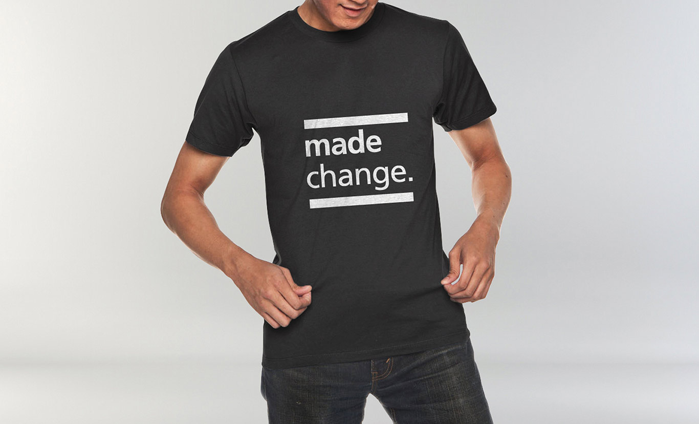
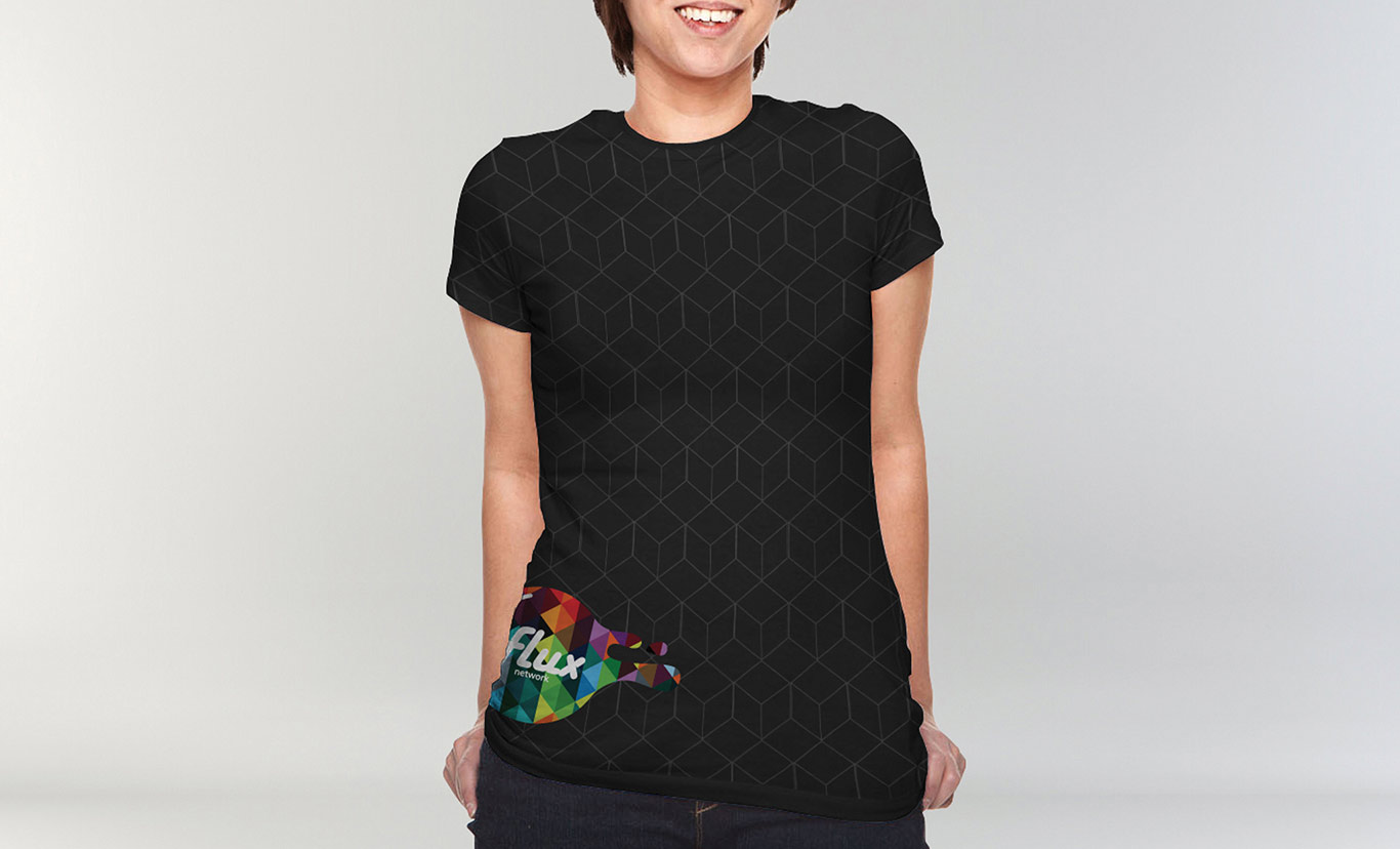
Flux is a fictitious inspirational television network designed for young creative adults (16-30). It features both live action programing, as well as several animated series. The initial concept of Flux was to provoke the will-power of making change, or building the desire to create by expression in art or design. Hence, the tag line emerged from this drive to "make change". The first graphical treatment, that also played a part in the design of the logo, also took part in the subtle theme of the identity. This subtle graphical treatment was the idea of liquid. Liquid is flux (constant change), so the shape of the logo coincides with both the theme, and contemporary look to hit the desired target. The idea that liquid could be fabricated through an arbitrary science laboratory, helped tell a story of how an ominous black liquid could force itself to become the Flux logo. The liquid idea also played a part in the other TV bumps, as well as the fluidity of the website and its design. Black seemed to be an appropriate color not only for its eloquent look, but also that it represents nothing, and everything. Flux can be what you make of it. This can be also seen through the various logo renderings and colors of Flux. All of the movies, and shows featured through Flux have the reputation of motivating the want to draw, paint, or design. The example of Iron Man, or Tron Legacy inspired many artists to design their own versions of these popular movies when they where released. Currently Flux was designed with the idea to motivate, inspire, and play popular nostalgic and contemporary shows for today's young creative minds.
2009
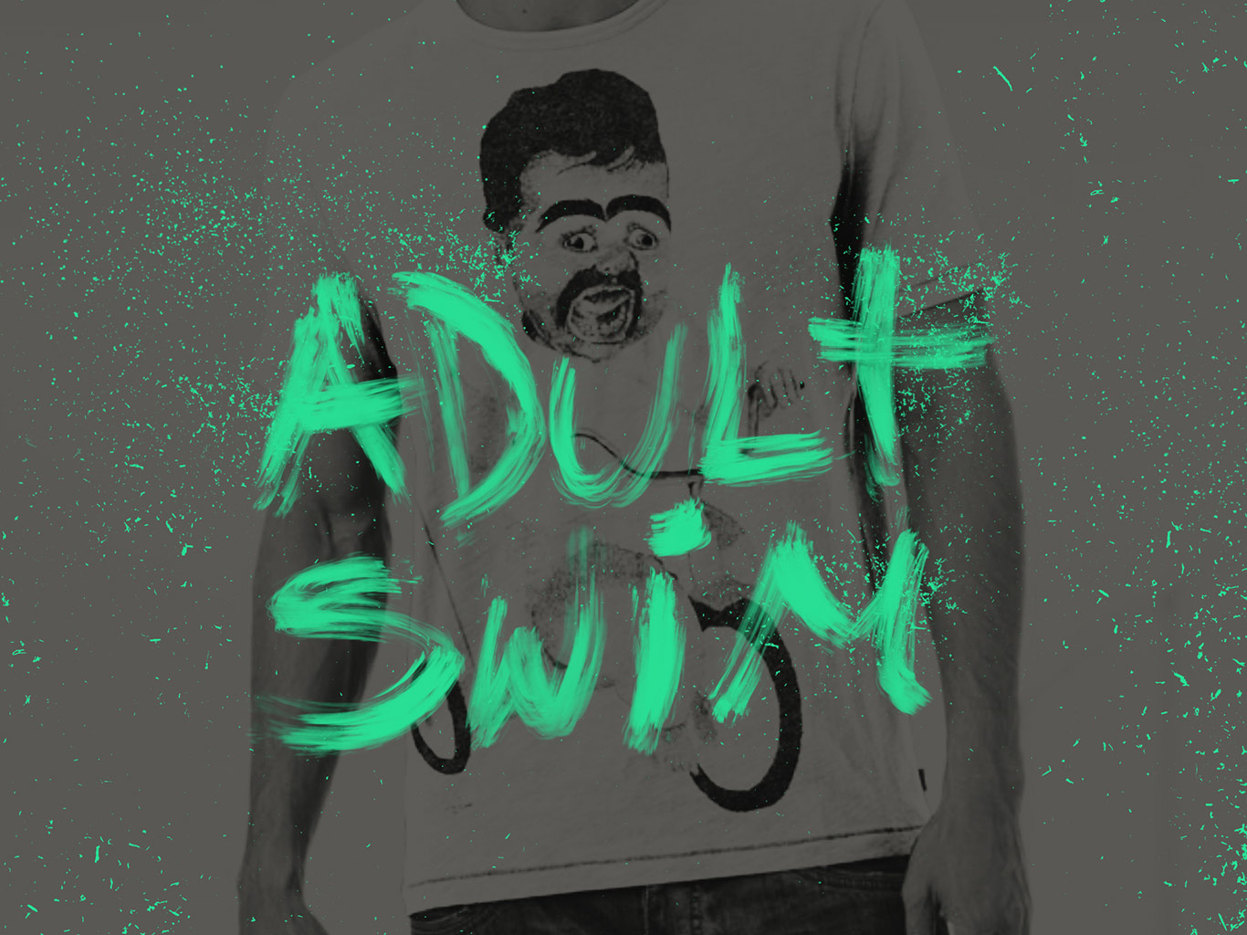
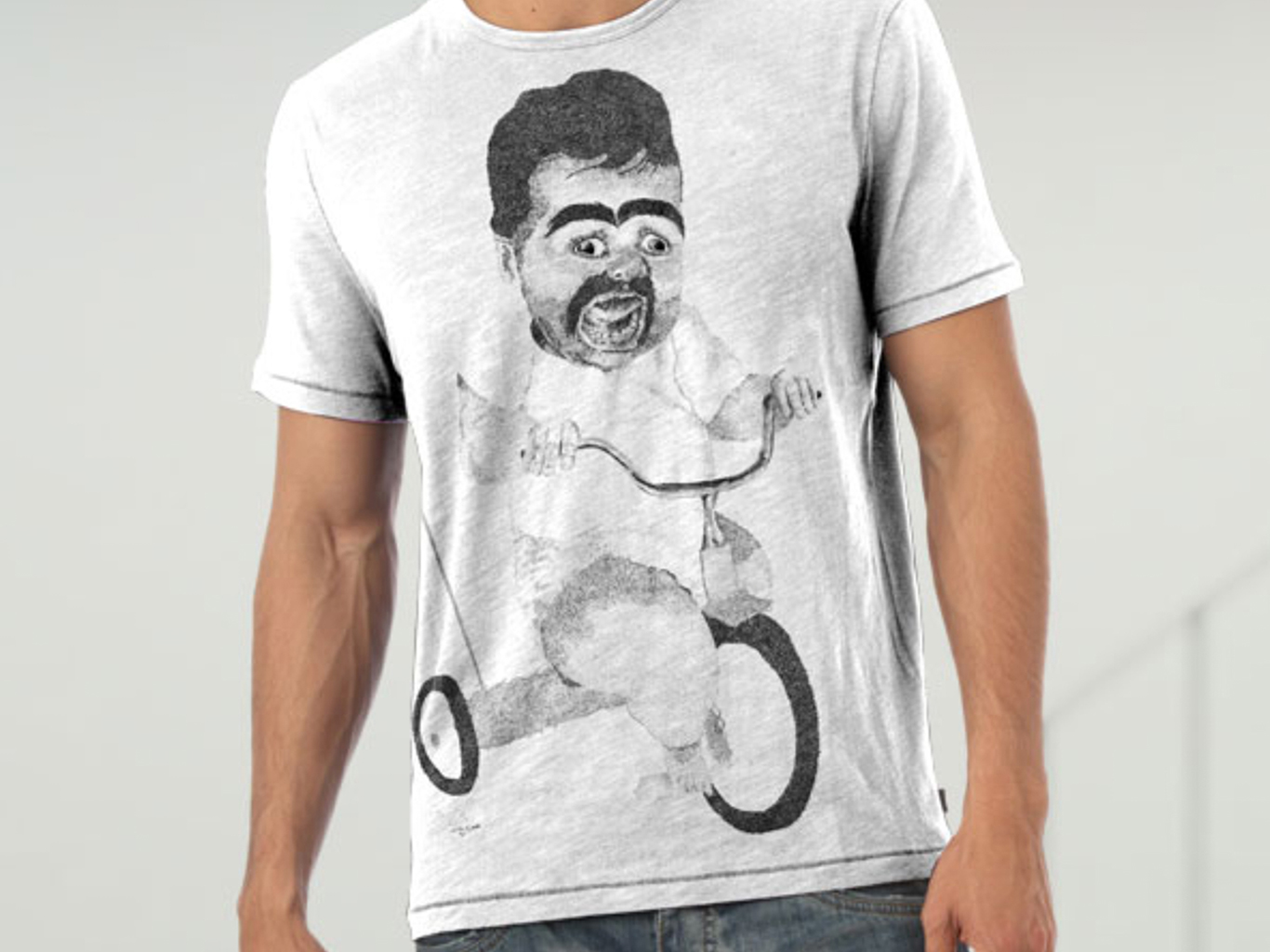
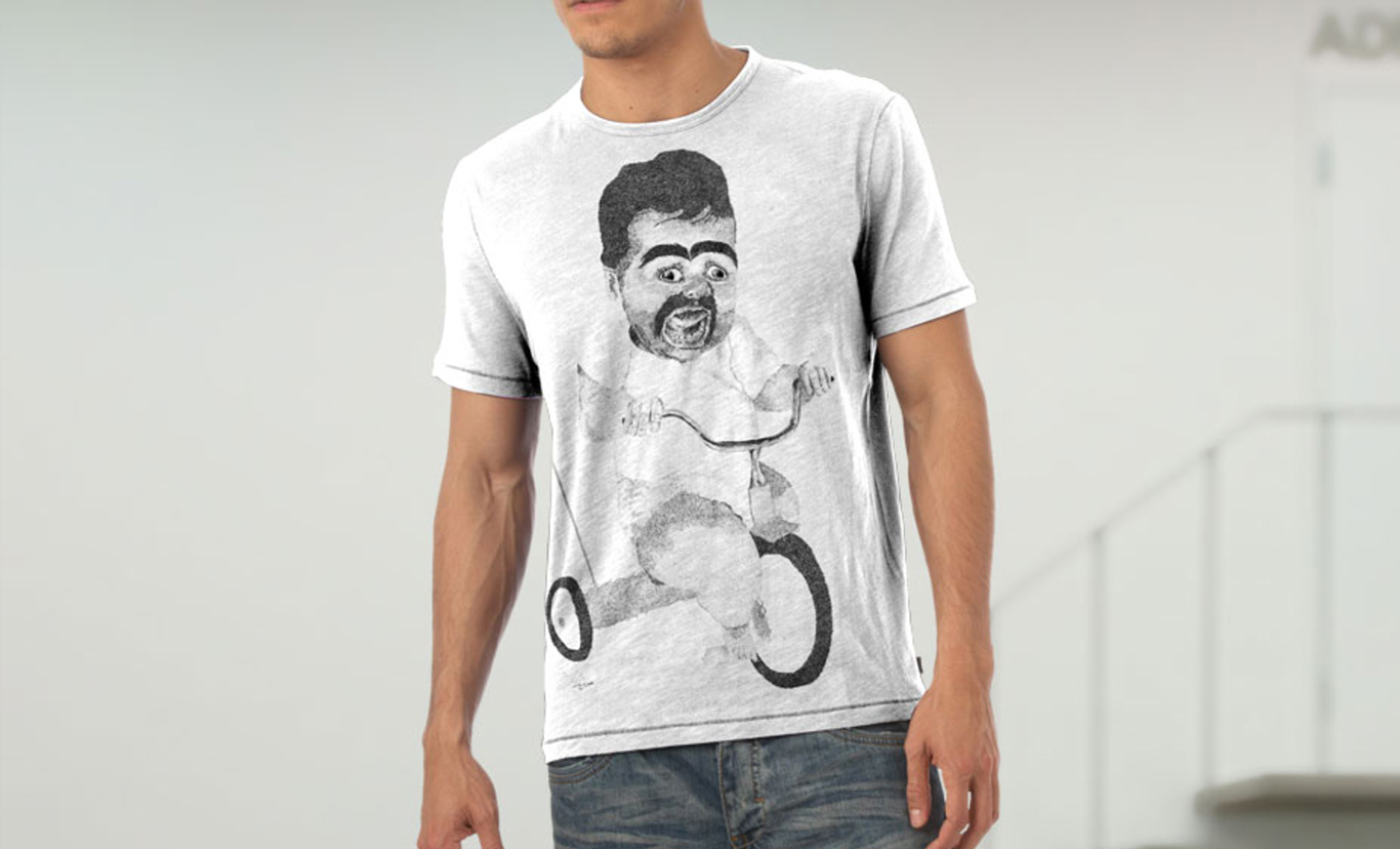
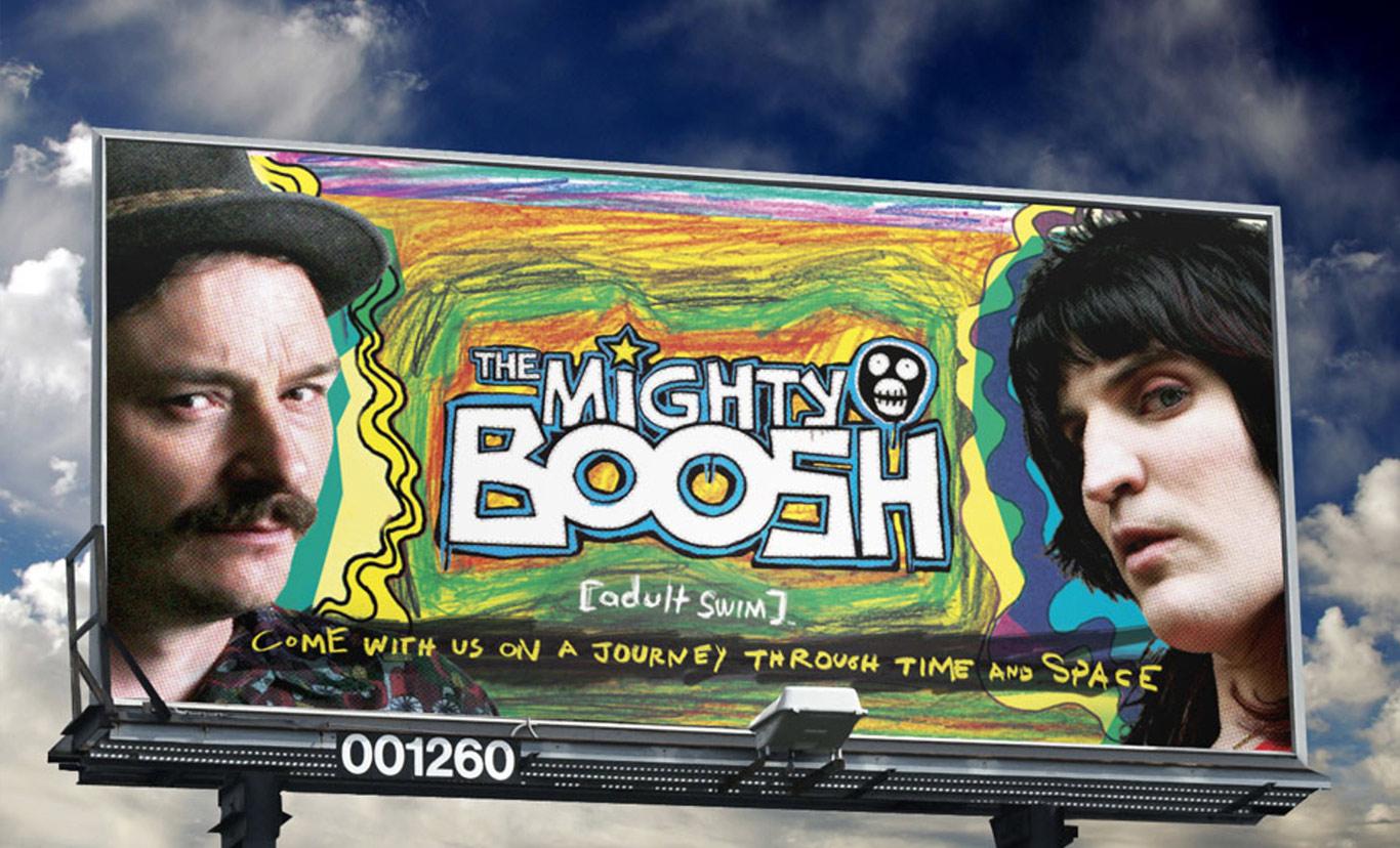
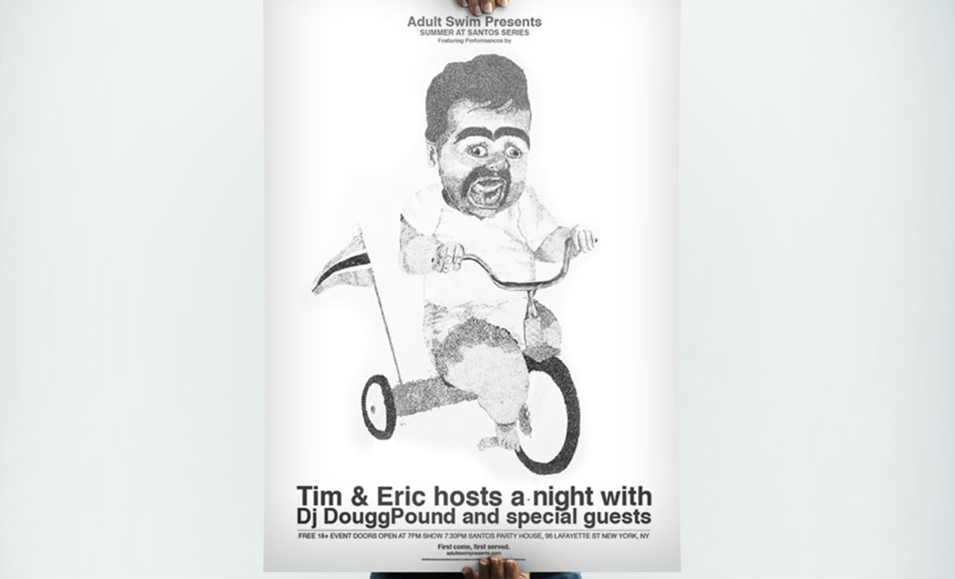
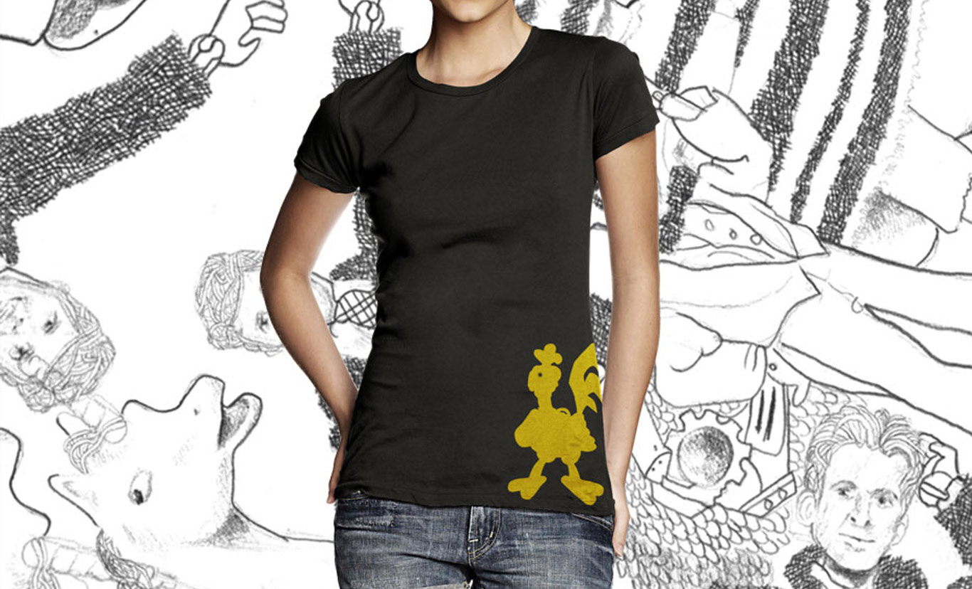
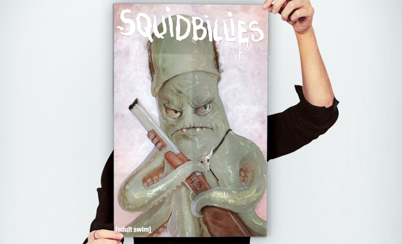
ADULT SWIMprint - video - billboard - tv bump
I was brought in to do illustration work for the Tim & Eric show which included a poster, and some illustrations. This later turned into one of the Adult Swim bumps that aired in 2009. The Squidbillies poster is a promotional item found in the Squidbillies Season 2 DVD pack. (I did not do the artwork for the Squidbillies poster, just the design)
2014
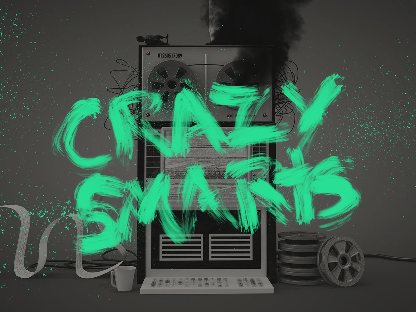
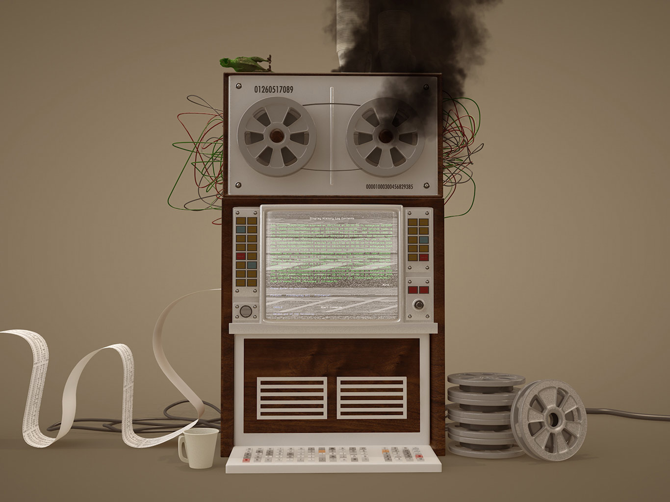
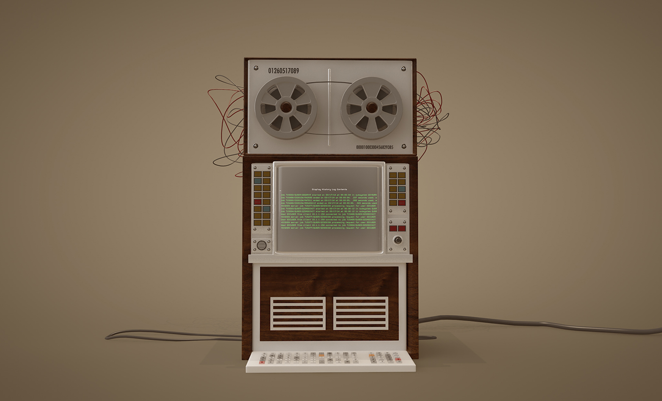
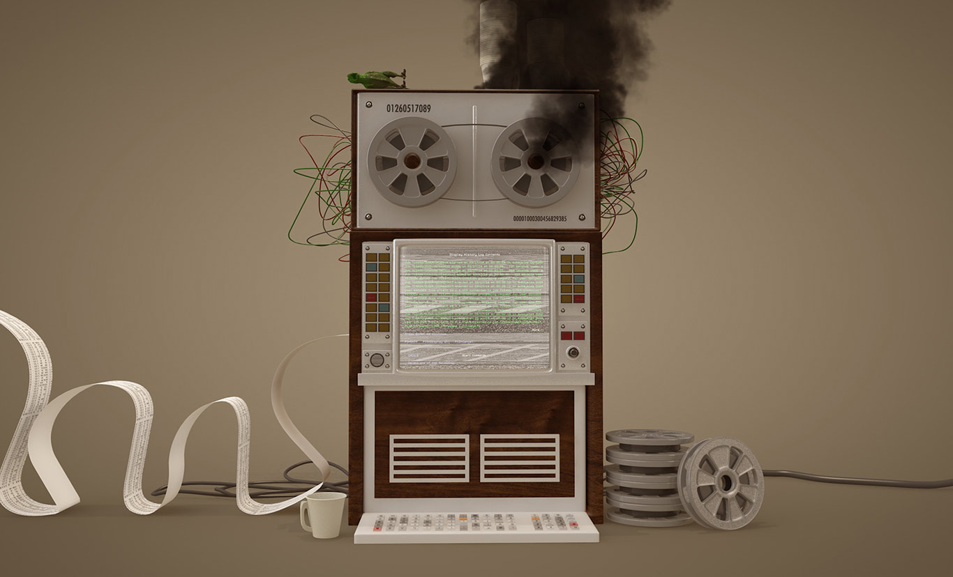
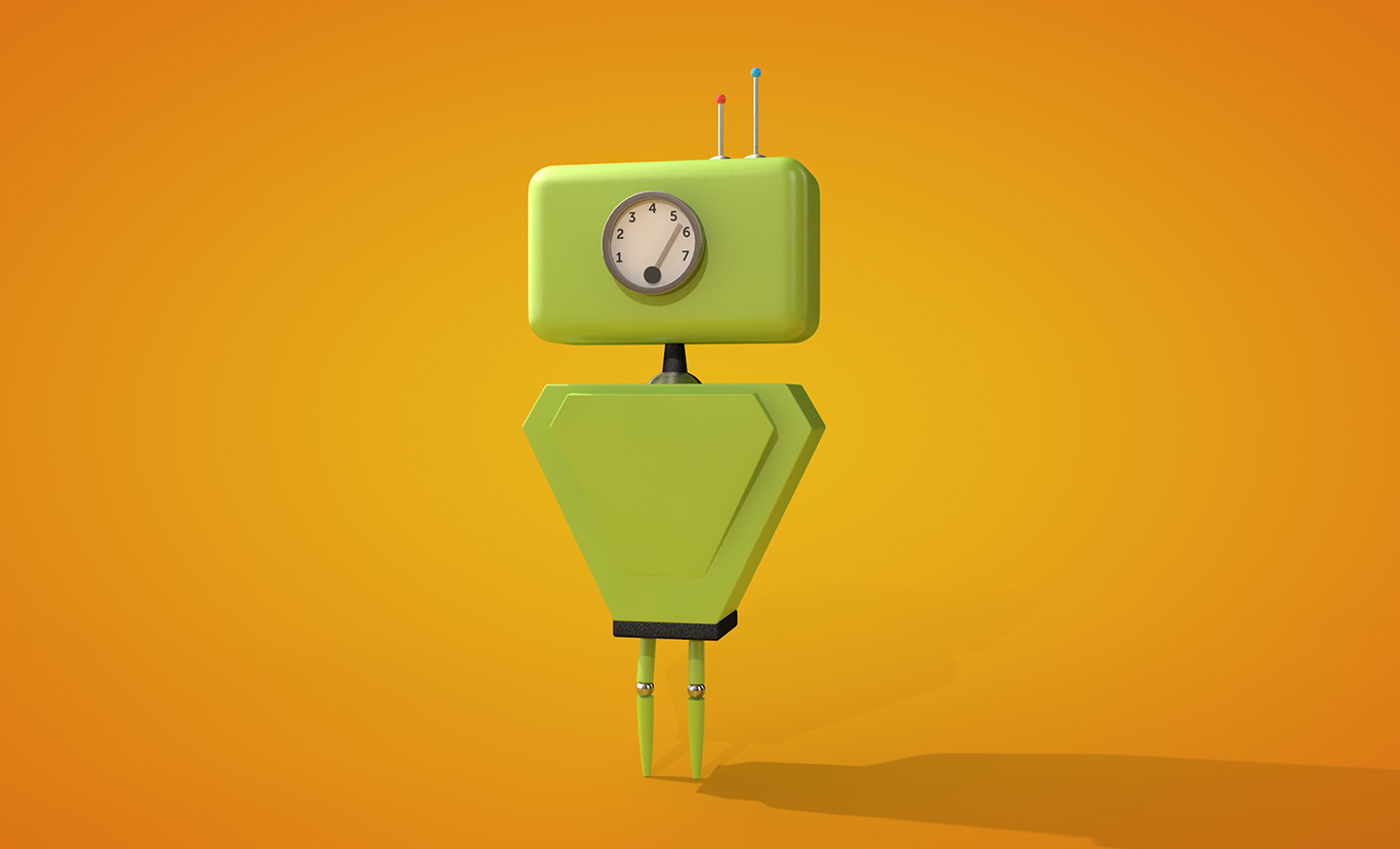
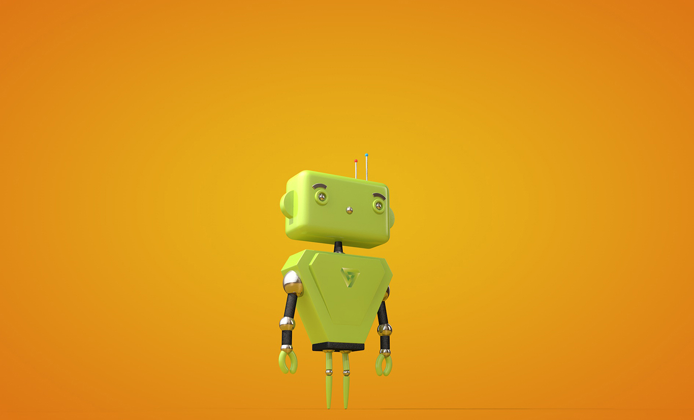
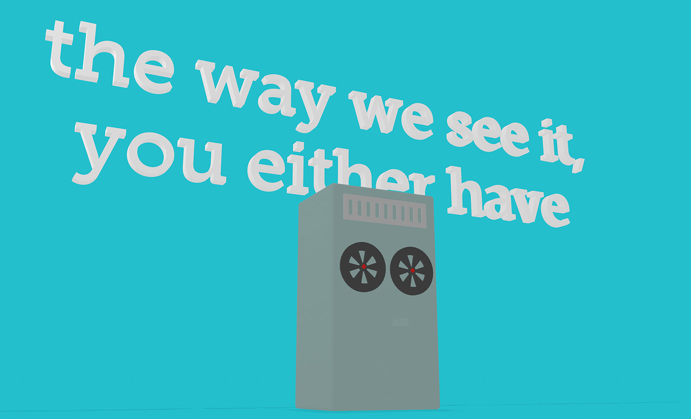
CRAZY SMARTSmotion - 3d - art direction - advertising
Together we ultimatley chose one concept to capture the online app. The final concept compares one way things are already being done, to the more sleak and modern way of using this type of technology. We portrayed the "everyday" as a dying, old machine, while this app is shown as a nimble, forward thinking, technologically advanced solution. I felt the other concept was strong, as a result bellow I'm showing a few screens from that second concept.
2010
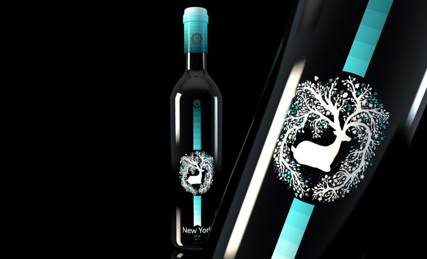
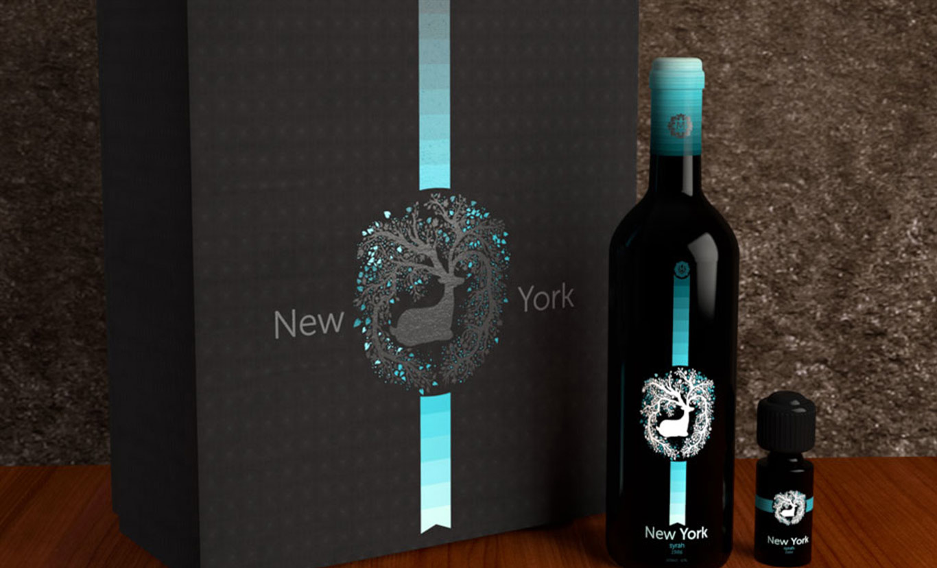
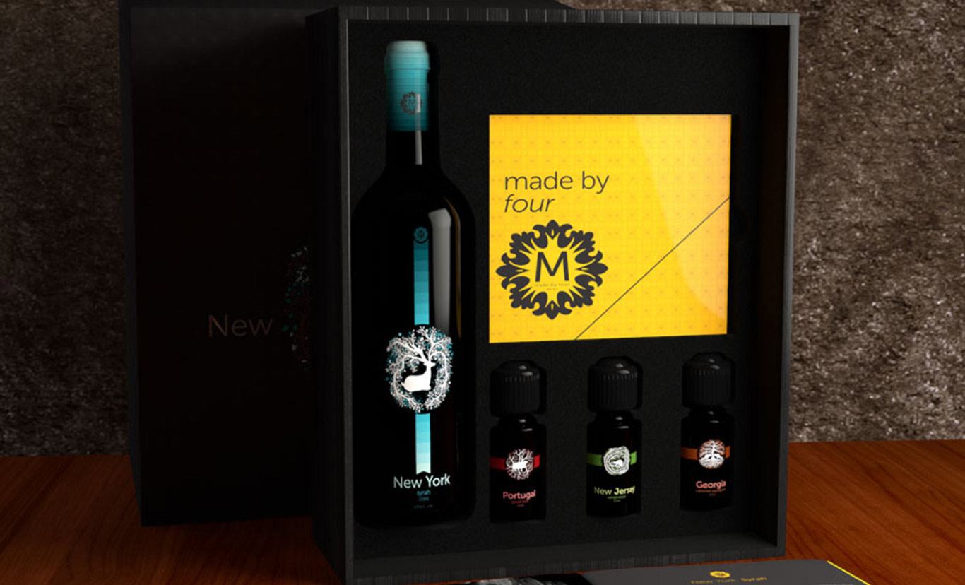
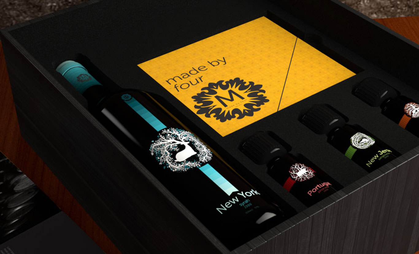
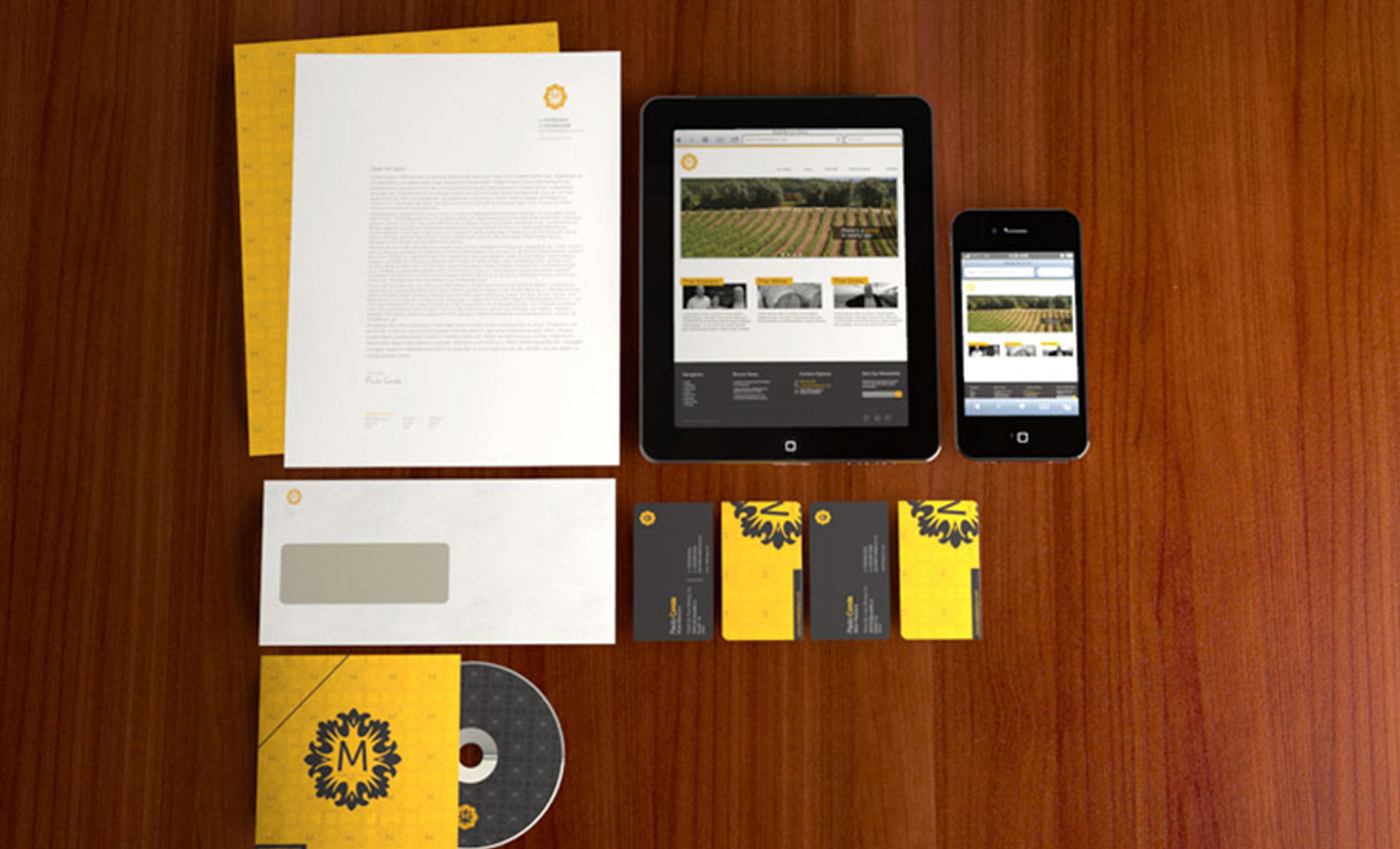
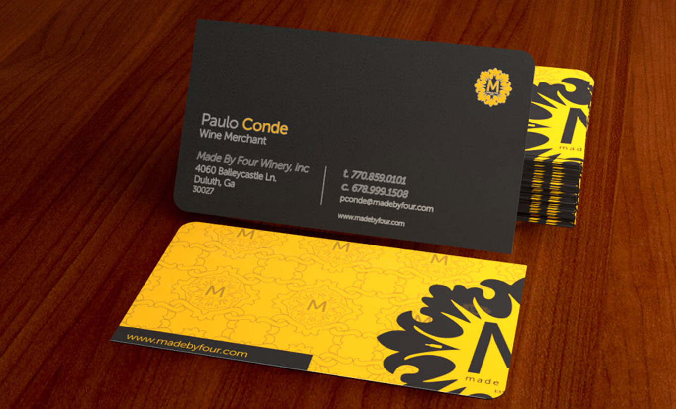
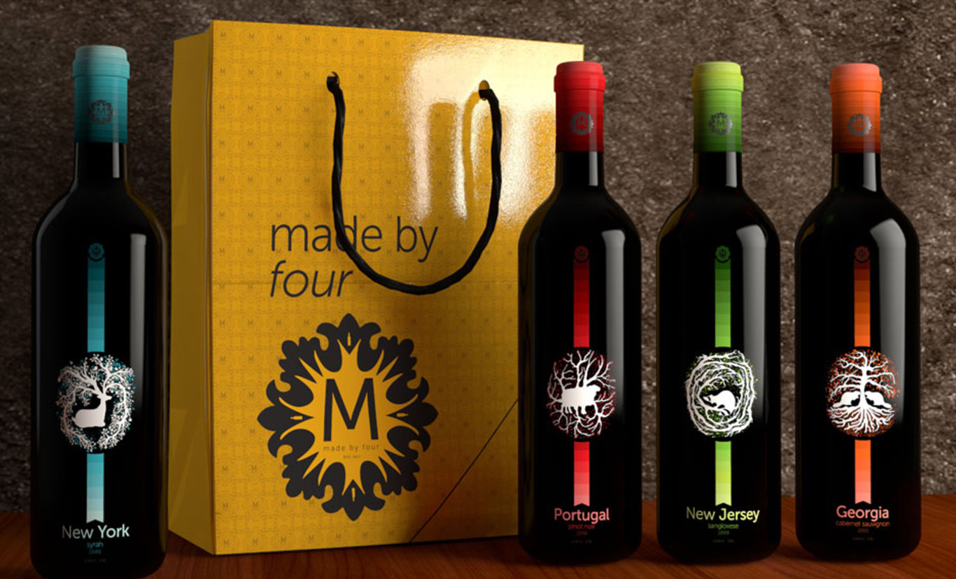
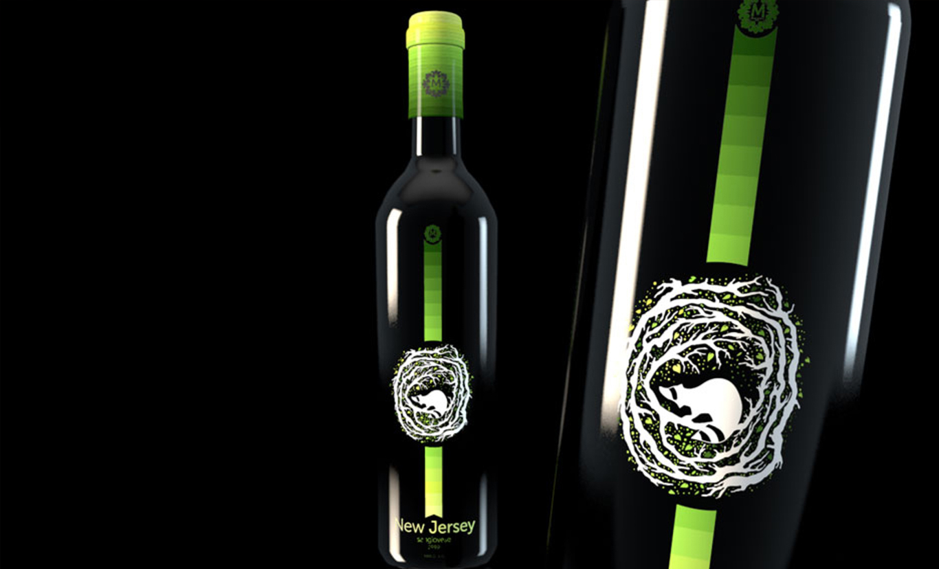
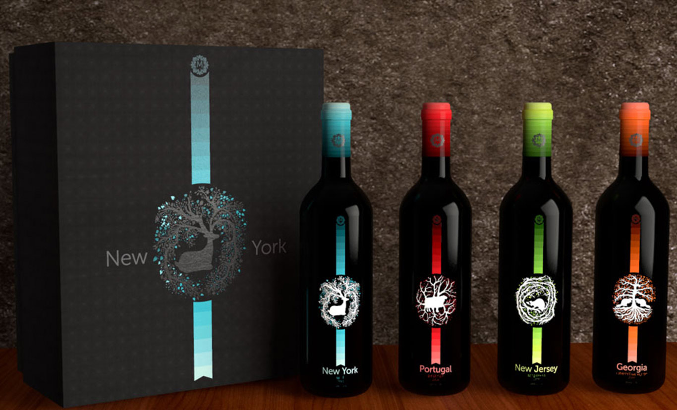
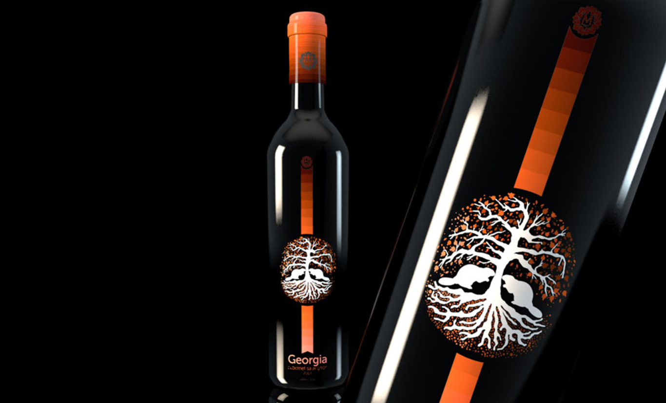
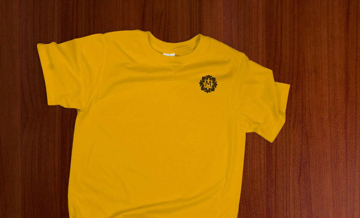
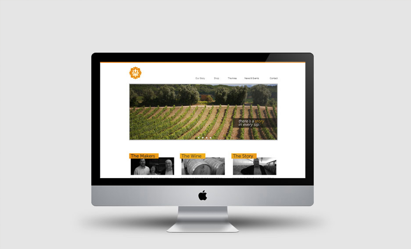
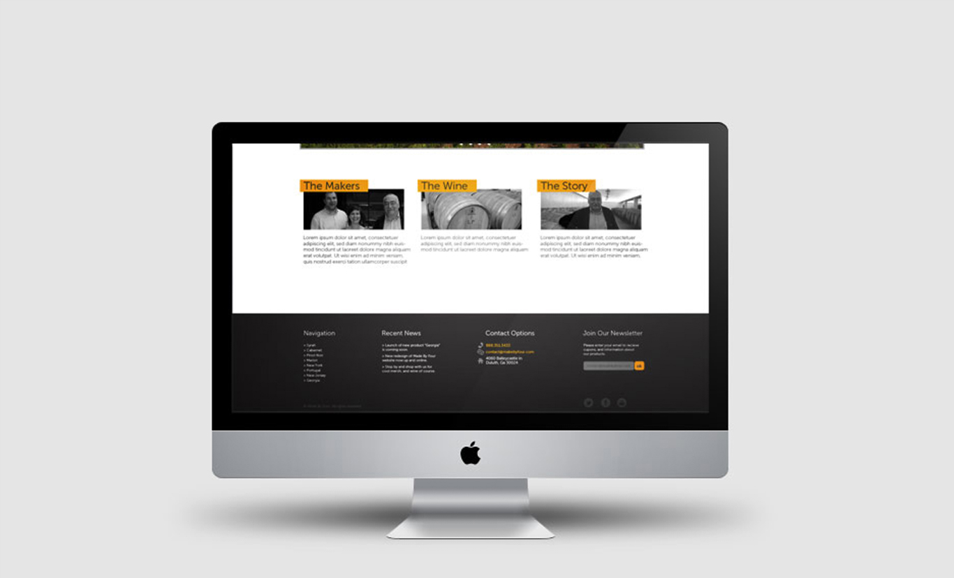
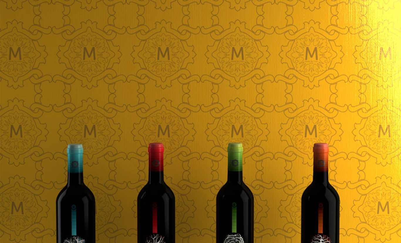
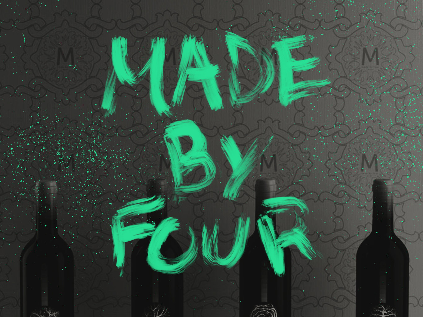
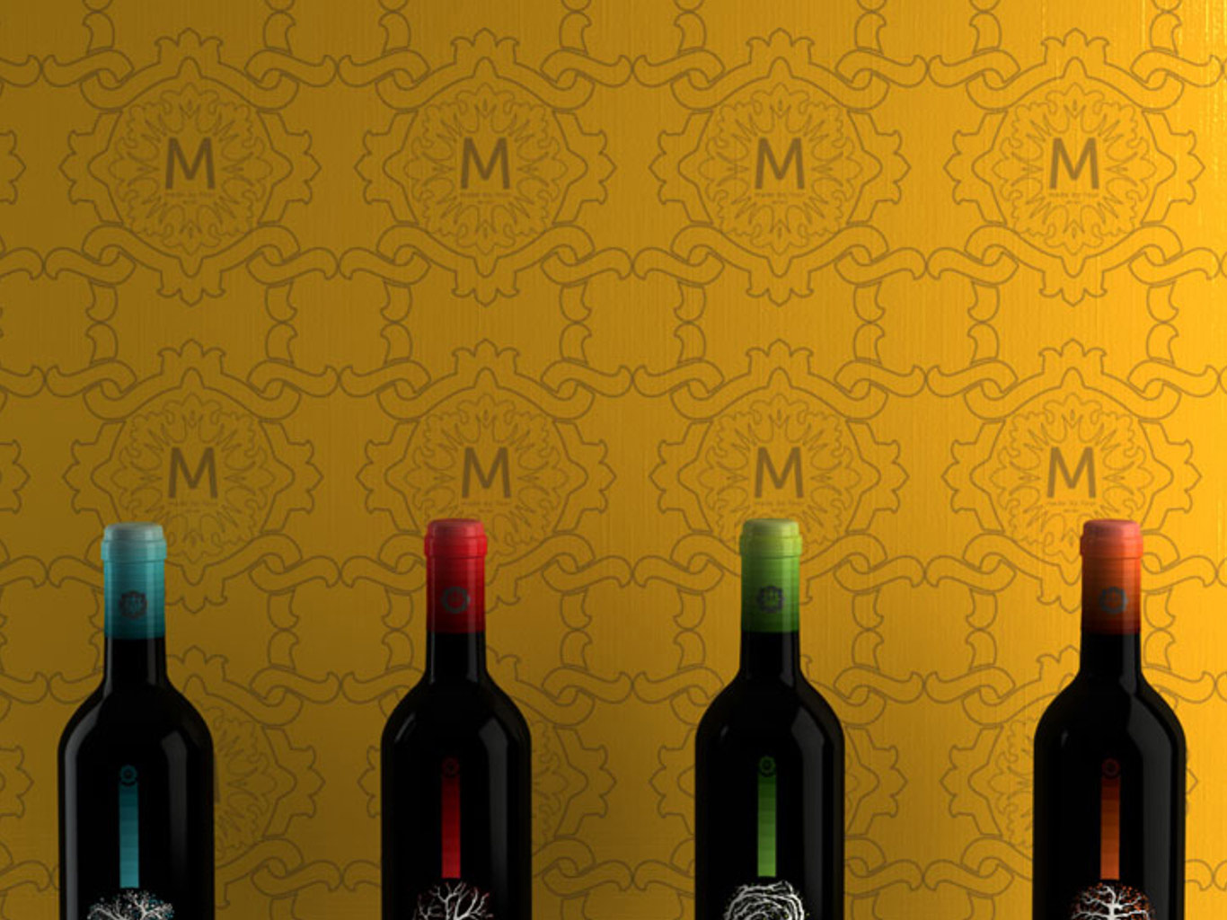
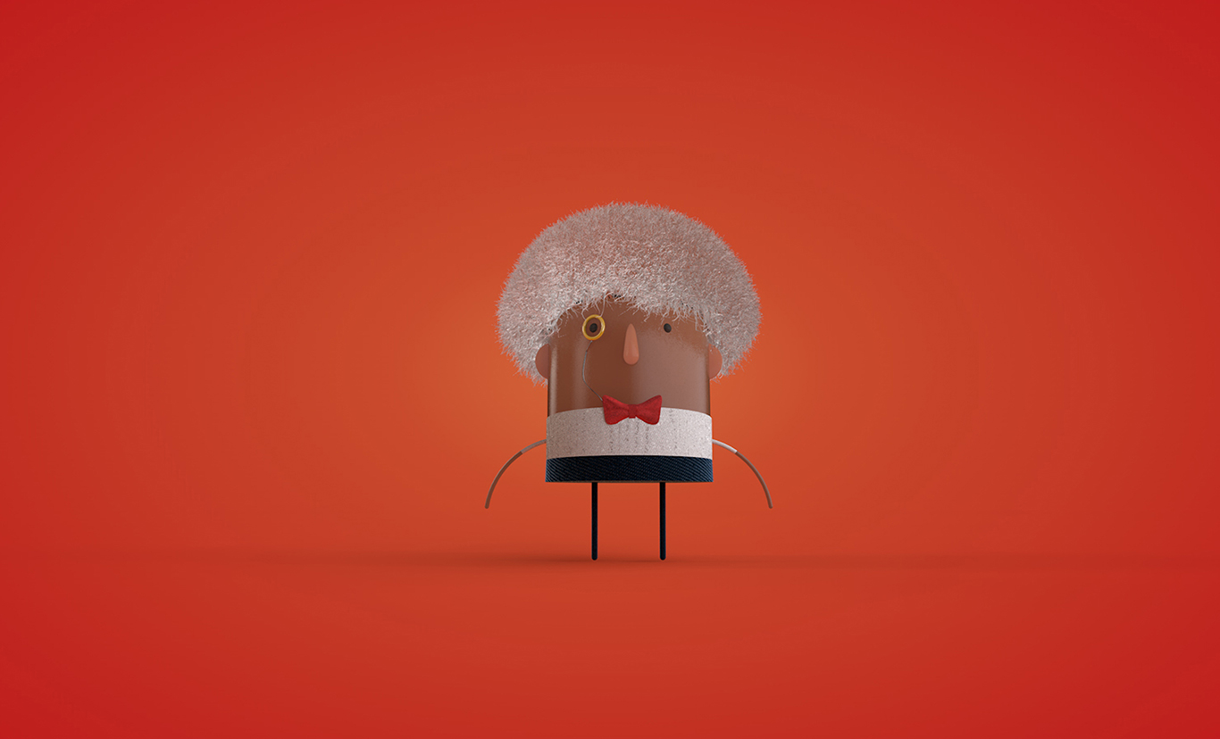
MADE BY FOURbranding - packaging - 3d
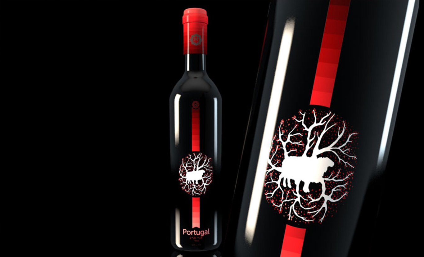
Made By Four (MB4) is a fictitious, dynamic wine company.The concept sprung from my family and the history, and stories we all share. Each bottle has a gradient with a specific color, location, and an animal. Each color on the gradient represents individual memories from a specific location(New York, Portugal, New Jersey, Georgia) where we have lived. The small winesamplers focus on individual events from each bottle; hence, the reason whythey are a solid color off the gradient from each bottle. As the wine decreases the gradient gets lighter, and so our memories become "happier". This also plays off nights at the dinner table where my father usually relives ourfamily history, and becomes "happier" while he tells us our great talesas a family. The animals are targeted as pivot points in each location that played a part in our lives, and in some cases had an impact on me as an individual, and ties in the symbols of the colors with the location. Vintage wine companies inspired the logo, as well as traditional Portuguese ceramic art called "Azuleijo". Yellow and black where used as part ofthe logo and visual branding of the company to represent its dynamic, and modern European culture.